| Image |
Comment |
| 05/06/2003 04:03:17 PM |
|
 Photographer found comment helpful. Photographer found comment helpful. |
| 05/06/2003 04:02:14 PM |
|
| Photographer found comment helpful. |
| 05/06/2003 10:07:25 AM |
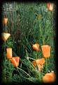
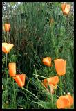
Your Photo Hereby GeneralEComment by emagen: nice composition, but as I commented on the print's challenge, I think there are too many elements for a sticker, nice work though... good luck |
| Photographer found comment helpful. |
| 05/06/2003 09:44:49 AM |
|
| Photographer found comment helpful. |
| 05/06/2003 08:30:41 AM |
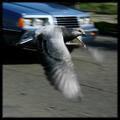
Feathered Ratby GeneralEComment by kiwiness: Critique Club:
Hi Paul, I got your pic to critique :-) The first thing that struck me when I looked at this pic is the sharpness of the pigeon's eye and that it seemed to be looking directly at me. It is amazing how you captured that eye, the color is a wonderful deep red/orange and it is definitely the focal point of your image.
As I mentioned below in my original comment the motion blur on the wings is very effective and works well with the in-focus body and head.
The car in the background is somewhat distracting though and it was just unfortunate that it was driving past at the moment you shot the pigeon. You could have blurred it out a little by reducing your shutter speed to between 1/30 and 1/60, which is usually the best panning speed. This would taken the background into a motion blur but at the same time would have created too much motion blur on the pigeon's wings.
Maybe it would just have been best to ask the pigeon to do a series of fly-by's until you got the correct exposure in :-)
All in all a very good pic which is mirrored by the 5.6 score it received. Well done.
Gary |
| Photographer found comment helpful. |
| 05/06/2003 02:13:29 AM |
|
| 05/06/2003 12:52:09 AM |
|
| Photographer found comment helpful. |
| 05/05/2003 01:51:14 PM |
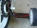
Training Wheelby GeneralEComment by Amiee: Very nice image. I really like the way that the object is photographed. I also like the texture that the chains on the bike, and the patterns in the wheels, create for the image. Good job. |
| Photographer found comment helpful. |
| 05/05/2003 01:50:44 PM |
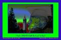
Berkeleyby GeneralEComment by ursula: I like this postcard, even though I think it's not the best photo in this challenge (please don't get offended :) I like how the picture can be divided into two triangles (top left - bottom right). The tower looks beautiful, but overall the picture looks a bit fuzzy, and the trees are so dark! I love the lettering, it looks just right for the picture |
| Photographer found comment helpful. |
| 05/05/2003 08:28:34 AM |
|
| Photographer found comment helpful. |
Home -
Challenges -
Community -
League -
Photos -
Cameras -
Lenses -
Learn -
Prints! -
Help -
Terms of Use -
Privacy -
Top ^
DPChallenge, and website content and design, Copyright © 2001-2024 Challenging Technologies, LLC.
All digital photo copyrights belong to the photographers and may not be used without permission.
Current Server Time: 04/23/2024 02:44:22 AM EDT.