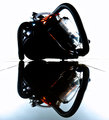
Space Age Suctionby
Covert_OddityComment: Good day! You're the recipient of my first ever "critique club" critique! So feel free to take this with a grain of salt :D
First Impression: This image has a very strong first impression. The deep contrasts make it interesting and the reflection makes it wonderful. Without the reflection, the photo would have been way too top heavy and not nearly as interesting.
Composition: I like the composition--the centered worked for me. The other option would have been to crop in from the right and add some space onto the left to balance out the larger right side of the vacuum. However, I don't think your leading lines would have been as effective, then. I would, however, have like a little additional space at the top and the bottom. It seems a little squished there.
Subject: Very good choice of subject.
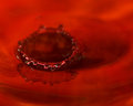
Technical: As I mentioned, I do like the strong contrasts. However, it does leave a very large black space in the middle of the photo. Black spaces are fine, but our eyes want to resolve what's hidden, so it draws your eye and takes away from the impact of the photo. I can understand not wanting a lot of detail, but if there was a way you could have brought out perhaps just the edge of the wheel cover, that would have been enough. I do like how you brought out the little splashes of red. Imo, they really help make the shot. One last thing, there's a bit of noise in the foreground color, but it's not too distracting.
Final thoughts: Well deserved finish! Congrats on the top 10!