| Image |
Comment |
| 02/08/2018 12:36:48 AM |
|
 Photographer found comment helpful. Photographer found comment helpful. |
| 02/07/2018 05:18:09 AM |
|
| Photographer found comment helpful. |
| 02/07/2018 01:49:10 AM |
|
| Photographer found comment helpful. |
| 01/29/2018 11:31:48 AM |
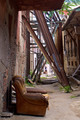
Street Architectureby PangurbanComment by ciaeagle: Greetings from the Critique Club!
First things first ... I'm glad you did eventually get that beer. :)
Theme: In terms or architecture, your image definitely covers a lot of bases. From steel girders to the crumbling brick you've captured the mix of old and new. That being said this is a tough picture to compete with the classic shots of buildings and bridges submitted in this challenge.
Image: I love the earthy colors of this image and how you've shown the steel supports holding up the older failing walls of the previous age. The bits of green popping out add contrast and the soccer players at the end draw the eye. You've framed them perfectly between the supports and the depth creates interest. Lots of detail shown in the textures of the various materials and the neglect of the chair offsets the life in the children.
All in all this is a great image and I am struggling to offer constructive feedback. Forced to pick something I would say its possibly a bit busy (there is a lot going on) but again I like it so ... |
| Photographer found comment helpful. |
| 01/20/2018 04:59:49 PM |
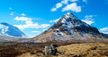
The Scottish Wayby PangurbanComment by sidpixel: Hello from the critique club
An image that contributes to the challenge
Your portrait fulfils the challenge brief in that it has been taken in natural light, there are however, a few things that I may suggest as potential improvements. There is a lot of distracting background that competes with the main subject as a result of the chosen aperture which has given you too much DOF. Most good portraits isolate the model from the background through use of (often) maximum aperture, sufficient distance between the subject and the background and by moving in closer to also reduce DOF. The composition is very central, use of thirds would greatly improve impact and also use of landscape orientation would enable you to make more use of the scene to add impact to the end result. I can see that you would want to include his kilt so a cropped composition just above the hem line and just above his head with landscape orientation with him to the left hrizontal third would have greatly improved the impact. Hope this helps a little Ellie, keep at it... |
| Photographer found comment helpful. |
| 01/19/2018 06:05:38 AM |
|
| Photographer found comment helpful. |
| 01/17/2018 05:34:32 PM |
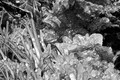
Iced Gemsby PangurbanComment by sidpixel: Hello from the critique club
An image that contributes to the challenge
The way the ice encapsulates the leaves like this is amazing sin't it, I recall a similar experience in Iceland some years ago. To be honest, I think there is rather too much going on here, there is no focal point, I think you would have been better to isolate a smaller part of the image in a macro to emphasis that encapsulation. Also, you remark about your ISO but to be honest with such a small aperture you couldn't have gone too much lower anyway. I always try to avoid using such small apertures to avoid the high ISOs compensation necessary to produce a shake-free image. |
| Photographer found comment helpful. |
| 01/11/2018 05:47:42 PM |
|
| Photographer found comment helpful. |
| 01/08/2018 07:22:50 AM |
|
| Photographer found comment helpful. |
| 01/06/2018 02:23:08 PM |
|
| Photographer found comment helpful. |
Home -
Challenges -
Community -
League -
Photos -
Cameras -
Lenses -
Learn -
Prints! -
Help -
Terms of Use -
Privacy -
Top ^
DPChallenge, and website content and design, Copyright © 2001-2024 Challenging Technologies, LLC.
All digital photo copyrights belong to the photographers and may not be used without permission.
Current Server Time: 04/28/2024 02:51:55 AM EDT.