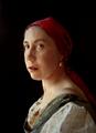
Lady With A Pearl Earring (An Interpretation of a Classic Painting)by
JunieMoonComment: Let me start out by saying that I'd probably have given this an 8 or a 9. I'm a sucker for the painting and I quite like this particular one.
Yes, the focus was indeed the issue here, but the star of the show is the lighting. Beautifully lit. Really nicely done there. Your pose is brilliant as well. So on the photography level, you've nailed it 100%. The problems come in in your PP choices.
I looked a bit closer at the original painting and a few things that I noticed in comparing:
painting has more of a 'grainy' feel
painting also has a bit of craqueling
painting has more of a 'posterization' look
painting is indeed more contrasty in the face (especially in the eyes, which almost look like Vermeer over-used the 'dodge' tool), but is not 'sharp'.
So it seems like the soft focus was an attempt to replicate those ideas.
If there had been some grain added, a very subtle amount of craqueling and posterization feel underneath the soft focus layer and a small amount of contrast boost in the eyes, I feel that this would have come together a bit better.
Another thing that I don't like is the black. It's common in photos to have pure blacks. But it's not common at all in painting to have pure blacks. In Vermeer's, his background is a dark brownish and serves to increase the "pop" of the blue headband just a bit. Your headband is red, so it wouldn't pop as well off a dark brownish, but I don't think it's necessary. This picture doesn't necessarily need to be MORE contrasty than the original, especially given the context of an older subject.
Since these are PP issues, I believe it could still be accomplished! Remastering this could be a nice way to get back into things in your first year back! :)