DPChallenge: A Digital Photography Contest You are not logged in. (log in or register
 
Browse Settings
Currently viewing:
Registered UserKuriKuri

Show comments:

Per page:

Order:

Comments:


Comments Received by KuriKuri
Pages:  
Showing 1 - 10 of ~70
Image Comment
Alaska's Blacktail Deer
07/05/2007 03:33:48 PM
Alaska's Blacktail Deer
by KuriKuri

Comment by kevrobertson:
Shame about the fence.
Makes it seem not real.

Good luck

Kev
Alaska's Blacktail Deer
07/04/2007 03:34:09 PM
Alaska's Blacktail Deer
by KuriKuri

Comment by BakerBug:
The lighting being behind the deer really hurt this shot. If it were possible to take this with the light coming from the side, or behind you, it would have improved this a lot.
Alaska's Blacktail Deer
07/02/2007 11:48:26 PM
Alaska's Blacktail Deer
by KuriKuri

Comment by smurfguy:
Subject seems pretty dark, and the bkg fence takes away from the majesty of the shot. Nice and sharp, though.
Duckie
06/26/2007 04:37:18 AM
Duckie
by KuriKuri

Comment by Sheryll:
Nice shot. 6
Duckie
06/24/2007 06:13:30 PM
Duckie
by KuriKuri

Comment by bergiekat:
Love the circular rings in the water.
Duckie
06/22/2007 03:14:05 PM
Duckie
by KuriKuri

Comment by KarenNfld:
wonderful timing, what type of duck is this? love the ripples
Duckie
06/20/2007 10:37:35 PM
Duckie
by KuriKuri

Comment by posthumous:
no sense of negative space here, it is kind of washed out by the highlights in the water.
Duckie
06/20/2007 03:16:00 PM
Duckie
by KuriKuri

Comment by Dona_k:
I'm not sure that you have a true neg. background only surrounding area (Water) of same color. Think in terms of removing 'negating' the background by blurring or what ever bringing all the attention to the duck and making it all look pretty. Then you got a winner! I hope this helps. Good luck in the challenge.
HiLiTr
04/16/2006 11:53:14 PM
HiLiTr
by KuriKuri

Comment by fotomann_forever:
::: Greetings from Critique Club :::

Hi, as requested, here is an indepth critique of your submission.

First Impression - the most important one:
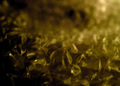
I'm generally not one to be harsh on photos, but this looks horrible. It was destroyed by the plastic wrap filter.

Composition:
Boring, very boring. Although, I appreciate the complementary colors, the comp itself draws very little attention.

Subject:
It's there, I suppose it's clear, but that's about it.

Technical (Color, focus, and light):
Color is oversaturated. Focus is hindered by a bad choice in filters and lighting is flat.

To grow its vote?:
Leave the artistic filters alone. Really. Voters here want to see photography, not, "Look what this filter can do."

Summary:
I really don't like to sound mean in critiques, but this just appears to be something yellow you shot and "tried" to make it look better with filters.

Hope to see more from you soon,
Leroy
Pop De Bubbles
04/13/2006 11:40:19 AM
Pop De Bubbles
by KuriKuri

Comment by electina:
This is too out of focus and noisy... otherwise it would have been a nice photo...
Pages:  
Showing 1 - 10 of ~70


Home - Challenges - Community - League - Photos - Cameras - Lenses - Learn - Prints! - Help - Terms of Use - Privacy - Top ^
DPChallenge, and website content and design, Copyright © 2001-2024 Challenging Technologies, LLC.
All digital photo copyrights belong to the photographers and may not be used without permission.
Current Server Time: 04/27/2024 05:58:21 PM EDT.