| Image |
Comment |
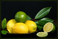
| 07/28/2007 11:12:47 AM |
A Slice of Lifeby jrdawsonComment: You have good color, good lighting, good focus, good placement... but I couldn't go above a 7 because your cut lime looks dry and not very appealing. It doesn't have that fresh look to it. Maybe if you had sprizted some water on it to give it a fresh jucy look or used a really fresh lime, it would have helped. I know I would have voted higher. |
 Photographer found comment helpful. Photographer found comment helpful. |
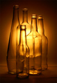
| 07/28/2007 11:08:30 AM |
Spotlight On Still Lifeby Jacques123Comment: If you only could have gotten one more bottle that didn't have words on it... the words around the neck of the one bottle keeps grabbing my attention and I want to read what it says. But the horizontal placement of the words through off the vertical lines of the bottles. Good lighting and color and I would have given this a least a 9 rather than an 8 had it not been for the one bottle. |
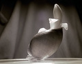
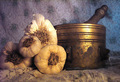
| 07/28/2007 11:04:38 AM |
Shell with Flowerby JeffryZComment: I really wanted to give this a 9 instead of the 8, but it took a while to figure out what was off about it. The first thing is it is not level. The straight line of the table shows the slant, which makes the shell look off. A little clockwise rotation would have made the difference. The dark shadow up in the left corner also keeps grabing my eyes. Usually it's the lightest area that attracts the eyes, but in this case, since the contrast of the shell, flower and rest of background are pretty close to the same, it's the dark corner that stands out the most. Nice job over all though. |
| Photographer found comment helpful. |
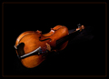
| 07/28/2007 10:59:14 AM |
"Joseph Guarnerius, 1751"by alexzenComment: I would have moved this image up another point if it hadn't been for the lighting. The shadow on the neck of the violin causes the body and end to lose connectivity and it fades to much into the background. I feel that had you opened up those shadows even a little more, it would have improved the image. I think it really needs the bow in the picture as well, but that's just my opinion. I also suspect that the full size image might show the detail that is lost when sizing for the screen. Nice shot other wise and worth the 8 I gave it. |
| Photographer found comment helpful. |
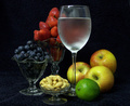
| 07/28/2007 10:51:02 AM |
Add taste to your foodby KliopatraComment: I think your picture is one of the 3 best ones of the whole group. The only nit I have about it is that your camera is too low and I get the impression that the right side is higher than the right, giving it a bit of a lopsided appearance. But your placement, color, exposure and focus is very good and because of that, I still gave it a 10. |
| Photographer found comment helpful. |
| 07/28/2007 10:49:03 AM |
Healthby LuguerComment: Your picture was very well done. I feel that you cropped it too much on the bottom and top though which causes it to have a squeezed in feeling. In size of that, I still gave it a 10 because you have good placement of the objects, good color, lighting and focus. |
| Photographer found comment helpful. |
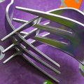
| 07/26/2007 01:31:27 AM |
Intertwinedby Photon-painterComment: Good idea and nice use of lines and shapes. But to me it's cropped way too tight and the orange and green colors are out of place in the image. Still, not bad, but it could have been better. |
| Photographer found comment helpful. |
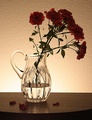
| 07/26/2007 01:30:21 AM |
Still Lifeby johngaltComment: This really needs some light on the flowers. You have good light on the vase, but the flowers are too much in the dark. A little selective lighting on the flowers and I think it would have really improved this image. |
| Photographer found comment helpful. |
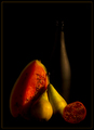
| 07/26/2007 01:28:56 AM |
Fruit Cocktailby FalcComment: This was almost a very good image. I think it needs a bit more light on the forground objects and the background bottle. If you could have placed a slit light on the bottole and a tad more light on the fruit, I could have gone a 9 or even a 10 on it. |
| Photographer found comment helpful. |
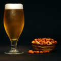
| 07/26/2007 01:27:17 AM |
The Warmthby shalrathComment: You could have had a very good picture here, but you have too much seperation between the drink and the peanuts. It's like there is two seperate pictures going on here. I think it would have had a lot more impact had you put the bowl right next to the glass and maybe had the lose peanuts around the base of the glass. This would have given a connection between the two objects. I think it's croped a bit tight on the left side as well.
Lighting is good as is color and focus. I could have gone a 9 or even a 10 had it been placed just a little bit better. |
| Photographer found comment helpful. |
Home -
Challenges -
Community -
League -
Photos -
Cameras -
Lenses -
Learn -
Prints! -
Help -
Terms of Use -
Privacy -
Top ^
DPChallenge, and website content and design, Copyright © 2001-2024 Challenging Technologies, LLC.
All digital photo copyrights belong to the photographers and may not be used without permission.
Current Server Time: 04/25/2024 01:36:43 PM EDT.