| Author | Thread |
|
|
11/19/2016 01:46:39 AM · #1 |
Looks like this thread has stalled. I'm curious if the "volunteers" have seen any increase in post challenge comments. Regardless, I'm trying to work through the list with a comment for all the volunteers. Here are several more.:
  grahamgator grahamgator
This simple backlit image caught my attention. It's was initially a combination of the light and shadow with lovely bokeh. Even though the main subject isn't compelling on it's own, the combination of light and color works well. THEN... the butterfly! A remarkable story of nature's camouflage, and I like it even better.
  hahn23 hahn23
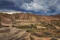
Wow. What a spectacular scene! And I really appreciate the vivid, rich colors presented here without radioactive saturation. The yellow and greens seem completely authentic - refreshingly so. In the spirit of that authenticity, I might have toned down the deepest blues in the sky, but then again, it's been a long time since I've been in the Rockies in the fall. Gorgeous!.
  GeneralE GeneralE
Quirky and cool. Trying to imagine the context of this installation(?) Regardless it worked to keep me looking and coming back.
 GeorgesBogaert GeorgesBogaert
The photo stands alone. The title and link in the Photographer's Comments gives it a context, albeit an ambiguous one. The location adds subtext if one considers why you were there in the first place (I'm wondering if the orange door is nearby). Fun to see a photo that works on multiple levels. And stands alone.
 flaherma flaherma
Agreeing with the previous comment. It's a slow, rewarding reveal after the first glance at this photo. I'm wondering if the eye starting at the top and eventually finding the sheep at the lower right is enhanced by the way the image loads from the top down. I wish I could see this for the first time again - without a slow screen refresh. I'm curious if the eye would find the sheep faster. Regardless, it's a very engaging image.
 Elaine Elaine
Love that the color is not overly saturated. Lots of interesting detail, too. I do find my eyes having trouble with where to settle, though.
 Dennisheckman Dennisheckman
This is really lovely and very appropriately impressionistic. Its has the characteristics of both a photo that has been processed with filter AND the look of a painting that's been photographed.
|
|
|
|
11/07/2016 08:56:15 AM · #2 |
[quote=wbanning] It seems the participants in this thread have taken to including their comments here along with the thumbnail. I've worked through a few more this morning:
  markwiley markwiley
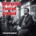
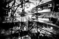
I'm a decent speller, but as with Beetle, I'm a careless reader. Didn't notice misspellings. Didn't score with any language penalties. What I like most here is the isolation of the subject, even in the context of a subway car. It really works for the title film title concept. Not sure I'd want to sit through it, though.
I thought that these misspelled words were on purpose. When depressed everything cracks or craks or raks, descent or decent or cent for that mattaer matter.
But I did not like the image, the processing, the font or the poster. Gave it a 5 for the idea behind it.
In this forum it's not only praise, that's why we placed our names on the list |
|
|
|
11/06/2016 11:50:15 PM · #3 |
Originally posted by wbanning:
Here's the next group of recent entries I've made post-challenge comments on:
. . .
 nam nam |
Thanks for the in-depth comment, Bill. I've responded and linked to a revision (which I hope you can see - let me know if you can't) in the thread on the image. |
|
|
|
11/06/2016 02:33:22 PM · #4 |
It seems the participants in this thread have taken to including their comments here along with the thumbnail. I've worked through a few more this morning:
 mitalapo mitalapo
This is a photo that just reaches out and grabs my attention. Calls me back, and stops me in my tracks as I'm looking through the challenge entries to vote or review after rollover. The quality of light and shadow plays well with the textures, and oddly, the busy-ness of the composition in no way detracts from the central focus on the full leaf in the center lower third. Remarkable.
 Melethia Melethia
Well done! Fascinating choices in color, blending, still and motion. Keeps me looking.
markwiley
I'm a decent speller, but as with Beetle, I'm a careless reader. Didn't notice misspellings. Didn't score with any language penalties. What I like most here is the isolation of the subject, even in the context of a subway car. It really works for the title film title concept. Not sure I'd want to sit through it, though.
 mariuca mariuca
The interesting thing about this for me was the time it took me to even notice the critters. I do find the man on the right to be dominating my attention.
 Lydia Lydia
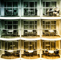
This is a strong image for me. Didn't score this challenge, but would have ranked this high. Put me in the camp of not disturbed by the gradient colors, and clear that the railing in front of faces is the distraction. To me the color cast is a counter balance to the sameness of the repeating balconies. There the same, but with a different mood in each one. I'd expect the inhabitants of each unit to be in some way defined by the colors. Congrats and kudos!
  lei_73 lei_73
I've never seen purple asphalt before, but it works well here as part of a fantasy color palette of iridescent autumn. Nicely done.
|
|
|
|
11/06/2016 09:52:42 AM · #5 |
Bear,
A leaf and a boat, what could be more appropriate to describe the human condition?
Perhaps also a blue sky, for hope.
I do not mean to derail this thread so I offer for critique an image of a challenge I did not vote for, HDR, of fear of seeing unwanted processing. This IS NOT on of them
 |
|
|
|
11/05/2016 08:18:48 PM · #6 |
Originally posted by mariuca:
 
Found it! Took me a while to find the one in two images!
Now these are images to be discussed!
The Bear got some milage out of this leaf.
The monument, the one on the left, I couldn't care less although the details at the bottom of the leaf are marvelous, a vintage Bear!The idea per se is not bad at all and I wouldn't be surprised if we'll see soon real iron and steel monument on the street. It could be nice. Quite striking. But here, as a photo I do not like it. (I gave it a 5)
Now the second one is a different story. It does have the feel of a possible overleaf for a Conrad novel, for instance. The leaf is now a torn sail. The stories that it could tell! |
The Monument one's a shoehorn. I had nothing, so I improvised, because I wanted something. The Memory one's talking about Alzheimer's, which I'm now being treated for. But the FIRST use of this leaf was in "Foliage", which is what I shot it for. It's a smallish Hosta leaf, and I stuck it in the top of my car door to shoot it with the sun behind it.

Message edited by author 2016-11-05 20:19:15. |
|
|
|
11/05/2016 05:34:27 PM · #7 |
Here's the next group of recent entries I've made post-challenge comments on:
 P-A-U-L P-A-U-L
 NikonJeb NikonJeb
 NiallOTuama NiallOTuama
  Neil Neil
 Neat Neat
nam |
|
|
|
11/05/2016 02:59:21 PM · #8 |
|
|
|
11/05/2016 01:53:14 PM · #9 |

LOL!!! Wonderful!
I like the thirds on this a lot.
|
|
|
|
11/05/2016 01:50:44 PM · #10 |
Originally posted by NikonJeb:
  tanguera tanguera
I absolutely love the light, the washed colors save for the red legs. It's a story to behold. I gave this a 7. |
Originally posted by tanguera:
I was wondering what this spate of comments was about!
Thanks everyone. |
NOW do you think this thread is irrelevant???
LOL!!! Grinnin' & Duckin'
|
|
|
|
11/05/2016 01:34:34 PM · #11 |
|
|
|
11/05/2016 12:28:12 PM · #12 |
Originally posted by NikonJeb:
tanguera
I absolutely love the light, the washed colors save for the red legs. It's a story to behold. I gave this a 7. |
I was wondering what this spate of comments was about!
Thanks everyone. |
|
|
|
11/05/2016 09:36:03 AM · #13 |
Great minds.....
Excellently provocative. The mind ventures forth.
|
|
|
|
11/05/2016 09:32:50 AM · #14 |
tanguera
I absolutely love the light, the washed colors save for the red legs. It's a story to behold. I gave this a 7.
|
|
|
|
11/05/2016 03:48:01 AM · #15 |
I'm late to these Post-Challenge Volunteer threads, but intrigued by the idea. I added my name to the "willing to receive" list earlier this evening. I'm committing to cycling through everyone on the list with a post-challenge comment. This time through, I'm picking a recent entry. Maybe next time I'll pick ones I scored high or low and add comment.
I started tonight at the bottom of the list and worked upwards. Here are the ones I got to this time - comments on the entry page:
 vawendy vawendy
 tnun tnun
tanguera
 primabarbara primabarbara
 posthumous posthumous
 pixelpig pixelpig
 PennyStreet PennyStreet |
|
|
|
11/05/2016 01:28:33 AM · #16 |
One of the rare challenges I didn't vote on, but I really liked this image. Something about nines and blue-gold gradients that speaks to me :-)
October 2016 Lydia
 September 2013 wbanning September 2013 wbanning
Pretty cool! I'd completely forgotten about this entry until I saw the reminiscent colors and 3x3 squares. |
|
|
|
11/04/2016 07:46:01 PM · #17 |
Found it! Took me a while to find the one in two images!
Now these are images to be discussed!
The Bear got some milage out of this leaf.
The monument, the one on the left, I couldn't care less although the details at the bottom of the leaf are marvelous, a vintage Bear!The idea per se is not bad at all and I wouldn't be surprised if we'll see soon real iron and steel monument on the street. It could be nice. Quite striking. But here, as a photo I do not like it. (I gave it a 5)
Now the second one is a different story. It does have the feel of a possible overleaf for a Conrad novel, for instance. The leaf is now a torn sail. The stories that it could tell!
Message edited by author 2016-11-04 19:58:28. |
|
|
|
11/04/2016 06:12:07 PM · #18 |
Originally posted by vawendy:
Here's another that's more distracting image than distracting element. But I also enjoyed searching it immensely.
 |
This was my pick for the Red.
Dennis's just edged it out because of my personal thing for mannequins....LOL!!!
|
|
|
|
11/04/2016 06:10:13 PM · #19 |
Originally posted by mariuca:
For what's worth, it was a 7 from me. I liked the image a lot- the distractive element was the uneasiness we felt at looking at it.
I had a feeling of deja vu, but it did not matter. Yes, save for the filters, this was one of my favorite images.
Excellent title also. |
7 from me as well.
I was unsure about the toning at first but the more I looked at it, the more it worked for me.
|
|
|
|
11/04/2016 06:04:45 PM · #20 |
Originally posted by tanguera:
Lovely that people are commenting. I'm just not understanding the purpose of this thread...? Wouldn't you want the comments on your image to appear on the image page? |
Originally posted by Dennisheckman:
I think it's best to post in the image and post here as well for the general discussion. That's how I will handle my commenting. |
Yah, that.....
From the first post...
I don't know if we should just/only comment on the image, we definitely should on the image, but I know part of what I liked was having open discussion as well as the comment when my image was up for perusal. So I mirrored the comment I left here in this thread
As I saw it, post the comment on the image, then mirror it here so that the image that was picked & commented upon could get discussion & hopefully, more comments.
|
|
|
|
11/04/2016 05:50:15 PM · #21 |
Originally posted by mariuca:

I disagree with the other commenters.
Being one of the people who loves taking pictures of reflections, I considered this image inconsequential. Yes, point the camera to a reflective surface and you get something mildly interesting and yes, distracting. Such as this one.
But to me a reflection is an organized chaos.
You could have probably done better with the processing - it's way to even. I am distracted but...from WHAT?
Hope I am understood properly. |
Mariuca- Thanks for taking the time to express your opinion! I am loving all the different points of view from everyone commenting. This image to be honest, was a shoehorn. I was walking down the main st of Mt Carroll IL just seeing what was there to catch my eye and I snapped this one. I actually wished the reflections of the other side if the street were not in the image but maybe they added a little more distraction. But I sort of felt overwhelmed by too many distractions in the image as well. But I do feel the main subject is the female manniquin and everything else is a distraction and/or complimentary to the image. As far as processing, I didn't know what else to do with it, and I didn't feel like spending hours on the computer doing it this time. |
|
|
|
11/04/2016 05:41:08 PM · #22 |
For what's worth, it was a 7 from me. I liked the image a lot- the distractive element was the uneasiness we felt at looking at it.
I had a feeling of deja vu, but it did not matter. Yes, save for the filters, this was one of my favorite images.
Excellent title also.
7from me also.Have not much to add from the comment I made already.
The image seems so contemporary that it gives one chills. Well done, again
I disagree with the other commenters.
Being one of the people who loves taking pictures of reflections, I considered this image inconsequential. Yes, point the camera to a reflective surface and you get something mildly interesting and yes, distracting. Such as this one.
But to me a reflection is an organized chaos.
You could have probably done better with the processing - it's way to even. I am distracted but...from WHAT?
Hope I am understood properly. |
|
|
|
11/04/2016 04:31:14 PM · #23 |
Originally posted by tanguera:
I still find the need for this thread incredibly disheartening, and we are clearly deferring to a very small number of people who do not want comments. |
I think as people see that a "large" number of people DO want comments and are willing to abstain from vitriolic responses, they will be encouraged to just start commenting again and the need for this thread will pass.
Originally posted by mariuca:
I am leaving comments on the images posted, if I have something more to say. Shall I place them here also?. |
I think that's fine -- reading your comment here may inspire someone to go look at a picture they would have otherwise skipped.
Message edited by author 2016-11-04 16:31:55. |
|
|
|
11/04/2016 04:16:00 PM · #24 |
| I am leaving comments on the images posted, if I have something more to say. Shall I place them here also?. |
|
|
|
11/04/2016 04:09:29 PM · #25 |
Originally posted by mariuca:
Originally posted by tanguera:
Lovely that people are commenting. I'm just not understanding the purpose of this thread...? Wouldn't you want the comments on your image to appear on the image page? |
So far there seems to have been mostly praise but the purpose of the thread seems to me like an appraisal of the entire challenge and a more in depth critique of the pictures that we have more to say about without creating a problem. A lot of people do not like a critique of any kind, thus the bagheads, thus this thread.
For instance, the Yolk is on you was for me a huge disappointment. The entire topic was uninspiring for me and although I love to participate as much as I can, I could not find a single idea. I would like to make some comments but I have to be careful and look at the list of people who don't mind an after the challenge discussion. |
I still find the need for this thread incredibly disheartening, and we are clearly deferring to a very small number of people who do not want comments. |
|
Home -
Challenges -
Community -
League -
Photos -
Cameras -
Lenses -
Learn -
Prints! -
Help -
Terms of Use -
Privacy -
Top ^
DPChallenge, and website content and design, Copyright © 2001-2024 Challenging Technologies, LLC.
All digital photo copyrights belong to the photographers and may not be used without permission.
Current Server Time: 04/19/2024 02:07:25 AM EDT.