|
| Author | Thread |
|
|
01/26/2012 09:33:35 AM · #1 |
From the original thread: upcoming photoshop how to side challenge
Maybe? Perhaps?
As I was going through my photos, getting ready for book titles, I realized that I do quite a span of editing.
Sometimes I do quite a bit -- layer upon layer, tweaking things as I go. I don't think they're large tweaks, but definitely a lot of tweaks.
Other times, I barely touch them.
This is something that many people have problems with when the first start (and many times people have problems with it through their time on DPC): Just how much editing is done on the pictures??
I would love to start a side challenge that shows before and after on challenge entries for one week (plus one) of challenges. I'm thinking "landscape at night", "single light source", "book titles", and "indoor macro". You don't have to do all three (even if you have entries in all three).
At first I loved the idea. Then I was afraid that people wouldn't want to enter for fear of being DQd (not that they're purposely cheating, but we've all seen what happens when people have posted their steps in the comments section, only to have those comments get them DQd.)
Well -- here's the deal: The top 5 have to validate anyway. If the photo isn't top 5, then here's your chance to know there's a problem before you get a validation request in the future. :)
Though I highly doubt the SC will be skimming this side challenge looking for problems.
So the question is (or maybe the two questions are:)
1. If you are entered in these challenges -- are you interested in showing us your before and after, telling us the steps you used in editing your picts?
2. Should it be on these four challenges, or should it start at a later date? (I thought these four because night landscapes seemed to use different processing steps, single light could be interesting to see how the processing affected the light, book titles because it's there, and indoor macro because it's basic.)
 vawendy vawendy
 melethia melethia
cinnabear
 generale generale
mariuca
 SEG SEG
bhuge
markwiley
cuttooth
timtam
minsophoto
Here's where you can put your information! Let's see what we can do. :)
Message edited by author 2012-01-26 10:20:54. |
|
|
|
01/26/2012 09:50:54 AM · #2 |
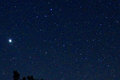
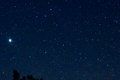
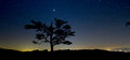
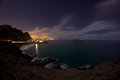
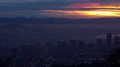
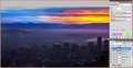
There actually was very little done to my landscape at night photo. The biggest thing was that the exposure was a bit off.
I shoot in RAW, because it gives me much more flexibility, imo.
Here's the original image from the camera:
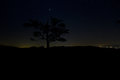
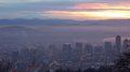
I didn't even give it a second thought, because it looked like I messed up. When I finally got around to opening it, all I did was boost the exposure in the RAW converter and this is what I saw:
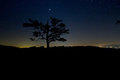
It was quite exciting!
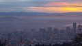
From there, I only did 6 steps (after a crop and straighten, that is):
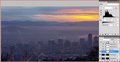
1. I don't know what I'm doing with night photography, so I shot at 1600 ISO. I thought I had to shoot that high to be able to get the dimmer stars without getting trails. I'm still thinking I had to. Did I? Would a lower ISO have given me the same thing with less noise? Anyway, I had noise -- so I used topaz denoise to try to cut it down a bit:
2. The tree looked a little muddy, so I did a topaz (I don't remember which one, just something to bring out the details a tad -- probably clarity setting or simple pop.) I didn't make a big difference. It did bring out the noise a bit more, so I really should have just topazed the tree, not the whole thing.
3. It also was still a little dark, so I adjusted the curves -- very simple adjustment -- I just grabbed the far right point, and dragged it directly left.
4. The last step was resizing and sharpening.
Sharpening was done by going to the filter menu -> sharpen -> sharpen more. Amount of 109, radius .5 (Judi showed me this sharpening method, and I really like it. It sharpened the tree too much because of the topaz, so I really should have had two levels of sharpening -- one for the sky, one for the tree. But I didn't think of it at the time. But it really brought out the stars
5. add border -- the darker border also brings out the stars.
6. I cloned out a small amount of a tree on the right. (you'll see it in step 2)
Final shot:
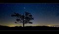
That's it. There was very little editing in this one.
Message edited by author 2012-01-26 09:55:26. |
|
|
|
01/26/2012 10:04:36 AM · #3 |
gotta love raw.
thanks for the tutorial. |
|
|
|
01/28/2012 12:49:03 PM · #4 |
| Gorgeous shot, Wendy. Usually I think I'm taking good images UNTIL I see them on the computer, not the other way around. Love when it works out that way. :D |
|
|
|
01/28/2012 01:08:41 PM · #5 |
Originally posted by vawendy:
1. I don't know what I'm doing with night photography, so I shot at 1600 ISO. I thought I had to shoot that high to be able to get the dimmer stars without getting trails. I'm still thinking I had to. Did I? Would a lower ISO have given me the same thing with less noise? Anyway, I had noise -- so I used topaz denoise to try to cut it down a bit: |
You were probably just about where you needed to be, but you could have gained perhaps a stop of light by increasing your exposure time... maybe. The general rule is max exposure time is roughly 600/FL. Your f/3.5 aperture tells me you were shooting near or at the wide end of the 10-22. That means you could have gone with 600/10 = 60s without much trailing. You *would* have seen slight trailing in the full-size file, but it would not be easily detectable at reasonable print sizes, and probably not visible at web resolution.
The additional light would have helped with noise. Since you were shooting a single exposure, another thing that would help is enabling long exposure noise reduction (or using dark frames, which is a more involved technique).
So in the end, yes, you really needed the higher ISO to bring out the dimmer stars, and that's what really made the shot, IMO. It would not have been near as powerful with just a few stars.
IMO you did a really good job with the post-processing. It's easy to wind up with really "crunchy" stars. With respect to sharpening a starry sky, less is more. Your stars look a little bit crunchy, but at web resolutions, a little bit of that usually looks fine, and I think you found a good compromise.
|
|
|
|
01/28/2012 01:13:55 PM · #6 |
Originally posted by vawendy:
I shoot in RAW, because it gives me much more flexibility, imo. |
I don't/can't, and it (along with a small/noisy sensor) can be a real limitation ....
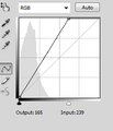
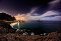
I'm actually fairly lazy as an editor -- I find I get most of the effects I want using variations on Curves adjustment layers, through masks as necessary. I find this particularly effective at discovering hidden detail in areas seemingly blocked up in deep shadow. The Landscape at Night challenge was a good opportunity to show this.
Curves are one of the most powerful controls over tonal range -- I recommend reading the tutorials on them if you are not familiar with how they work. Note that I have the "graph" axes reversed in orientation from the Photoshop default, with the 0,0 point in the lower-left -- to me it seems more intuitive to lighten the image by dragging the graph down.
I also display pixel values (in the Info window) in grayscale and CMYK values -- this is how positive images are built with subtractive inks in printing, whether by inkjet, laser, or traditional offset.
For starters, I'd spent all week trying to think of a good spot to take a landscape shot without too many city lights in it, and as I was driving home about two hours before the deadline I remembered this spot, which I'd shot before in the daytime for an earlier challenge. It is fortuitously-situated across a four-lane street from a gigantic BART (rapid transit) station parking lot, so the hillside got some light up to the treeline, plus there were scattered candles among the memorial crosses, stars, and crescents.
Original: 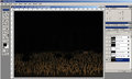 Entry: Entry: 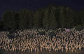
I started by creating a mask and applying a Curves adjustment to the combined RGB Channels to the area above the crosses to separate the trees from the sky. You can see a thumbnail of what the mask looks like in the Layers window.
Next came Curves to the bottom part in the RGB and Blue/Yellow Channels. Curves in the individual channels will shift towards that color in one direction, and the complementary color in the other direction.
Next came an RGB adjustment to the overall image. 
Althogh one person later commented that they didn't like the sign listing the number of casualties to date, I thought it was an important component, so I made a small mask and local adjustments.
I then masked off everything but the trees, and tweaked those.  
Finally, I made an adjustment to the sky area to give it a bluish cast.  |
|
|
|
01/29/2012 12:02:14 PM · #7 |
By contrast (ha ha) my Single Light Source entry could have been entered under Minimal rules -- I made only slight global adjustments to the RGB And Blue Channels. Two-second shot using the timer and resting the camera on a "beanbag" sitting on my car.Entry: 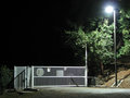 Unadjusted: Unadjusted:  RGB Curve: RGB Curve:  Blue Curve: Blue Curve:  |
|
|
|
02/03/2012 11:03:37 AM · #8 |
I forgot about posting this up. This is what I did for the Night Landscape challenge last week. Not really satisfied with the outcome because it was so soft in some spots. At some point I'll probably retake this and hopefully get it right.
Original (resized)
These are the steps that were sent in for validation, I'll elaborate a bit on some of them in italics.
Shot in Raw, imported with Lightroom.
Photomatix
Tonemapped 4 different versions. 1 for rocks, 2 for sky, 1 for water.
for sky, did a 2nd darker version for some hotspots in the clouds and in the light pollution from the city.
CS5
Blended individual tonemapped versions with layer masks.
Bleach bypass on the sky, some portions of water, mountain and foreground cliffs.
some of the colors were too vibrant and desat'g in PS didn't get the color I wanted. I used Phototools Free for this.
Levels, Curves, Contrast.
Dodge/Burn on foreground cliffs to get more depth. also parts of the mountain, water, and island.
selected the 3 portions of the cliffs separately to add depth. (the foreground, mid ground, and the farther portion. going progressively darker the farther away the rocks were.
Fixed some slight chromatic aberration on the edge of the mountain.
Using the original version, lightened with levels and applied orange photo filter. Used that to balance out some of the oversaturation in the orange clouds and parts of the mountain.
still wasn't happy with the color of the light pollution from the city.
Multiple passes with Topaz DeNoise. 2x on sky, 3x on water. 1x on mountain/rocks.
there was 1 main pass to reduce noise. the additional passes were in some spots that still had noise in them. they were then blended in using layer masks.
More Levels/Contrast adjustments
Cloned out hot pixels (quite a few)
Distort to fix slight lens distortion
Rotate
Crop
Spot sharpening on the island, lights, car lights, and stars.
Resized
USM
SFW
Here is the uncropped version (unsharpened), and the final rotated, cropped, and sharpened version.
 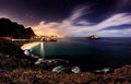
I used the fisheye but after cropping quite a bit, I should've just used my superwide, probably would've gotten a better result.
Hope people find this useful.
Message edited by author 2012-02-03 11:05:59. |
|
|
|
02/03/2012 08:54:53 PM · #9 |
Originally posted by Cuttooth:
I forgot about posting this up. This is what I did for the Night Landscape challenge last week. Not really satisfied with the outcome because it was so soft in some spots. At some point I'll probably retake this and hopefully get it right.[..]
Hope people find this useful. |
I found it very interesting. It seems that I have only scratched the surface of what can be done in PP. If you don't mind would you like to post a link to the original RAW? I'd like to play with it and compare my result. |
|
|
|
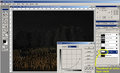
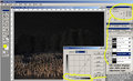
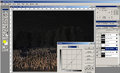
02/09/2012 11:45:23 PM · #10 |
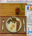
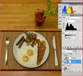
My entry got a 5.meh and I forgot about posting this, but here it is. I also have a tutorial for a better scoring FS that I will try to post tonight or tomorrow.
Here is the entry
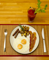
I'll post screenshots, but you can also just take a look at the layered tiff file in PS if you would like.
You can find it HERE. You will probably need PS5 to view it.
The original was taken handheld with a flash bounced off the ceiling.
I started off by importing to lightroom and applying lens correction. I also cropped it a bit.
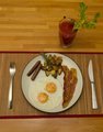
I then loaded it into PS and did some perspective transform because I was apparently a little off center when I shot it.
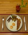
There were some imperfections in the fork and knife so I cloned a little of it out. People probably wouldn't have even noticed it but I'm picky. To do this I made a transparent layer and used the clone tool but I told it to sample from "Current and Below" layers. This allows me to do non-destructive cloning.
I then adjusted the levels to increase the black level.
I raised the exposure by 1/3 of a stop
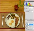
I then applied some curves adjustments. I ended up with a fairly flat line so I could have just done the same thing in the levels adjustments, but there was no point in undoing my changes and reapplying them in the levels layer.
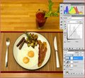
I then resized using "best for reduction" method and applied a bit of unsharp mask.
Converted from ProPhoto RGB to sRGB and saved it.
After voting started I looked at it next to the other entries and could not believe how yellow it looked. Alas it was too late to fix. I'm surprised more people didn't comment on the poor white balance.
|
|
|
|
02/10/2012 12:06:14 AM · #11 |
This will go over the entry "Song of Ice and Fire"
This is one of those images that I almost threw away because the city haze was so bad. I decided to play around with it anyway and it goes on to be my 4th highest scoring photo. I knew entering it that some people would not like it due to the unnatural colors, but hey you can't make everyone happy, and sometimes surrealistic images can be fun.
HERE is the source layered tiff file in PS if it's easier for you then screenshots.
I scaled down the original quite a bit because the original with layers was 470 megs!
Here are the individual images, I used raw but I converted these to JPG for ease of viewing.
You may notice a big black splotch on the dark image. That was an accident but that part of the dark image wasn't being used anyway so I didn't bother reloading it when I did the processing.
I used the lightest one for most of the city and mountain. The sun corner was the only part that was a composite of the three images. I combined the three in the sun area using the luminosity mask trick that was posted recently. I won't go over the process because the website does a much better job then I do at explaining it.
That got my sun from being blown out, but as you can see I still had some MAJOR morning haze issues. The city looks like it's full of chain smokers.
I didn't have a very good black point, the darkest parts where still grey so I adjusted the levels a little bit to drop the blacks down.
Then I wanted to get rid of a little haze and make the sun pop a little more, so I did some curves adjustments. I applied a slight S curve to the line will help with the contrast.
I also did a global adjustment to the contrast and brightness. This probably could have been done in the curves layer, but it's easy to over do the curves. Sometimes it's easier to just use the sliders
At this point I was very happy with the sun. It pops and is a great red/orange. From here on all the edits I made include a mask that would ensure the edits didn't mess up my sun. When adding these edits I would do it globally, but then paint black onto the mask to remove the edits from the sun. I used a huge brush size with a large falloff so that it would blend fairly well.
First off everything was too dark, so I added some exposure to the Mountain and the city.
That really pulled out the blues in the mountain. The top looked great, but the city started to look a little too fake. It had too much of a blue color cast to it. I tweaked the contrast a bit, which probably isn't needed now that I look at it. I also partially desatruated the city to make it more realistic.
Contrast
DeSaturate
After that I just resized it, converted it to sRGB, and added a little bit of sharpening.
Margaret, you asked in the comments if this was Seattle. You were very close! This is Portland. I was at Pittock mansion in the west hills looking east at Mt Hood.
|
|
|
|
02/10/2012 12:18:09 AM · #12 |
Wow - you guys are not only good at editing, but at keeping track of your editing!
I don't do all that much, and often don't remember what I do. If someone can tell me a good way of keeping track of what gets done in Silver Efex, that would help! I do have history turned on for Photoshop, and that helps, too.
This was my entry for Book Title:
And this was the original:

A crop was in order, then since I hadn't yet decided whether to go color or B&W, I did a bit of "transparent cloning" on the orange swish (the adult's hand, I think) to tone the color down since that bothered me. In other words, I chose a grayer section as my source for cloning, but set the opacity to about 50% so that I didn't clone all the texture from the source over the destination. Does that make sense?
Then I used Silver Efex which is on a separate layer, and tried the "luminosity layer" trick - basically set your Silver Efex layer to Luminosity blend mode - can be really nice. This is what I got:

I did like the pink, but in the end I preferred the pure B&W version.
Sorry I don't have more exciting details to share, but I really am not very skilled at the finer points of editing. :-) |
|
|
|
02/10/2012 12:23:37 AM · #13 |
Originally posted by Melethia:
Wow - you guys are not only good at editing, but at keeping track of your editing!
|
I try to do everything I can with non-destructive layers, which helps a lot in remembering what I did. These are the first two tutorials I've done, but I think I might do them for every entry. After going through each of my steps and writing them down I noticed quite a few things that I wish I would have done differently.
It's amazing how talking through your own edits can help you realize what you can improve on. |
|
|
|
02/10/2012 12:25:22 AM · #14 |
Deb, in Silver Efex there's a history button, it's the third button along in this screen shot (it's very helpful)
 |
|

|
|
Current Server Time: 04/16/2024 02:40:05 AM  |
Home -
Challenges -
Community -
League -
Photos -
Cameras -
Lenses -
Learn -
Prints! -
Help -
Terms of Use -
Privacy -
Top ^
DPChallenge, and website content and design, Copyright © 2001-2024 Challenging Technologies, LLC.
All digital photo copyrights belong to the photographers and may not be used without permission.
Current Server Time: 04/16/2024 02:40:06 AM EDT.
|


