| Author | Thread |
|
|
09/06/2012 09:56:09 PM · #26 |
Thanks everyone who added comments to the image thread, very helpful. I did consider dodging the trees on the right a bit more but felt that the result wouldn't ring true, and it was sheer laziness on my part that I didn't dodge the pants a bit. They're my loosest pair and I didn't want to ruin some good jeans ;-)
Just digging up an outtake as some suggest that seeing face would have made for a stronger image. Give me a couple minutes... |
|
|
|
09/06/2012 10:08:02 PM · #27 |
I'll try to leave on the picture, as well. I like posts in the thread, simply because it's easy to find the new comments without having to go back to each picture individually. But I can see it's helpful in the comments, as well. :)
|
|
|
|
09/07/2012 07:42:54 AM · #28 |
 OK here's the outtake which I probably should have used for Railway. Thoughts? OK here's the outtake which I probably should have used for Railway. Thoughts? |
|
|
|
09/07/2012 08:03:19 AM · #29 |
Originally posted by snaffles:
OK here's the outtake which I probably should have used for Railway. Thoughts? |
Susan - I gave your entry a 6, but would have likely given this a 9 or 10. In fact, I would have picked this one to ribbon. It just 'has it'. The face, the look sideways, the 'pose', the hand holding the remote less noticeable, the color all seem better in this one. Yeah, the clouds are better in the other one, but I like the blue sky.
Great shot. |
|
|
|
09/07/2012 10:15:39 AM · #30 |
I love the light on your very pretty face, Susan. I would still like some more details in the legs, but I'm sure I would have scored this higher.
Message edited by author 2012-09-07 10:16:03. |
|
|
|
09/07/2012 12:13:03 PM · #31 |
Here is an old one that I like to bring out occationally just to see if any fresh faces have any critique. I understand why it didn't do well in the challenge....It pays to read the rules...lol
|
|
|
|
09/07/2012 12:34:12 PM · #32 |
Originally posted by chazoe:
Originally posted by littlemav:
Here's one I'd really like some critique on, really trying to work on my "Expert Editing" sooo let er rip
 |
Like Mark said, the fence and goings on in the background don't add much and I think it would look better with just the cowboy, the horse, and the dust. |
I completely and utterly disagree with that statement. The background figures add interest and context, and it's lovely the way the dust obscures them. |
|
|
|
09/07/2012 12:37:35 PM · #33 |
Originally posted by GeneralE:
The horse's rear legs look partly transparent?
|
Honestly, is that a composite of more than one image? If so, it would have been nice to write that into the photogs comments (those cpmments would be nice for this thread anyway, just tp know what the intention was, the circumstances, the lighting etc.) |
|
|
|
09/07/2012 12:46:32 PM · #34 |
I like the thread Wendy.
But give us some instructions where it's best to leave the comments so that we all do the same. Perhaps under the photo itself instead of on the thread itself would be better for the photographer who posted it. |
|
|
|
09/07/2012 12:50:57 PM · #35 |
This one was just rejected at 1x. My 6th submission, one published. The one published went almost unnoticed here, at DPC.
I would really like any honest critique. |
|
|
|
09/07/2012 12:53:24 PM · #36 |
I could have rotated this one too but I left it the way it was. I thought it was a cool angle.
 |
|
|
|
09/07/2012 01:25:15 PM · #37 |
Well I have to thank everyone on all the imput on my bucking horse, The funny thing is the part that really botherd me was I felt the horse and rider were a little ??blurry, out of focus, but that didn't seem to bother anyone else.. LOL Tons of EXCELLENT pointers that I Did NOT see ... Thanks so much!! I had to laugh at the comment about You put this up for critique it's excellent (or words to that meaning) I did not feel it was excellent, but ya'll have given me a boost in my "expert editing" confindence!
Oh it was  vikas saying you musta been stoned to put this up for critique, it's fantastic... LOL I love that comment! vikas saying you musta been stoned to put this up for critique, it's fantastic... LOL I love that comment!
Message edited by author 2012-09-07 13:26:50. |
|
|
|
09/07/2012 01:30:23 PM · #38 |
I just +1'ed  jagar's comment :) jagar's comment :)
Originally posted by littlemav:
Oh it was vikas saying you musta been stoned to put this up for critique, it's fantastic... LOL I love that comment! |
|
|
|
|
09/07/2012 01:39:32 PM · #39 |
Originally posted by mariuca:
I like the thread Wendy.
But give us some instructions where it's best to leave the comments so that we all do the same. Perhaps under the photo itself instead of on the thread itself would be better for the photographer who posted it. |
I agree that for the photographer it is better to comment directly on the image - I've done that on all so far. I think if everyone posted a comment to this thread on each of the images it would get really untidy and unwieldy in my opinion. Though I agree with Wendy that it's less of a faff to posters if it's all in one place - but I don't mind the minor inconvenience of checking back on photos to see if others agreed with me. |
|
|
|
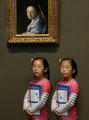
09/07/2012 01:58:43 PM · #40 |
Originally posted by mariuca:
This one was just rejected at 1x. My 6th submission, one published. The one published went almost unnoticed here, at DPC.
I would really like any honest critique. |
Thank you Vikas, Katie, Don and T for the wonderful and prompt comments.
If you did not know yet, you probably guessed that I am nuts about painting and taking photos at museums is one my most favorite things in life. This is taken at the Met where we are lucky to have a few Vermeers.
The girl, yes, one only, was posing for her mom after glaring over the painting (girl to girl) and I "saw" my future picture in front of my eyes. Therefore, I added the twin, each girl with a secret smile on.
My problem I guess are mostly technicals. I am also lazy and do not cary the big Nikon with me.
I just wanted to know how much I am missing technically.
LevT said and rightly so that "the girls look posed, especially looking straight into the camera, the light is also not very interesting".
Well, he did say "the girls" so I must have fooled him also!
I object to his "posing" comment. I wanted to show the difference between the obviously posing girls and the one totally candid in the painting.
Thanks again.
|
|
|
|
09/07/2012 02:48:03 PM · #41 |
Originally posted by lawrysimm:
Originally posted by mariuca:
I like the thread Wendy.
But give us some instructions where it's best to leave the comments so that we all do the same. Perhaps under the photo itself instead of on the thread itself would be better for the photographer who posted it. |
I agree that for the photographer it is better to comment directly on the image - I've done that on all so far. I think if everyone posted a comment to this thread on each of the images it would get really untidy and unwieldy in my opinion. Though I agree with Wendy that it's less of a faff to posters if it's all in one place - but I don't mind the minor inconvenience of checking back on photos to see if others agreed with me. |
I just leave the comment in both places � two chances for people to see it.
When you click on the image in this thread, it pops up in a new window. I write the comment, copy it, then close that window -- at that point I'm right back in this thread, so I can then paste the comment into the thread. |
|
|
|
09/07/2012 04:14:26 PM · #42 |
Originally posted by GeneralE:
Originally posted by lawrysimm:
Originally posted by mariuca:
I like the thread Wendy.
But give us some instructions where it's best to leave the comments so that we all do the same. Perhaps under the photo itself instead of on the thread itself would be better for the photographer who posted it. |
I agree that for the photographer it is better to comment directly on the image - I've done that on all so far. I think if everyone posted a comment to this thread on each of the images it would get really untidy and unwieldy in my opinion. Though I agree with Wendy that it's less of a faff to posters if it's all in one place - but I don't mind the minor inconvenience of checking back on photos to see if others agreed with me. |
I just leave the comment in both places � two chances for people to see it.
When you click on the image in this thread, it pops up in a new window. I write the comment, copy it, then close that window -- at that point I'm right back in this thread, so I can then paste the comment into the thread. |
I really prefer the comments in the thread, though it does tend to get messy that way. But it's a lazy way for me to see what's going on without having to click on all the photos. :)
But my main reason for liking things in this thread is that it makes it look active. I was afraid that if all the comments were left on the pictures themselves, it would look like a thread where people post pictures, but never get answers.
But it seems like people are finding their way just fine.
(Don't you love it when people are wishy-washy with their answers ? :P )
|
|
|
|
09/07/2012 04:17:50 PM · #43 |
Originally posted by vawendy:
Ok -- I'm afraid no one will post before this rolls off the page, so here's one with which to start.
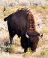 |
Commenting for the critique thread... It's an interesting scene, with all the little birds, and I like the movement in the bird on the far left. I think the cows head being down at the ground is not very engaging. I would feel more of a connection with the shot if the cow was looking at you. It also feels as though some definition has been lost - i.e. is it a really tight crop of a much larger image? Or maybe heavy noise reduction? I'm not clever enough to understand what processing may have been done on this, but it feels a little overdone somehow.
|
|
|
|
09/07/2012 04:18:23 PM · #44 |
Originally posted by bmartuch:
I tried something different and got pummeled. What are your thoughts?
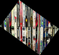 |
Commenting for the critique thread.... I see I gave this a 4 at vote time. My votes vary based on the strength of the competition and so a 4 in one challenge could be a 6 in another as I ensure I get a full spread of marks. In a free study, I my expectations are higher - it's supposed to represent the best shot of the month for the respective photographers.
I guess I'm on of Yo Spiff's dreaded border patrol. I'm it a fan of borders unless they are very subtle - I generally don't feel they add much to photos. In this particular shot I felt the border overwhelmed the image. I haven't been scientific but it feels like there is more border than actual image. Straight away your score was hit on that basis.
Then looking at the image itself, I like the lines and colours, but I think I would like to have seen the lines at an angle rather than vertical. Either mirroring the angle of the border, or at a complimentary angle.
Maybe if the shot has been rotated so there was no border but the skis went at an angle I would have found it more engaging. Or maybe shooting along the wall instead of towards it, and using a shallow depth of field to give some graduation to the focus would make it more interesting. This just didn't do it for me in a free study.
Message edited by author 2012-09-06 15:10:30.
|
|
|
|
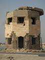
09/07/2012 04:19:10 PM · #45 |
Originally posted by Yo_Spiff:
You got my feedback on that one in private. I'm curious to see if others are in agreement or not.
I'll play. I almost entered this one in a freestudy. There are some things I'll tell about the shot once I have initial, uninfluenced impressions.
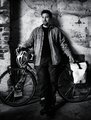 |
Commenting for the critique thread - I don't actually see a whole lot wrong with this image. For a free study my starting vote would probably be a 7 then adjusted based on the strength of the competiton.
The deep shadow in the alcove draws my gaze a little, like I'm trying to find what is lurking in the dark, but it's not a real big issue. The setting is fine, and suits the shot, though I agree the centre composition detracts a little too. Finally, the it white saddle bag also draws the eye, maybe a bit of darkening on that to make it less impactive on the image as a whole would help?
But that's just being picky I guess, as on the whole I like it.
As an aside, is Bryan blind? He has a kind of distant gaze that is reminiscent of a friend that is blind.
Message edited by author 2012-09-06 15:21:35.
|
|
|
|
09/07/2012 04:20:04 PM · #46 |
Originally posted by cowboy221977:
 |
Commenting for the critique thread - I see I have this a 5 in voting.
For me the immediate turn off is the tilting horizon. I'm like the "level police". I'll always knock a point off for what I perceive to be a lack of attention to detail. If it is an intentional tilt, I would expect it to be a little more exaggerated.
I agree with the other comments about a tighter crop too... The signs on the right are quite distracting so I would crop in so they were out of shot.
The leading lines are good, but for a shot like this I would prefer more front to back focus so a much smaller aperture.
I also feel a slightly lower perspective would help so that there was more looking along the tracks rather than down at the tracks.
I do like the topaz processing, I agree with you that it came out pretty good.
|
|
|
|
09/07/2012 04:20:50 PM · #47 |
Originally posted by Venser:
Ignore the title, it was the best at that time.
 |
Commenting for the critique thread - I think I was on a voting hiatus when this challenge came out. Without looking at the whole challenge, my starting vote would have been a 6, adjusted then based on the strength of the competition.
I agree with the comment regarding the top row, I think it would help if that very straight row was cropped out to maintain the flow of the other levels. I think the shot would benefit from a much higher range of tones,more contrast.
Other then that, I find it quite an interesting shot, but not a world beater.
|
|
|
|
09/07/2012 04:21:40 PM · #48 |
Originally posted by markwiley:
This is a nice idea, Wendy. I have left comments on some of the images in this thread, but maybe I was supposed to comment in the thread?
I posted this last night to the color side challenge. It's gotten just 2 views and no comments. I like it, but I am attached to the subject and have trouble seeing it objectively.
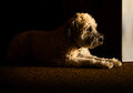 |
Commenting for the critique thread - I agree with your description of "really nice light". Echoing what others have said, the band of door is really distracting and detracts from the balance. Try cloning that out with the blackness and see if that improves the balance. I also agree with GeneralE that the use of negative space in this shot is really good.
The texture of the carpet and the way it runs through the image is really nice.
On the whole, a very good low key pet portrait.
|
|
|
|
09/07/2012 04:22:28 PM · #49 |
Originally posted by littlemav:
Here's one I'd really like some critique on, really trying to work on my "Expert Editing" sooo let er rip
|
Commenting for the critique thread - well hardly a critique. If I saw this in a relevant challenge and I would probably be throwing a 10 your way. Of course put it in a 'Spiders' challenge and you're getting a 1 :-) I'm like DNMC police!
Seriously, a great vibrant and dynamic shot. |
|
|
|
09/07/2012 04:23:30 PM · #50 |
Originally posted by snaffles:
Hmmm...I thought this 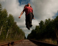 would do a lot better, like mid-6 range as opposed to the high 5s. My commenters all seemed to like this shot, so comments/critique welcome. would do a lot better, like mid-6 range as opposed to the high 5s. My commenters all seemed to like this shot, so comments/critique welcome.
@  littlemav....love the saddle bronc and the colours, but think I have to go with what others have already said, a bit more contrast. Also watch that teeny skirf of blue from the original image on the back of the saddle. Frankly, if you increased the contrast and then did a b/w on it, I think it could be a killer image. littlemav....love the saddle bronc and the colours, but think I have to go with what others have already said, a bit more contrast. Also watch that teeny skirf of blue from the original image on the back of the saddle. Frankly, if you increased the contrast and then did a b/w on it, I think it could be a killer image. |
Commenting for the critique thread (also viewing on an iPad right now).
I see I scored this a 6 in the original voting, as it met the challenge and was technically sound but didn't engage me in any particular way.
The reasons for this echo much of what has already been said - not being able to see your face results in a lack of connection with the viewer, not much definition in your legs (I really would have loved to see this with a billowing skirt or some such) and your left hand tucked behind your body is a shame - both arms a little more outstretched might have helped.
I also feel that the leading lines going to the vanishing point sort of drag the viewers gaze straight through the shot to the far distance rather than leading directly to you
I'm happy with the exposure, focus and processing, just not really the composition.
On the whole, not a great deal wrong with the shot, just not a world beater.
|
|
Home -
Challenges -
Community -
League -
Photos -
Cameras -
Lenses -
Learn -
Prints! -
Help -
Terms of Use -
Privacy -
Top ^
DPChallenge, and website content and design, Copyright © 2001-2024 Challenging Technologies, LLC.
All digital photo copyrights belong to the photographers and may not be used without permission.
Current Server Time: 04/27/2024 02:52:02 AM EDT.


