| Author | Thread |
|
|
05/20/2006 11:12:08 PM · #576 |
Originally posted by GeneralE:
Originally posted by stdavidson:
Is the blue channel curves adjustment what brought out all the nice image detail in your update? |
I think it's more the RGB Curves that bring out the detail; I added the Blue just as a way of adjusting the color ... I just have a tendency to use Curves of one kind or another for everything.
I'll try to take and post a series of incremental screenshots so you can see the effect of each adjustment in turn. Not sure if I'll get to that tonight though ... |
You don't really need to do that... I missed the RGB curves adjustment reference... that makes sense.
I have a tendency to use Curves primarily for midtone contrast, certain color cast corrections and occasionally for contrast adjustments directed to certain luminosity ranges.
Message edited by author 2006-05-20 23:12:50.
|
|
|
|
05/20/2006 11:25:55 PM · #577 |
Originally posted by stdavidson:
DPC voters are not as devoted to absolute realism as they used to be. These days DPCers are very accepting of total surrealism in landscape imagery and reward them with high scores as long as it is well done and unambiguously meets the challenge. |
I think you're right, most landscapes that are super-processed to the point of being radioactive seem to score better here.
Although that might not be the case for other types of shots, my entry in the self portrait challenge used an exposure effect and was processed to give some pretty bright/saturated colors, and it's not doing too well (the fact that it doesn't immediately look like a portrait to most people can't help) |
|
|
|
05/21/2006 01:24:02 AM · #578 |
|
|
|
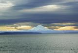
05/21/2006 02:52:10 AM · #579 |
Original:  Final: Final: 
Screenshots of the progressive editing steps are in this pBase gallery.
You can see what the masks look like by checking the thumbnails in the Layers Palette.
If you keep an eye on the Info window, you can see some interesting things happen to the colors. The reading was taken from the same place each time, right in the center of the photo, on the dark spot on the mountain. I think most of the "detail" is brought out by the sharpening.
Sample: 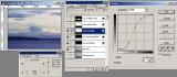 |
|
|
|
05/22/2006 09:01:25 PM · #580 |
So the subject isn't centered, but I don't think it's in a proper "third" either. Horizon is just about centered. Subject is what many may find dull (compared to Iceland or Oregon, for instance) but this was a scene I saw while riding and had to go back later to shoot. It's Texas, and I kinda like it. :-)
original:

edited:
 |
|
|
|
05/22/2006 10:47:35 PM · #581 |
I'm rather new to DPC, but it has been rather quiet on this thread for the past few days, so I guess I'll post my $0.02...
The cropping in the edit is a significant improvement. I'd almost be tempted to crop in a little tighter to get rid of the small gap in the branches on the right side of the trees. Only reason I can think of not to do so is that would move the subject even farther from the middle, thus abiding by The Rules(TM) more than before.
Personally, the grass seems a bit too yellow for my tastes, but I'm not a big fan of the hypersaturated landscape movement that's so popular these days, so feel free to ignore me on this one.
I've done some shooting in Texas (Amarillo area), so I know how hard it is to find an interesting landscape. Only so many ways to display "flat" and "dusty", although things aren't much easier up here in northern Illinois. Those guys who live in Moab or Waikiki are cheating, as far as I'm concerned :-) |
|
|
|
05/22/2006 11:03:04 PM · #582 |
| You may be new, but your comments are most appreciated! I may try cropping it a bit more on the right. I don't mind having the shed move a little closer to the edge and in fact, may prefer it. And I kinda agree that the grass is bit too yellow. I have a hard time convincing myself to "turn it up" in post processing but I'm working on achieving a balance in that respect. Thanks again for taking the time to comment! |
|
|
|
05/23/2006 09:54:03 AM · #583 |
Original: ... stdavidson first version: ... stdavidson first version:  ... Bear_Music version: ... Bear_Music version: 
Stdavidson DPC "over the top" add-on landscape version: 
Since post processing of landscapes seems as much a part of this discussion as composition and technique and I've been thinking about the properties in landscapes that appeals to the DPC community at large, I made a couple "over the top" additions to my first version.
It's purpose is to achieve one important goal...
Immediate viewer impact!:
The key here is the instant reaction a DPC viewer has the moment they see it, sorta like love at first sight. In a landscape this usually translates into surrealism using unusual or exaggerated colors and/or dramatic tones. Here the artist uses post processing to enhance or adjust what mother nature provides. Impact exceeds photo realism in its appeal to DPCers.
Here I made three changes to my first version to add impact. I applied what Bear_Music likes to call contrast masking, except in CS2 it is Shadow/Highlight. There you adjust controls for shadows, highlights and color for adding mood to an image. Next I used "vivid light" mode highlighting on a 50% grey layer for exaggerated brightness in the foreground for added viewer interest and for better lighting balance. If anything I did too little of that. Lastly, I selected the highlights and painted a light blue in the 50% grey layer to cool the sky and add unusual color to it for added viewer appeal.
High technical quality:
A word about quality. High technical quality will never hurt an image. This convers such things as noise, digital artifacting, haloing, exposure, tonality and sharpness. You don't want over or underexposed areas in the image and digital artifacting and haloing should be elimimated.
Sharpness is particularly important in landscapes because they tend to have a lot of fine detail. That is always challenging and I continue to struggle with it. At some point it might be good to share ideas and techniques about this important area and how it relates to landscape photography.
|
|
|
|
05/23/2006 10:47:46 AM · #584 |
|
|
|
05/23/2006 11:04:11 AM · #585 |
i haven't seen a sky that color since i last ate mushrooms ;} of course to be realistic the grass would have to be bright pink...
Message edited by author 2006-05-23 11:05:18.
|
|
|
|
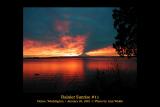
05/23/2006 11:07:16 AM · #586 |
Originally posted by soup:
i haven't seen a sky that color since i last ate mushrooms ;} of course to be realistic the grass would have to be bright pink... |
Absolute photo realism is not a criteria for ribbon winning landscapes.
Here is an example of a blue ribbon winner of a similar sky:

Message edited by author 2006-05-23 11:08:17.
|
|
|
|
05/23/2006 11:11:47 AM · #587 |
i understand. in my opinion though the editing sometimes gets taken too far. not something i am keen on. here is another example i feel went too far. apparently i am in the minority though...
also a ribbon winner.

|
|
|
|
05/23/2006 11:16:56 AM · #588 |
| That's REALLY turning it up, Steve! I really should try going a bit more overboard at times, but I gotta say that I kinda agree with Soup that the sky is just a wee bit too blue. Actually makes my head hurt to look at it. But I do see where I could amp up my edit a bit more, for potential voting purposes. To print, I like the way I have it. |
|
|
|
05/23/2006 11:18:56 AM · #589 |
Originally posted by soup:
i understand. in my opinion though the editing sometimes gets taken too far. not something i am keen on. here is another example i feel went too far. apparently i am in the minority though...
also a ribbon winner.
|
I agree 100%, but that only matters for DPC submissions. DPCers are becoming more "artsy" in what they like in landscapes. Something I'd recommend is that you post process your image the way you want it first and then add additional layers for the "over the top" items to give the image more instantaneous appeal if it is to be submitted for a challenge. That way those layers can easily be removed.
Message edited by author 2006-05-23 11:20:26.
|
|
|
|
05/23/2006 11:27:44 AM · #590 |
I know lots of ways to over-process a blah image -- this is a tri-tone: 
But not all skies have to be over-done -- these two are pretty much the way it looked:
  |
|
|
|
05/23/2006 11:28:15 AM · #591 |
Originally posted by Melethia:
That's REALLY turning it up, Steve! I really should try going a bit more overboard at times, but I gotta say that I kinda agree with Soup that the sky is just a wee bit too blue. Actually makes my head hurt to look at it. But I do see where I could amp up my edit a bit more, for potential voting purposes. To print, I like the way I have it. |
Your point about printing is very important. You can get away with a lot of sloppiness in a web graphic for DPC, but it shows up like a sore thumb in an enlarged print.
What you do with an image should be guided by your intended purpose. DPC has always leaned more toward art in landscapes than photojournalistic realism for the top finishers.
|
|
|
|
05/23/2006 12:15:17 PM · #592 |
Originally posted by GeneralE:
But not all skies have to be over-done -- these two are pretty much the way it looked:
|
I would agree totally that mother nature can provide far more dramatic skies than ones "over-done" in post. My comments are strictly limited to getting higher DPC landscape scores, nothing more. Nature is rarely cooperative enough with landscapes for me during the challenge week in ways that support the challenge topic resulting in higher scores. LOL! :)
I have found that, for myself, no matter how great the image is that my camera records, it can always be improved with appropriate post processing which is independent of any DPC concerns.
|
|
|
|
05/23/2006 01:18:49 PM · #593 |
Originally posted by stdavidson:
Originally posted by Melethia:
So the subject isn't centered, but I don't think it's in a proper "third" either. Horizon is just about centered. Subject is what many may find dull (compared to Iceland or Oregon, for instance) but this was a scene I saw while riding and had to go back later to shoot. It's Texas, and I kinda like it. :-)
original:
edited:
|
Here is an example starting with your original and applying "over the top" DPC post processing I mentioned for "immediate viewer impact" that would probably get this image a higher DPC score...

|
Since Steve's heading over the top with this one, I thought I'd reverse that and bring it in under the weather, so to speak. It's been my experience that lots of times on bleakish landscapes a little desaturation can go a long ways:

I flattened out the contrast with contrast masking, then added it back with Gothic Glow. I pasted the GG in as a new layer and then desaturated yellow, cyan, and blue channels dramatically, also playing with their brightness levels. I cloned over the gap in the trees. I used the saturation sponge on the shed. I used avery large brush to burn in the middletones in the foreground, and there you have it.
The same approach could have been taken without the GG, for a "sharper" or "crisper" image, but I like the relatively understated glow effect here, it feels dreamy to me.
R.
|
|
|
|
05/23/2006 01:44:32 PM · #594 |
Originally posted by Bear_Music:
Originally posted by Melethia:
So the subject isn't centered, but I don't think it's in a proper "third" either. Horizon is just about centered. Subject is what many may find dull (compared to Iceland or Oregon, for instance) but this was a scene I saw while riding and had to go back later to shoot. It's Texas, and I kinda like it. :-) |
original:
...... |
And to think Melethia felt Texas might be dull compared to Iceland and Oregon. LOL!
|
|
|
|
05/23/2006 01:52:29 PM · #595 |
Originally posted by stdavidson:
Originally posted by Bear_Music:
Originally posted by Melethia:
So the subject isn't centered, but I don't think it's in a proper "third" either. Horizon is just about centered. Subject is what many may find dull (compared to Iceland or Oregon, for instance) but this was a scene I saw while riding and had to go back later to shoot. It's Texas, and I kinda like it. :-) |
original:
...... |
And to think Melethia felt Texas might be dull compared to Iceland and Oregon. LOL! |
As long as we're on this one, let's get pedagogical for a second. Lemme put on my teacher's cap:
There, that's good!
Now, as I was about to say, for me one of the critical things to do in shots like this is bring modelling and depth into the foreground. You frequently see me do it with a simple gradient, and you freguently see me do it by lightening/darkening and saturating/desaturating side-by-side colors with hue/saturation layers. Both were done here, except I used the burn tool instead of the gradient so I could follow the uneven natural shape of the grass better.
See how the work on the foreground draws the eye in, gives depth to the image? We use sky gradients for this too, but in this particular case the Gothic Glow gave a natural gradient that didn't need manipulating, except for the partial desaturation.
Robt.
|
|
|
|
05/23/2006 01:56:13 PM · #596 |
Originally posted by Bear_Music:
As long as we're on this one, let's get pedagogical for a second. |
Didn't you already have to do hard jail time for being a pedagogical?
|
|
|
|
05/23/2006 02:03:00 PM · #597 |
I proudly operate under this time tested philosophy...
I work hours with an original image until it is totally screwed up, then I choose "File->Save".
|
|
|
|
05/23/2006 08:56:36 PM · #598 |
Ummm... wow! So that's how they make Iceland look so good! Bear, dear, I really am going to have to find a way to come visit before I leave the country - I don't follow half of what you do. I'm definitely a PS novice with lots to learn!
I really like the "adding depth" part since this is what seems to be lacking in most Texas landscapes.
I'm not familiar with how to use "actions" - I do know there's a website out there with actions on it, so I'll check that out, since I suspect there may be a tutorial of some kind. I do like the gothic glow for some things - it makes this picture look a bit like a painting, which is kinda nifty.
Oh, and Steve, can I use your last statement as my signature line if I give you credit? Busted up laughing when I read that one - scared the poor cat sitting in front of the monitor.
Now to go edit really bad snapshots taken in icky lighting conditions with only the on-board flash. Thanks for spiffin' up my picture for me - I do want folks to see that Texas ain't all bad - in fact it's really quite pretty in its own desolate way! |
|
|
|
05/23/2006 09:15:54 PM · #599 |
Originally posted by Prism:
I finally got out and took a shot that I feel works even though it breaks the rules. The red grain elevator is in the center of the shot as the subject. It is balance by the white elevator on the left and the replicated train station on the right.
 original original  after PP after PP
edit: did some more PP on it...better but still working |
Now that you have shown what can be done with Texas, I'd really appreciate it if one of you PS gurus would take a shot at Alberta and show me how it's done! :0) |
|
|
|
05/24/2006 02:16:14 AM · #600 |
Originally posted by Prism:
Originally posted by Prism:
I finally got out and took a shot that I feel works even though it breaks the rules. The red grain elevator is in the center of the shot as the subject. It is balance by the white elevator on the left and the replicated train station on the right.
original after PP
edit: did some more PP on it...better but still working |
Now that you have shown what can be done with Texas, I'd really appreciate it if one of you PS gurus would take a shot at Alberta and show me how it's done! :0) |
Okey Dokey. I was tempted to "glow" this one too, but by way of comparison with the previous, somewhat similar image, I did this one straight:

Contrast masking round 1: SCREEN the lights and HARD LIGHT the darks, adding contrast, both at 100%; make a copy of the base layer, merge these 2 layers onto it, and use that as the new base.
Contrast masking, round 2: Select the lights again and set in SOFT LIGHT mode.
Hue/saturation to saturate and darken the yellows, goose the reds a little, play with saturation and brightness in blue & cyan for the sky.
Create new, empty layer in multiply mode and add faint gradients top and bottom. Fade and merge the gradient layer down. Duplicate composite layer and add slight vignetting, fade and merge, save for web...
R.
|
|