| Author | Thread |
|
|
07/16/2018 12:00:15 AM · #1 |
| Post your outtakes from the Town or City Scape II (DPL4 WK2) challenge here. |
|
|
|
07/16/2018 11:21:28 AM · #2 |
|
|
|
07/16/2018 11:31:46 AM · #3 |
 - I was really tempted to enter this but ended up going with a "safer" image, so I'm curious as to how many people would have liked this one. - I was really tempted to enter this but ended up going with a "safer" image, so I'm curious as to how many people would have liked this one.
|
|
|
|
07/16/2018 11:58:06 AM · #4 |
You'd have gotten 2 more points out of me ... I like it.
:)
Originally posted by Manic:
- I was really tempted to enter this but ended up going with a "safer" image, so I'm curious as to how many people would have liked this one. |
|
|
|
|
07/16/2018 12:02:56 PM · #5 |
Almost my worst scoring image ever, but trust me, I'm fine with that. I guess I should have gone more traditional. Although that image isn't so go either:
my entry:  my outtake: my outtake:  |
|
|
|
07/16/2018 12:39:34 PM · #6 |
| I am loving your outtakes, I would have given at least 2-3 more points than I scored your originals with! |
|
|
|
07/16/2018 11:41:45 PM · #7 |
Originally posted by hopper:
Almost my worst scoring image ever, but trust me, I'm fine with that. I guess I should have gone more traditional. Although that image isn't so go either:
my entry: my outtake: |
The Outtake would have scored better. Your original entry to me is just a building/ architecture not landscapes.
Message edited by author 2018-07-16 23:42:24. |
|
|
|
07/17/2018 03:44:14 AM · #8 |
Originally posted by Manic:
- I was really tempted to enter this but ended up going with a "safer" image, so I'm curious as to how many people would have liked this one. |
I find this more interesting than your entry, as it offers a very unusual viewpoint of a crossing. |
|
|
|
07/17/2018 03:46:44 AM · #9 |
I had this as

as an alternative to what I entered

Not much difference, I guess. |
|
|
|
07/17/2018 05:30:16 AM · #10 |
|
|
|
07/17/2018 07:30:08 AM · #11 |
It's hard to argue when the image my team preferred over my favorite finished in the Top 10, but  JulietNN suggested in the comments that a lower angle might have been preferable, and that's what my favorite was, so here they are: JulietNN suggested in the comments that a lower angle might have been preferable, and that's what my favorite was, so here they are:
10th Place Image: 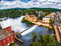
The one that got away:  (which definitely would have been saturation adjusted before entry) (which definitely would have been saturation adjusted before entry) |
|
|
|
07/17/2018 07:44:33 AM · #12 |
Originally posted by hopper:
Almost my worst scoring image ever, but trust me, I'm fine with that. I guess I should have gone more traditional. Although that image isn't so go either:
my entry: my outtake: |
Your first image didn't meet what I consider to be a "scape". It's a great architecture shot, but I need more than 1 building to consider it a view of the city or town you're shooting, even if the building is iconic and defines the city. So your second image would have scored higher only because my DNMC's get a 4 (or maybe a 5 if they would otherwise been an 8-10). I would have given the outtake a 5 as is, but cropped down and in from the left with some good post-processing it definitely would have earned more.
Originally posted by Manic:
- I was really tempted to enter this but ended up going with a "safer" image, so I'm curious as to how many people would have liked this one. |
I'm a drone guy so I love shots like this. That said I much prefer your entry in the category, even with the blown out sun. I'm assuming you're shooting RAW so I would have hoped you could do something with the haziness, particularly over the city. I don't mind it so much in the glare of the sun but if you'd had removed it over NYC then this would likely have been in my top 10 or better. |
|
|
|
07/17/2018 07:48:08 AM · #13 |
|
|
|
07/17/2018 11:48:58 AM · #14 |
Seeing the outtake, I can see why your team said go with the higher shot, I think I would have probably said go with it too. It does have that have that bridge,street and more lake and side by side, it has more impact.
I can not believe the difference 4 feet makes though in visual and how much is lost from the original, that is not a lot difference, but it shows so much here.
I think your team picked the right shot. And well done you. Still fantastic shots. |
|
|
|
07/17/2018 12:27:46 PM · #15 |
First shot was definitely the best choice for the challenge topic. |
|
|
|
07/17/2018 01:03:15 PM · #16 |
Originally posted by JulietNN:
I can not believe the difference 4 feet makes though in visual and how much is lost from the original, that is not a lot difference, but it shows so much here.
I think your team picked the right shot. And well done you. Still fantastic shots. |
The 4 feet I mentioned in the comment had to do with height at that spot and was likely more like 10 feet before the tree became too prominent. The second shot is actually 60 feet lower and a good 10-15 feet to the left of the first spot and most of the way down the tree. But yeah, with drones a foot here and there changes a lot. |
|
|
|
07/17/2018 01:16:13 PM · #17 |
I like the lower angle shot much more, lovely reflection in the water and that waterfall is looking even nicer in that shot. I gave you a 6 for your image, but the lower angle one would have at least scored 7, probably 8. |
|
|
|
07/17/2018 01:55:18 PM · #18 |
Originally posted by JakeKurdsjuk:
Originally posted by JulietNN:
I can not believe the difference 4 feet makes though in visual and how much is lost from the original, that is not a lot difference, but it shows so much here.
I think your team picked the right shot. And well done you. Still fantastic shots. |
The 4 feet I mentioned in the comment had to do with height at that spot and was likely more like 10 feet before the tree became too prominent. The second shot is actually 60 feet lower and a good 10-15 feet to the left of the first spot and most of the way down the tree. But yeah, with drones a foot here and there changes a lot. |
Well, 4 feet did blow my mind, that it made that much of a difference in the shot. But the 60 feet does make more sense lol |
|
|
|
07/17/2018 02:01:50 PM · #19 |
Originally posted by Kroburg:
I like the lower angle shot much more, lovely reflection in the water and that waterfall is looking even nicer in that shot. |
And the birds (geese?)! I "like" the second shot too, though it breaks traditional "rules" for landscapes (e.g. middle horizon line) and might have gotten lower votes from sticklers for that kind of thing.
I don't think your notes mention the type of drone/camera, just the exposure data -- consider adding those if not a secret ... :-) |
|
|
|
07/17/2018 03:25:19 PM · #20 |
Originally posted by GeneralE:
Originally posted by Kroburg:
I like the lower angle shot much more, lovely reflection in the water and that waterfall is looking even nicer in that shot. |
And the birds (geese?)! I "like" the second shot too, though it breaks traditional "rules" for landscapes (e.g. middle horizon line) and might have gotten lower votes from sticklers for that kind of thing.
I don't think your notes mention the type of drone/camera, just the exposure data -- consider adding those if not a secret ... :-) |
I'd add it but I'd have to kill you. Drone and all. LOL Actually I never added it with the old one since none of that data was available in the RAW data so I'd have to constantly pick it if I used it. I'll add the new one.
"Canada Ducks" as my father in-law calls them. And since when are their "rules"?! Besides, this is a "townscape", not a landscape. ;) If I went any lower then I'd be giving you tourists and who wants that?! |
|
Home -
Challenges -
Community -
League -
Photos -
Cameras -
Lenses -
Learn -
Prints! -
Help -
Terms of Use -
Privacy -
Top ^
DPChallenge, and website content and design, Copyright © 2001-2024 Challenging Technologies, LLC.
All digital photo copyrights belong to the photographers and may not be used without permission.
Current Server Time: 04/18/2024 01:22:42 PM EDT.