DPChallenge: A Digital Photography Contest You are not logged in. (log in or register
 
Challenge Entries
This image is not a part of any challenge.
Portfolio Images
This image is not part of a public portfolio.
May15
May15
MarkB


Photograph Information Photographer's Comments
Camera: Canon EOS-600D/T3i Rebel
Lens: Canon EF 50mm f/1.8 II
Aperture: f/4.5
ISO: 100
Shutter: 1/200
Galleries: Self Portrait
Date Uploaded: May 15, 2012

Viewed: 228
Comments: 7
Favorites: 0

Two speed lights with shoot through umbrellas. One at slight camera left and the second behind me lighting the background.

Please log in or register to add your comments!

AuthorThread
06/15/2012 11:17:50 AM
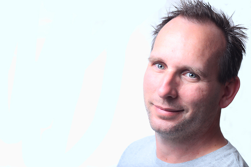
Probably my favorite studio type setup in this series, but I'm seeing some very strange, almost posterization-like effects in your lower face. That's not at all a bad thing, and actually, a bit of an oil brush look would make this quite compelling on a business card. Especially with your hair style.

It seems to me that your self portraits seem to have a bit of awkwardness as to what to do with the shoulders. I read a really good article once about the details of classic portraiture and posing. I've forgotten most of it and seldom follow it, but it might be something that will give you some tools to have a bit more control over this feature of your poses. I think it's the fact that you have dropped your shoulder a tiny bit too much in a few shots, which puts you a bit off-kilter. It is barely noticeable in this pic due to the close crop, which is probably why I like it. Squaring the shoulders would make a more 'masculine' pose, dropping the shoulder gives a more 'sensitive' pose. This might be exactly what you wanted to show of yourself in this pic though, so then it would not be a negative feature.

As usual, your lighting is excellent.

Message edited by author 2012-06-15 11:21:14.
05/17/2012 11:00:13 PM
This is my favorite shot of yours. Everyone else has mentioned the background. A technique I like to use is to apply a new fill layer (white) drop the opacity a bit so you can see the shot (in this case your face) then I paint over the part that I want to show through the white. Also works really nicely on black backgrounds.

Keep em coming!
  Photographer found comment helpful.
05/16/2012 01:59:08 PM
Amazing clarity in the eyes. Great shot.
  Photographer found comment helpful.
05/16/2012 11:27:21 AM
agreed, besides the bg this is really good.
  Photographer found comment helpful.
05/16/2012 09:21:22 AM
BG aside, this one really does pop nicely, the lighting is nice and balanced and the eyes have good focus.
  Photographer found comment helpful.
05/16/2012 01:42:44 AM
Hey, great work on the lighting here. The eyes pop! Only issue with this one is the background. You might not see it on your monitor, but if you adjust the brightness down a bit it becomes obvious. I had issues like this with challenge entries in the past and what I do is turn the brightness way down to identify any problems before I submit or post the image. Easy to fix with the dodge tool or just paint it white.
  Photographer found comment helpful.
05/15/2012 11:31:20 PM
i agree, great work on the eyes
  Photographer found comment helpful.


Home - Challenges - Community - League - Photos - Cameras - Lenses - Learn - Prints! - Help - Terms of Use - Privacy - Top ^
DPChallenge, and website content and design, Copyright © 2001-2024 Challenging Technologies, LLC.
All digital photo copyrights belong to the photographers and may not be used without permission.
Current Server Time: 04/19/2024 07:30:52 PM EDT.