| Author | Thread |
|
|
08/13/2012 05:21:37 PM |
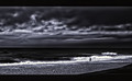
| I agree with the comments about over processing. I find the lower right quadrant difficult to understand -- the depth has been flattened to the point where I can't tell the difference between the wall and something on or below the wall and the beach. The sky is smooth with subtle tones, but the water is contrasty to the point of the highlights being blown out. The sky and water feel like two different photos. I didn't vote on this challenge, but if I had, I would have given this a 4 or 5, because I think it is a well composed image of a good scene that has been spoiled by editing. |
|
 Photographer found comment helpful. Photographer found comment helpful. |
|
|
08/13/2012 05:00:17 PM |
Forgive me if I repeat others' comments - I deliberately didn't read them so as to not be influenced by them.
Two things pop out at me - the four concrete pillars, and the ocean/sky line being dead center in the picture. The four pillars don't make any visual sense to me - the foreground looks like a retaining wall, but the pillars themselves look like they are at beach level, and there is no edge or transition between a raised area and the beach. The other thing that emerges after looking at it a bit is that the upper left 2/3 of the shot is pretty dark and lacking in features - dark sky, dark sea. I would suggest trying more contrast - about the only real white in the shot is the waves. The windows in the building are interesting, but blend into the rest of the shot too much.
The person adds some perspective as to size, etc. but is a bit far from the camera.
Emotionally, this is kind-of a "downer" shot - no spot of color, just all greys and darker greys - almost oppressive or depressive. |
|
| Photographer found comment helpful. |
|
|
08/13/2012 01:44:12 PM |
| I did not vote or enter in this challenge. With that being said, I would not have scored this above a 5. It is way to overly processed and there is no texture. |
|
| Photographer found comment helpful. |
|
|
08/13/2012 09:26:51 AM |
| Peter stated it well, but this is way over sharpened on my monitor.... lovely scene though, and a venue you should revisit! |
|
| Photographer found comment helpful. |
|
|
08/13/2012 08:20:43 AM |
| A lovely location and with so much possibilites. The wall, the building and the sand all provide a lovely frame to the white water and the almost perfect placement of the person in the frame. However, the image seems excessively processed on my monitor. While voting, I couldn't get past the oversharpening that made the lines in the building and the edge of the water jump off the screen. This contrasted with the supersmooth sky and loss of texture in the building walls from smoothing software. Had it been processed in a more subtle way, i would have likely voted it an 8 or 9. As it was, I gave it a 3. |
|
| Photographer found comment helpful. |
|
|
08/13/2012 03:08:33 AM |
WELL I STILL LOVE IT EVEN IF OTHERS DIFFERENT... I LOVE THE STRONG BOLD STATEMENT IT GAVE ME RE THE BUILDING AND TEXTURES... SAD TO SEE IT NOT DOING AS GOOD AS I EXPECTED... I LOVED IT A LOT XOX FROM SHEZ
|
|
| Photographer found comment helpful. |
Comments Made During the Challenge  |
|
|
08/11/2012 07:05:21 PM |
| Beautiful! I love this processing - Anita? Top 5. |
|
| Photographer found comment helpful. |
|
|
08/08/2012 09:52:49 PM |
| I love the dark feel (and usually I don't)...I also like the clouds and the waves, I also like the texture ...Good shot |
|
| Photographer found comment helpful. |
|
|
08/07/2012 04:12:49 AM |
| If this didn't have halos on the building, I would've voted it a solid 7, but the obvious editing there makes me lower to a 5. Interesting scene, nice conversion generally, but that edge really hurts things. |
|
| Photographer found comment helpful. |
|
|
08/07/2012 01:18:51 AM |
| NICE ONE LOVE THE COLOUR TONE XOX FROM SHEZ |
|
| Photographer found comment helpful. |
|
|
08/06/2012 09:26:44 AM |
| This really jumps out at you. |
|
| Photographer found comment helpful. |
Home -
Challenges -
Community -
League -
Photos -
Cameras -
Lenses -
Learn -
Prints! -
Help -
Terms of Use -
Privacy -
Top ^
DPChallenge, and website content and design, Copyright © 2001-2024 Challenging Technologies, LLC.
All digital photo copyrights belong to the photographers and may not be used without permission.
Current Server Time: 04/18/2024 08:48:12 PM EDT.