| Author | Thread |
|
|
10/31/2008 12:05:34 AM |
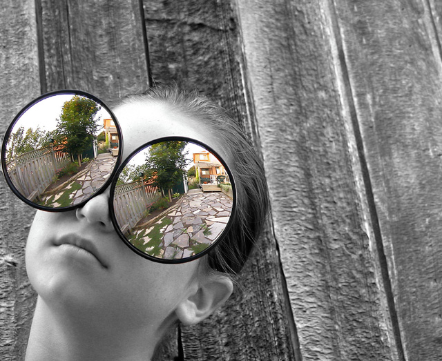
| I love the focus here, where the viewer is drawn into the glasses to walk down the magical path to the pixies' house. :) |
|
 Photographer found comment helpful. Photographer found comment helpful. |
|
|
02/17/2007 01:35:54 PM |
|
| Photographer found comment helpful. |
|
|
09/24/2004 11:04:10 AM |
Greetings from the Critique Club :)
Hi Coley...
How lovely it is to finally get a 'decent' photograph to critique via the Critique Club... You just don't know how tiring it is to do these things over and over again on some of the most boring photos I have ever seen :)
First of all, I didn't comment on this photo during the challenge, but it was one of my tens during the vote. I don't normally care for selective desaturations, but this one works nicely. In so many cases where I see it used, it seems to be done inappropriately. What I'm used to seeing is everything desaturated, including the subject, with some arbitrary element of the photo left in color. It serves no purpose other than to draw the viewer's attention away from the subject. In your case, it forces my eye right to the subject of the photo.
There are only a few minor critiques that I could possibly offer for improving this image.
1. I believe the proximity of the 'mirror' to the left edge of the frame is slightly uncomfortable. I would have probably left a little extra breathing room in that area.
2. The empty space on the right of the frame feels a bit 'wasted' IMO. The face and mirrors are obviously the first thing I see when I look at the photo and the negative space on the right is just in limbo. If the negative space was on the left instead, it may provide a stronger composition with the theory of 'top to bottom and left to right' compositions. You can test this by horizontally mirroring the image in your editing software and see if it provides any additional aesthetic appeal.
3. If negative space was your actual intent with this photo, you could probably enhance that even more by making the subject slightly smaller in the frame than it actually is.
This is an excellent photo... great work :)
John Setzler
|
|
| Photographer found comment helpful. |
|
|
09/21/2004 04:27:56 AM |
Congrats on your 3rd place finish Cole!
(Can't see you in the reflection though) :)
Well Done!
|
|
| Photographer found comment helpful. |
|
|
09/20/2004 10:32:56 PM |
| Very imaginative and nicely composed. Congratulations. |
|
| Photographer found comment helpful. |
|
|
09/20/2004 09:17:06 PM |
Awesome!!!
Thanks to everyone who voted commented and viewed my shot.
We had a great time taking it
Thanks again to all
Love this site !!!!
Coley
Message edited by author 2004-09-21 20:00:40. |
|
|
|
09/20/2004 08:15:52 PM |
| Awesome creative thinking, congratulations, Love it! |
|
| Photographer found comment helpful. |
|
|
09/20/2004 12:36:25 PM |
| kinda reminds me of the Leaving Las Vegas movie cover. try liquifying it some and the results will be the same!! |
|
| Photographer found comment helpful. |
|
|
09/20/2004 12:11:53 PM |
| Very cool idea and the selective desat works very well. The cropping is just a little too tight on the left. |
|
| Photographer found comment helpful. |
|
|
09/20/2004 10:06:00 AM |
| Such an awesome idea... very cool! Congrats on the ribbon! :-) |
|
| Photographer found comment helpful. |
|
|
09/20/2004 08:13:16 AM |
|
| Photographer found comment helpful. |
|
|
09/20/2004 07:04:38 AM |
| This was my top!! congrats on the ribbon!!! :-) |
|
| Photographer found comment helpful. |
|
|
09/20/2004 05:19:58 AM |
Two shots among the ribbons making good use of select desat..nice work.
Congratulations. |
|
| Photographer found comment helpful. |
|
|
09/20/2004 03:37:49 AM |
| Nice ! Congrats on the yellow ! |
|
| Photographer found comment helpful. |
|
|
09/20/2004 02:22:03 AM |
| Congrats on the Yellow, squeezed into becoming a master! |
|
| Photographer found comment helpful. |
|
|
09/20/2004 01:46:39 AM |
| congratulation for this winning fun idea. |
|
| Photographer found comment helpful. |
|
|
09/20/2004 01:27:32 AM |
| Usually, I despise photo's that are partial desaturation, but this is awesome! |
|
| Photographer found comment helpful. |
|
|
09/20/2004 01:27:13 AM |
| Congratulations! A really great photo! |
|
| Photographer found comment helpful. |
|
|
09/20/2004 01:03:12 AM |
| Congratulations on your yellow. Your hard work paid off. My hat off to you and your daughter. |
|
| Photographer found comment helpful. |
|
|
09/20/2004 12:35:24 AM |
I was rooting for the photo! My fav in this competition.
Congratulations on the ribbon ........well deserved. |
|
| Photographer found comment helpful. |
|
|
09/20/2004 12:28:30 AM |
| Congratulations ... very clever and very well executed. |
|
| Photographer found comment helpful. |
|
|
09/20/2004 12:27:07 AM |
| this is just too cool....congrats on ribbon #2 |
|
| Photographer found comment helpful. |
|
|
09/20/2004 12:17:03 AM |
| congrats on becoming a master!!! |
|
| Photographer found comment helpful. |
|
|
09/20/2004 12:14:14 AM |
| Great job ...Congrat on ribbon |
|
| Photographer found comment helpful. |
|
|
09/20/2004 12:09:26 AM |
|
| Photographer found comment helpful. |
|
|
09/20/2004 12:03:23 AM |
| Great idea and composition!! Congratulations on your well-deserved ribbon... |
|
| Photographer found comment helpful. |
Comments Made During the Challenge  |
|
|
09/19/2004 09:52:21 PM |
| excellent shot and great composition I hope this wins a ribbon! |
|
| Photographer found comment helpful. |
|
|
09/19/2004 08:37:16 PM |
| Are these from Elton John's estate sale? : ) |
|
| Photographer found comment helpful. |
|
|
09/19/2004 08:15:17 PM |
| Very well executed photo, but it doesn't really catch my interest. |
|
| Photographer found comment helpful. |
|
|
09/19/2004 03:46:52 PM |
| nice color and clarity -- like the use of desat |
|
| Photographer found comment helpful. |
|
|
09/19/2004 12:44:46 AM |
| Great idea and well executed. I just wonder if the subject matter in the "glasses" really does the image justice, especially in relation to your title. I would expect something more personal or evocative to be inside the mirrors. This is a really interesting image though. |
|
| Photographer found comment helpful. |
|
|
09/18/2004 03:39:17 PM |
| Great composition and idea. How are these mirrors kept in place? I see no fixtures... |
|
| Photographer found comment helpful. |
|
|
09/18/2004 01:56:08 PM |
|
| Photographer found comment helpful. |
|
|
09/17/2004 03:10:48 AM |
| Very clever idea and interesting photograph |
|
| Photographer found comment helpful. |
|
|
09/16/2004 04:44:38 AM |
This is a great shot
I hope it will do very well |
|
| Photographer found comment helpful. |
|
|
09/16/2004 03:03:51 AM |
This shot jumped out at me! Very creative, excellent composition!
Good choice on the desat. I love it! 9 from me. Got my fingers crossed for you on this to ribbon! |
|
| Photographer found comment helpful. |
|
|
09/16/2004 02:45:15 AM |
|
| Photographer found comment helpful. |
|
|
09/15/2004 04:36:42 AM |
| Very neat, absolutely love it. Great use if selective desat, good overall composition, even love the kid's cool expression. |
|
| Photographer found comment helpful. |
|
|
09/15/2004 03:02:05 AM |
| Oh man, this one made me laugh out loud! Big bug eyes! Great creativity and use of selective desat. My sole complaint is the model's forehead as it's slightly overexposed. 7 |
|
| Photographer found comment helpful. |
|
|
09/14/2004 08:10:06 PM |
great concept, would be cool if the eyes reflected something else appropriate to the title though...
or maybe i'm missing the point?
|
|
| Photographer found comment helpful. |
|
|
09/14/2004 04:57:48 PM |
| ahhh she has bug eyes... no but really its cool.....8 |
|
| Photographer found comment helpful. |
|
|
09/13/2004 08:45:34 PM |
Whoa! :-)
Somehow this image is striking... from the perfection in the girl's facial features, to the sharpness in the lines in the boards, to the "stunningly large and sharp" mirrors on her face. I don't know why this one works so well, but it does.
|
|
| Photographer found comment helpful. |
|
|
09/13/2004 06:53:10 AM |
| Fantastic shot! Love how the straight lines of the board contrast wtih circular mirrors, as well as with the person. |
|
| Photographer found comment helpful. |
|
|
09/13/2004 12:31:14 AM |
| I hope this wins. It's just great. Good idea, perfect execution. Good luck. If I was voting it would be a 10, but I did add it to my favorites. |
|
| Photographer found comment helpful. |
|
|
09/13/2004 12:21:22 AM |
| Fun and almost goofy. A good place to be. 9 |
|
| Photographer found comment helpful. |
|
|
09/13/2004 12:16:35 AM |
| This is such an awesome picture...I don't know where to begin! Ok...I LOVE your choice of b&w, and then the image in the mirror is in color! The texture of the wall/fence adds a very nice rustic feel. I see a ribbon in your future!! :) |
|
| Photographer found comment helpful. |
Home -
Challenges -
Community -
League -
Photos -
Cameras -
Lenses -
Learn -
Prints! -
Help -
Terms of Use -
Privacy -
Top ^
DPChallenge, and website content and design, Copyright © 2001-2024 Challenging Technologies, LLC.
All digital photo copyrights belong to the photographers and may not be used without permission.
Current Server Time: 04/24/2024 09:12:52 PM EDT.


 Windows to the Soul


