| Author | Thread |
|
|
07/18/2005 11:20:58 PM |
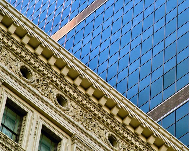
| Ya, I like this one, great contrasts! |
|
|
|
07/18/2005 09:39:05 AM |
| This is just fantastic! The old/new contrast is striking, composition is awesome. |
|
|
|
10/07/2004 10:25:46 AM |
|
|
|
10/06/2004 08:11:32 AM |
| Congratulations on a top ten placing. This is a great image one of my favorites in this challenge. |
|
 Photographer found comment helpful. Photographer found comment helpful. |
|
|
10/05/2004 01:11:22 AM |
|
|
|
10/04/2004 09:12:56 PM |
| congrats on your top 10, Rob! This is a well seen, well composed image. |
|
| Photographer found comment helpful. |
|
|
10/04/2004 01:08:21 PM |
| Top ten is not bad at all :). |
|
| Photographer found comment helpful. |
|
|
10/04/2004 07:46:58 AM |
Thanks Kylie, Dan and Thomas and for all the comments during the challenge as well!
Message edited by author 2004-10-05 09:30:06. |
|
|
|
10/04/2004 02:57:29 AM |
| Congrats on the top 10 finish. I like the blue versus yellow, but the photo doesn't speak to me (sorry!). |
|
| Photographer found comment helpful. |
|
|
10/04/2004 01:05:10 AM |
| Congratulations on your 10th placing. This image was a stroke of good aesthetic vigilance. You got the cool angle. |
|
| Photographer found comment helpful. |
|
|
10/04/2004 12:07:05 AM |
| Top ten!!!!! Another superb one by you!! |
|
| Photographer found comment helpful. |
Comments Made During the Challenge  |
|
|
10/03/2004 11:50:36 PM |
| Wonderful contrast between old and new, both of which are each complex in its own way. |
|
| Photographer found comment helpful. |
|
|
10/03/2004 08:55:38 PM |
| Lovely architecture with great subdued colors agaist the blue-;oke glass. Bumping up on compositional value. |
|
| Photographer found comment helpful. |
|
|
10/03/2004 08:06:56 PM |
| I really like this composition and the elements in the image. Great find - well done. |
|
| Photographer found comment helpful. |
|
|
10/03/2004 05:38:02 PM |
| Excellent contrast in archtectural styles; If I'd been smart enough to take this I'd probably have titled it Yin/Yang |
|
| Photographer found comment helpful. |
|
|
10/03/2004 04:17:36 PM |
| I like the cropping on this - very effective. |
|
| Photographer found comment helpful. |
|
|
10/02/2004 01:50:17 PM |
| good contrast, nice comp. |
|
| Photographer found comment helpful. |
|
|
10/02/2004 10:58:22 AM |
| Good idea of composition making diagonal line. But hard copetiton here... |
|
| Photographer found comment helpful. |
|
|
10/01/2004 09:27:54 PM |
|
| Photographer found comment helpful. |
|
|
09/28/2004 05:06:23 PM |
| Wonderful composition. I really like how you cut the frame in half diagonally - it echoes the divide between the old and new styles of architecture within this city. I also like the two golden window lines of the new building - they definitely add to the overall pattern for me. This is one of my top 10 for this challenge. |
|
| Photographer found comment helpful. |
|
|
09/27/2004 09:55:11 PM |
| love how you composed this making it more complex, great idea, nicely done IMHO! |
|
| Photographer found comment helpful. |
|
|
09/27/2004 09:28:37 PM |
| Good juxtaposition of old world complexity and modern simplicity. Behind both is most likely another kind of modern complexity. |
|
| Photographer found comment helpful. |
|
|
09/27/2004 03:16:32 PM |
| Nicely done. Old and new complexity. |
|
| Photographer found comment helpful. |
|
|
09/27/2004 11:36:38 AM |
| Nice contrasting images. Well done. |
|
| Photographer found comment helpful. |
|
|
09/27/2004 10:41:18 AM |
| great idea.. good quality capture |
|
| Photographer found comment helpful. |
|
|
09/27/2004 09:35:01 AM |
| very interesting anc complex relationship |
|
| Photographer found comment helpful. |
|
|
09/27/2004 09:10:45 AM |
| Interesting contrast. I like the diagonal |
|
| Photographer found comment helpful. |
|
|
09/27/2004 01:19:27 AM |
| Good eye, good composition, I'll be on the lookout now for similar photos to take. What hurts the picture though is the blurriness of the central dividing line created by the edge of the 'intricate' building. If it had been razor sharp would make the photo really pop. |
|
| Photographer found comment helpful. |
|
|
09/27/2004 01:11:54 AM |
Contrasting architectural styles in a very fine image. Quality is exceptionally good and fine detail without pixelation makes this one of the top images of this challenge.
Message edited by author 2004-10-04 02:36:58. |
|
| Photographer found comment helpful. |
|
|
09/27/2004 12:22:10 AM |
|
| Photographer found comment helpful. |
Home -
Challenges -
Community -
League -
Photos -
Cameras -
Lenses -
Learn -
Prints! -
Help -
Terms of Use -
Privacy -
Top ^
DPChallenge, and website content and design, Copyright © 2001-2024 Challenging Technologies, LLC.
All digital photo copyrights belong to the photographers and may not be used without permission.
Current Server Time: 04/20/2024 11:15:18 AM EDT.