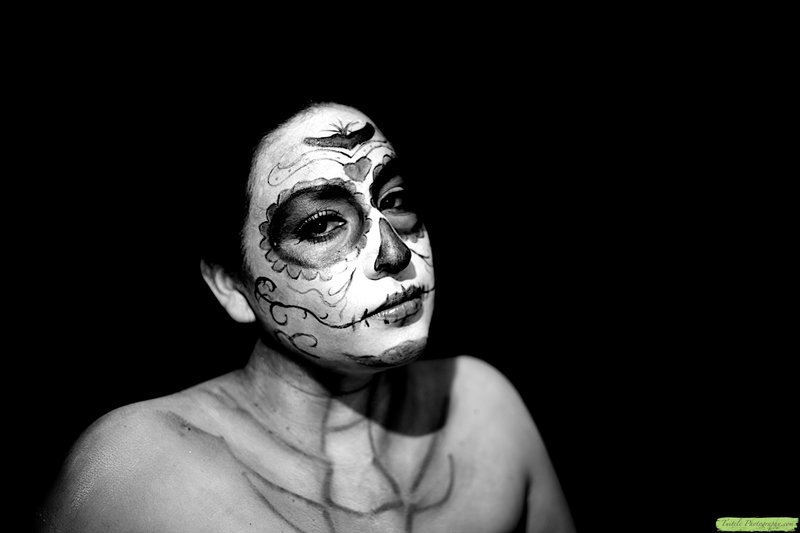
The basics of this image are really great - the pose, the attitude, the face paint. I feel the technicals need some tweaking, but for a first attempt at lighting, this is really great.
My biggest issue is the lack of separation between the bg and the subject, especially the head. Her face just seems to be sticking out of the bg at her hairline. The other bit is the really hot spot around her nose. I can't tell if it's because of the lighting or if the make-up is brighter at that point. I can see that you have one light above her, camera left, and perhaps it's too close, which is why it's so bright in just the one spot, and the shadow so sharp. I don't see where you used the 2nd light, and I would have used that as a hair light.
Other things to consider might be the crop. I'm not convinced this is the best option for the image, as I don't think it needs all that negative space. The interesting part is the face. The chest is not as interesting nor as well lit, so that might also merit a crop. |