Critique Club Comment:
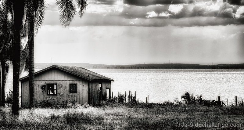
A really nice image that obviously did rather well. The elements all work really well, balancing the idea of "abandoned" with a beautiful setting that makes you wonder why. All of it worked for a nice top 10 image, but I have to be honest and say that somethings didn't work for me (I was originally one of your 5's), so let me go into them - and feel free to ignore me as an obvious outlier. :)
I would have to see the starting image SOOC to try and understand why you went with the squat crop, but I don't really like the long and flat look here. Compositionally there a sense of unbalance for me. I'm not speaking specifically of adherence to the rule of thirds, or golden triangles or golden ratios, but more of just something that feels off, and for me it has to do with the crop ratio. Not that I'd want to crop anything out, but at nearly 2:1 it makes me want to see the tops of those palms on the left instead of seeing those two branches pop in from nowhere.
There's also some spot issues. First, that single dot in the top center that I might have masked out - once I notice it my eye keeps going back to it. After that, there seem to be dust spots between the clouds and horizon to the right that probably were absolutely invisible until the Nik tools pulled them out (happens to me all the time).
I've had this in my critique queue for a week now, and it's taken me a few runs through to try and wrap my thoughts around why it didn't fully work for me when it obviously worked for others. I do like it, just not as much as most folks did. The spots are likely what kept me from being one of your 6's instead since these things to me always give the impression of being a little sloppy/lazy in post, and if there is one overriding thing in the photo that I'd want "fixed" it's that. Otherwise, well done on a to 10. |