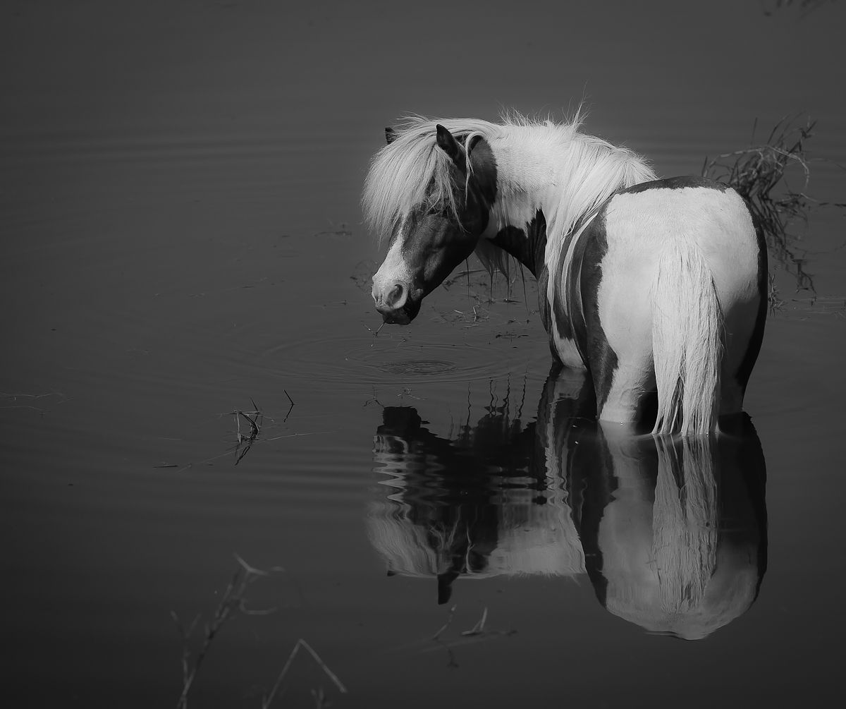
Hi Jayne,
This comment is part of my participation in the DPC Critique Club. This is a strong composition, set in a surprising (in a good way) tableau. The graceful lines of the pony's gaze backward and the rippled abstraction of the reflections all add to the impact. What I'm less certain about are your exposure/basic toning choices. On my monitor, even at full brightness, the highlights all tend to gray. While there are some areas of deep shadow/black, they seem to be in small proportion to the overall image. Taken together with the expanse of dark grey water, the overall effect is one of tonal similarity. I also notice that the reeds on the far right provide a minor distraction due to their overlap with the pony and those in the blurred foreground, draw my attention, too, and might be fairly easily removed in PP. Overall, the appeal is strong and the subject/composition trump the negatives I've noted to make this a strong shot, with potential to be improved with a bit more time in editing. |