*Hello from the Critique Club*
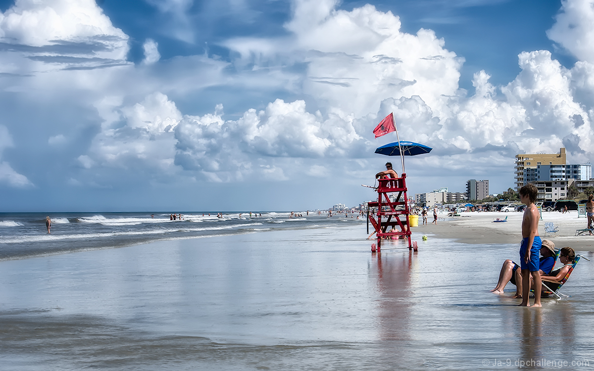
The first thing that hits me here is the beautiful sky and the beach reflections.
That sky has such an impact it truly dominates the image, I love the blues, the whites and all the hues in between and the tremendous cloud shapes its all gorgeous. I'm very pleased to see the horizon is level! I like the additional splashes of colour given by the red of the lifestation and his flag and brolly. I am not so keen on the yellow ball and the yellow bin in particular, I find it a little distracting and would probably have cloned them out.
The large DOF gives a feel for the vast open space of the beach
What bothers me most is the composition, you've obviously made a conscious decision to include the foreground family which also draws in some quite ugly buildings in the background, neither of which, in my opinion, add to the image. To me they detract and would be better cropped out, this would then leave me with the lifestation dominating the foreground, as it should, with rest of the people being dominated by him. I think it would also have improved the end result if you had timed the shot with him looking more towards the subjects in the sea.
Overall, a fine shot which generally works well |