| Author | Thread |
|
|
05/01/2016 11:49:36 PM |
|
 Photographer found comment helpful. Photographer found comment helpful. |
Comments Made During the Challenge  |
|
|
04/05/2016 09:21:44 PM |
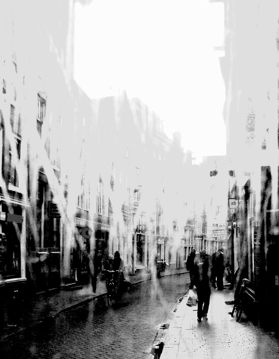
like a rain of beauty.
I'm hanging this in my fantasy art gallery
 |
|
|
|
04/05/2016 05:42:46 PM |
| now this is something I would like to see for myself. beautifully erased. |
|
| Photographer found comment helpful. |
|
|
04/05/2016 12:52:51 PM |
| I would have appreciated more see this photo without white lines. I give 6 |
|
| Photographer found comment helpful. |
|
|
04/02/2016 01:35:11 PM |
voted earlier and gave you an 8. I really love the lower part of the image.
Nice filmic feeling. Pure street photography at its best. Bumping up to 10 and my Blue dragon award  |
|
| Photographer found comment helpful. |
|
|
04/02/2016 01:24:56 PM |
| Love it. On the outside looking in.. or maybe that doesn't give credit to the artistry. 10 |
|
| Photographer found comment helpful. |
|
|
04/01/2016 05:25:02 PM |
| interesting processing, not sure that it adds to the image but it does add some mystery |
|
| Photographer found comment helpful. |
|
|
03/31/2016 10:56:46 PM |
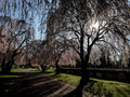
I don't know where this is but it transported me to Holland. Very nice
Up |
|
| Photographer found comment helpful. |
|
|
03/30/2016 02:58:23 PM |
| interesting picture. a bit abstract for me - i'm more of a realist. but i do find that this image held my attention. that surely says there's something in it !? the composition bothers me a bit, with just a tad too much white / bright at the top. cropping a bit of that out would have been better for me personally. but that's just my opinion. |
|
| Photographer found comment helpful. |
Home -
Challenges -
Community -
League -
Photos -
Cameras -
Lenses -
Learn -
Prints! -
Help -
Terms of Use -
Privacy -
Top ^
DPChallenge, and website content and design, Copyright © 2001-2024 Challenging Technologies, LLC.
All digital photo copyrights belong to the photographers and may not be used without permission.
Current Server Time: 04/18/2024 10:17:08 AM EDT.