| Author | Thread |
|
|
07/12/2017 01:09:38 PM |
Originally posted by davidspyle:
A beautiful image, extremely well-executed.
To take it to the next level -- and to my eye and IMHO -- requires only a slightly tighter cropping (off the top particularly) and a slight (minimal) leveling of the table (I didn't say level).
Doing so would draw the viewer into the image and make for a more intimate experience. Again, an exceptional image! |
Thanks a lot for your feedback.... Will keep them in mind. |
|
|
|
07/12/2017 11:34:09 AM |
A beautiful image, extremely well-executed.
To take it to the next level -- and to my eye and IMHO -- requires only a slightly tighter cropping (off the top particularly) and a slight (minimal) leveling of the table (I didn't say level).
Doing so would draw the viewer into the image and make for a more intimate experience. Again, an exceptional image! |
|
 Photographer found comment helpful. Photographer found comment helpful. |
|
|
07/12/2017 01:51:26 AM |
|
| Photographer found comment helpful. |
|
|
07/10/2017 07:25:50 PM |
Originally posted by tanguera:
I don't know how you could have improved this, other than straightening out the tilt :)
The colors, lighting, content, models - all excellent choices. |
In reality, the table is little tilt to give a sense of old/broken table, that's the reason there's little tilt, I was concentrating on the verticals in this case. Thanks a lot for the feedback and your time. Appreciate. |
|
|
|
07/10/2017 07:23:59 PM |
Originally posted by Lydia:
Fabulous! I'm so glad this did so well with the voters.
And... I love the tilt. |
Thanks a lot. |
|
|
|
07/10/2017 07:23:23 PM |
Originally posted by snaffles:
Greetings from the Critique Club!
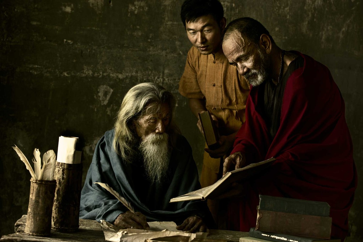
It's always hard to critique an image that has won a ribbon or finished within a cat's whisker of one. This is one of those images. Fantastic ambient lighting, the models are well chosen and posed, there is a ton of texture and a definite sense of story here, which is so important in portraits. Interesting choice of lens and settings, but it clearly worked! And you want me to tell you how to go to the next level.
Hmm....well there is that tilt to the table, and once seen, I find that it does just throw the balance of this image off just enough to be off-putting. And chopping off the top of the head of the youngest member of the trio is a big no-no in my book. Strictly fwiw the first thing I do with any image is check that the horizon is level, and level it if it needs it. And with portraits it seems to always be a good idea to shoot a bit wide around them (so your subject could *move* without being butted up too close to the edge of the pic.
Definitely you have an eye and a great sense for what makes a good shot, please keep up the good work and continue to enter! And congrats on the HM. In a Free Study, no less.
Susan |
Thanks a Lot Susan, Suggestions well taken. I thought of giving an explanation, on those you pointed out, but that becomes an excuse, which I think is not right, now I should accept the mistakes and remember not to repeat the mistakes. Thanks once again for the detailed critique. Appreciate your time. |
|
|
|
07/10/2017 07:18:51 PM |
Originally posted by blindjustice:
the lighting is really well done, great concept from start to finish, congrats |
Thanks a lot |
|
|
|
07/10/2017 07:18:16 PM |
Originally posted by Paul:
I think this is brilliant. |
Thanks a lot |
|
|
|
07/10/2017 05:31:56 PM |
| I think this is brilliant. |
|
| Photographer found comment helpful. |
|
|
07/10/2017 03:36:01 PM |
| the lighting is really well done, great concept from start to finish, congrats |
|
| Photographer found comment helpful. |
|
|
07/09/2017 11:36:18 PM |
Greetings from the Critique Club!
It's always hard to critique an image that has won a ribbon or finished within a cat's whisker of one. This is one of those images. Fantastic ambient lighting, the models are well chosen and posed, there is a ton of texture and a definite sense of story here, which is so important in portraits. Interesting choice of lens and settings, but it clearly worked! And you want me to tell you how to go to the next level.
Hmm....well there is that tilt to the table, and once seen, I find that it does just throw the balance of this image off just enough to be off-putting. And chopping off the top of the head of the youngest member of the trio is a big no-no in my book. Strictly fwiw the first thing I do with any image is check that the horizon is level, and level it if it needs it. And with portraits it seems to always be a good idea to shoot a bit wide around them (so your subject could *move* without being butted up too close to the edge of the pic.
Definitely you have an eye and a great sense for what makes a good shot, please keep up the good work and continue to enter! And congrats on the HM. In a Free Study, no less.
Susan |
|
| Photographer found comment helpful. |
|
|
07/09/2017 06:00:48 PM |
Fabulous! I'm so glad this did so well with the voters.
And... I love the tilt.
|
|
| Photographer found comment helpful. |
|
|
07/08/2017 05:49:18 PM |
I don't know how you could have improved this, other than straightening out the tilt :)
The colors, lighting, content, models - all excellent choices. |
|
| Photographer found comment helpful. |
|
|
07/08/2017 02:14:41 PM |
| This is SO beautiful. It brought back memories to me of the wonderful [user]Jorge De Sousa[/user]. I really miss him. Anyways... many congrats on your first HM. Excellent work. |
|
| Photographer found comment helpful. |
|
|
07/08/2017 12:32:45 AM |
| Very, very 'old masters' - subject, lighting and 'look'. Well done. |
|
| Photographer found comment helpful. |
Comments Made During the Challenge  |
|
|
07/07/2017 11:39:41 PM |
| I love the light and color tone you captured. What an intriguing moment. |
|
| Photographer found comment helpful. |
|
|
07/07/2017 10:54:53 PM |
| wow, this really evokes a painting. well done. |
|
| Photographer found comment helpful. |
|
|
07/06/2017 12:06:04 PM |
| Love the light; it really suits the subjects. |
|
| Photographer found comment helpful. |
|
|
07/02/2017 10:34:50 PM |
| 9 from me... like an old Masters painting... |
|
| Photographer found comment helpful. |
|
|
07/01/2017 12:33:38 PM |
| Caravaggesque - very ambitious |
|
| Photographer found comment helpful. |
Home -
Challenges -
Community -
League -
Photos -
Cameras -
Lenses -
Learn -
Prints! -
Help -
Terms of Use -
Privacy -
Top ^
DPChallenge, and website content and design, Copyright © 2001-2024 Challenging Technologies, LLC.
All digital photo copyrights belong to the photographers and may not be used without permission.
Current Server Time: 04/16/2024 09:35:50 AM EDT.