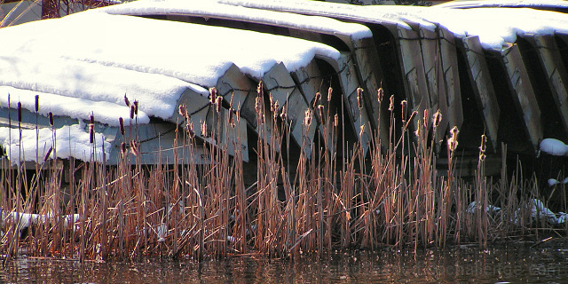
Rental boats stored for winter at Mott's Run Reservoir, Fredericksburg, VA.
Post-processed with Paint Shop Pro 9
Crop
Resize
Brightness & Contrast: Clarify +5
Brightness & Contrast: HMS (+20, 0, 0)
Hue & Saturation: Master (Sat +40), Blue (Sat -40)
Color Adjust: RGB (R 0, G 0, B -5)
Sharpness: USM (.50,125,0)
Save as JPG
Sharpness: USM (.35,120,5)
Save as JPG
Statistics
Place: 120 out of 148 Avg (all users): 4.8125 Avg (commenters): 5.0000 Avg (participants): 4.5604 Avg (non-participants): 5.0085 Views since voting: 888 Views during voting: 321 Votes: 208 Comments: 7 Favorites: 0
ok, i am voting this challenge in 2 passes. in this pass, you will get a partial comment and a score. then i will come back to comment again. if you have any problem whatsoever with this comment, pm me and let me know. otherwise, take it with a grain of salt...i'm not trying to be a know-it-all, i'm just explaining where i'm coming from in voting this challenge. and, if this comment is NOT helpful (of if you think i'm full of $#!+), don't mark it helpful.
billboards are a science unto themselves. a lot of research has gone into determining just how much information a person can digest and retain in specific time spans. they use this information to develop formulas for determining the number of words and letters to use on billboards, as well as their sizes. they also determine the size and number of visual elements to include.
the graphics/photograph on a billboard are designed to get the point across in a moment. on the road, a driver will have less time with a billboard than a voter will give your image. this is a key element in the challenge: composing a shot that will get its point across quickly and succintly. along those lines, a strong composition will probably have few details and make strong use of negative space.
--------------------
this is a nice idea, but as a billboard it would have to be placed somewhere where the user would have time to look at it. there is a bit too much detail to get the point across quickly.