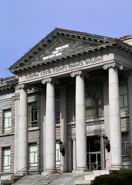
Contra Costa County Finance Building. Cropped a bit from the left and bottom to eliminate a light pole and street sign. Cloned out a few leaves from an overhanging branch in the upper-left corner of the sky.
Used the Dodge tool to lighten the shadow over the date, then selected the date area and used a Curves Adjustment Layer to heighten the contrast of the date. Used the Dodge tool to lighten the lamps by the sides of the doorways.
Overall RGB Curve for contrast. Selected the sky area and applied additional RGB and Blue Curves to saturate the sky color a bit.
Saved composite to TIFF. Applied noise reduction using PictureCooler with these settings:
Luminance DeNoise: 0.0
Color DeNoise: 1.7
Open Space DeNoise Ramge: 2.9
Refocus Level: 0.0
Kill Noisy Pixels: 0.8
Saved result to TIFF
-Resized for DPC
-USM at 16%/48 dia/TH=0
-USM at 66%/0.6 dia/TH=5
-SaveAs JPEG at 8/10 = 131kb
Statistics
Place: 189 out of 258 Avg (all users): 5.0957 Avg (commenters): 4.3333 Avg (participants): 4.9844 Avg (non-participants): 5.2716 Views since voting: 908 Views during voting: 277 Votes: 209 Comments: 6 Favorites: 0
... the cropping leaves me with too much too look at. It's a very busy shot and while sometimes this works with crowds and such, with a building shot I try to look for something specific to be drawn to in the shot. The name, the shape of the windows, something that makes the building special and stand out. Using my magic envelopes, if you had taken out more of the sky and just a slight tighter crop on the left would have really brought out the front of the building, making the pillars the center of attraction. Also, the Christmas lights are a bit distracting to the overall image. Again, some cloning would really sharpen the overall shot.
Hope you find these comments helpful and Good luck In future challenges!
Deannda
Thanks! I have some of those envelopes sitting around too ... : )
I was afraid to crop into the windows on the left, and, for a stock image, I thought it better to leave some blank sky (where any added type might go), and trust the designer to crop it if appropriate for their particular use.
I like the image for it's the lines and such but that's about it. Reading what you did to it afterwards explains the odd sense I got from looking at it more closely. I can see the difference in the shadows of the pillers, where you lightened one area but not others. If you had lightened all the shadows so they were the same it would have really helped balance out the overall image.
Also the cropping leaves me with too much too look at. It's a very busy shot and while sometimes this works with crowds and such, with a building shot I try to look for something specific to be drawn to in the shot. The name, the shape of the windows, something that makes the building special and stand out. Using my magic envelopes, if you had taken out more of the sky and just a slight tighter crop on the left would have really brought out the front of the building, making the pillars the center of attraction. Also, the Christmas lights are a bit distracting to the overall image. Again, some cloning would really sharpen the overall shot.
Hope you find these comments helpful and Good luck In future challenges!
Excellent shot! I love the hue, but there appears to be a blending problem on the upper banister between building and sky. Right on target about the theme.