| Author | Thread |
|
|
12/05/2005 10:02:55 PM |
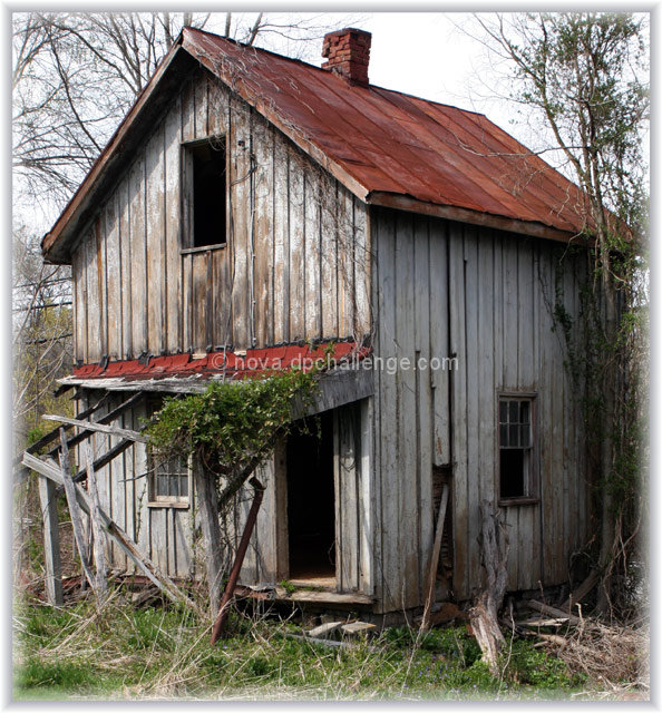
| Six months later I have come back to this image and considered the many comments both in favor of and opposition to the border I selected. With the passage of a little time I conclude that while I respect all opinions to the contrary, I think the border works and I'm glad I added it. Sure would have liked to top a "6" with this image, but that notwithstanding, I'm glad I submitted it as I did. Thanks for the comments. |
|
|
|
06/29/2005 11:52:25 AM |
| I could've sworn I commented on this. Really a nice capture. I like the coloration and the fuzzed edging you did as well. |
|
 Photographer found comment helpful. Photographer found comment helpful. |
|
|
05/05/2005 11:03:27 PM |
heyah, ray! love the image, but honestly, my first reaction was, "why'd he put that border on it?" in general, i don't have a problem with borders--to me, they are just another part of the presentation to consider (i look at titles the same way). along those lines, if you are going to do it, ask yourself if the border is going to enhance or detract from the image? if you are just playing with borders, i'd suggest using your portfolio space to try them out, rather than lose a half point to a point from those that find it distracting or detracting.
all the same, great find, nicely observed! keep it up! |
|
| Photographer found comment helpful. |
Comments Made During the Challenge  |
|
|
04/19/2005 01:01:23 AM |
| I like this. I don't think I'd put the border on, but that's just me. Good exposure, sharp. Great subject. Bumping up. |
|
| Photographer found comment helpful. |
|
|
04/18/2005 03:41:39 AM |
Well here goes.
This image had a lot going for it. Well composed, nicely post-processed, nice colors and had a nice appeal with the green foliage on the porch roof.
Notice I said "had" a lot going for it. The frame you added in here, wasn't needed and actually took just a little away from the bldg. A simple 10 pixel solid white would have worked better or none at all in my opinion.
I still gave this image a 6 and would have scored it at least a 7 or 8 had it not been for the border. Please don't take offense, as this is only my personal opinion. |
|
| Photographer found comment helpful. |
|
|
04/17/2005 05:51:49 PM |
a risky fade effect but i dont realy mind that with this view
its a cute thing this house |
|
| Photographer found comment helpful. |
|
|
04/17/2005 04:20:46 PM |
| this border doesn't really add anything to the shot, especially as it is so closely cropped |
|
| Photographer found comment helpful. |
|
|
04/17/2005 10:04:43 AM |
|
| Photographer found comment helpful. |
|
|
04/16/2005 09:30:08 PM |
| Nice softness to it - very nice color. |
|
| Photographer found comment helpful. |
|
|
04/16/2005 03:06:49 AM |
| I think the fading boarder distracts - perhaps it is just is too tight a crop. |
|
| Photographer found comment helpful. |
|
|
04/15/2005 06:37:14 PM |
| I just raised my vote for you because I like the shot, and I appreciate that you did not punch up the blue sky. You left the image natural looking, good job |
|
| Photographer found comment helpful. |
|
|
04/15/2005 12:05:07 PM |
| I like the picture I don't like the faded edges. |
|
| Photographer found comment helpful. |
|
|
04/15/2005 11:19:16 AM |
| nice shot. I also like the border |
|
| Photographer found comment helpful. |
|
|
04/15/2005 09:25:34 AM |
| Very good looks like my house |
|
| Photographer found comment helpful. |
|
|
04/15/2005 08:37:27 AM |
| I think the border helps this image. I really like this. Honestly not sure why - what it is about the capture that draws me to it. Crop, focus, DOF, POV very good. colors work for me. 7 for now, may pass again. Bumping to 8 |
|
| Photographer found comment helpful. |
|
|
04/15/2005 06:17:43 AM |
I'm not voting in this challenge, but just searching through, this one REALLY caught my eye. Great focus, exposure and colour. I really hope you ribbon with this. Even the boarder (which I usually hate) really works with this. Fantastic shot...Making it a favorite!!
l8r, |
|
| Photographer found comment helpful. |
|
|
04/15/2005 02:53:32 AM |
| Beautiful color and composition. The frame is a little distracting, IMO, but I like it. |
|
| Photographer found comment helpful. |
|
|
04/14/2005 09:12:34 PM |
| Nicely done. You look like you did some dodging on the edges, but I'll let someone else be the judge of that. This is a really good picture. It's well composed and well balanced colorwise. This could be a winner. |
|
| Photographer found comment helpful. |
|
|
04/14/2005 07:57:28 PM |
I can not decide if the frame is helping or not so I give it
6 |
|
| Photographer found comment helpful. |
|
|
04/14/2005 12:10:03 PM |
| great composition and subject for this challenge, good shot |
|
| Photographer found comment helpful. |
|
|
04/14/2005 11:17:02 AM |
| What a great house/hut, very Clampettesque, (Beverly Hill-billies) |
|
| Photographer found comment helpful. |
|
|
04/14/2005 09:35:31 AM |
|
| Photographer found comment helpful. |
|
|
04/14/2005 06:20:07 AM |
| Very nice picture, I like the subtle colors, composition, subdued lighting. I hope it will do well (10) |
|
| Photographer found comment helpful. |
|
|
04/13/2005 06:37:35 PM |
| Nice crop but the feathered border distracts (For me anyway) |
|
| Photographer found comment helpful. |
|
|
04/13/2005 05:08:26 PM |
| well focused & composed. like the blurred edge effect. don't know enought to know if it was intentional or not but I like it! Wonder what it might have looked like in b&w. |
|
| Photographer found comment helpful. |
|
|
04/13/2005 04:55:17 PM |
| I love it..I give it a 10 |
|
| Photographer found comment helpful. |
|
|
04/13/2005 03:42:25 PM |
| Very nice find and nice detail. I don't care to much for the border especially with that tight of a crop. I think a solid white border a bit smaller would of be better. With that said, I still like you photograph. Composed well and lighting good. |
|
| Photographer found comment helpful. |
|
|
04/13/2005 01:52:58 PM |
|
| Photographer found comment helpful. |
|
|
04/13/2005 12:18:59 PM |
|
| Photographer found comment helpful. |
|
|
04/13/2005 09:24:59 AM |
| nice color and angle to get part of the roof, great looking photo |
|
| Photographer found comment helpful. |
|
|
04/13/2005 08:45:50 AM |
|
| Photographer found comment helpful. |
|
|
04/13/2005 07:54:02 AM |
| Nice image. Wonderful textures, and great color. Feathering the image gives it that soft timeless look. <7> |
|
| Photographer found comment helpful. |
Home -
Challenges -
Community -
League -
Photos -
Cameras -
Lenses -
Learn -
Prints! -
Help -
Terms of Use -
Privacy -
Top ^
DPChallenge, and website content and design, Copyright © 2001-2024 Challenging Technologies, LLC.
All digital photo copyrights belong to the photographers and may not be used without permission.
Current Server Time: 04/23/2024 09:58:02 AM EDT.