| Author | Thread |
|
|
05/08/2005 06:22:56 AM |
Greetings, from the critique club :)
I generally like this image, and feel there's a bit of the umph factor that makes one photograph stand out from others.
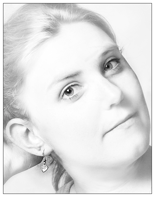
The quick take: I agree that the eyes hijacked the composition. The extremely light tones in most of the image robs it of details, and one particular instance where this is less effective is the separation line between the jawline and the neck, which is very slight and creates an unnatural impression, and I believe a stronger jawline would have yielded a more positive overall viewing result.
The long take:
a) As mentioned by several of the commenters already, my eyes were immediately drawn to the model's eyes and then the earring. There's quite a competition between these two elements in the image, and I agree that the earring did not win the battle, perhaps due to its positioning in the composition or its smaller size. The eyes' luminosity and darker tones are also quite magnetic, and their contrasting tone as compared against the background and the rest of the image also serve to highlight them, at the expense of the earring.
b) I'm struck by the marble-like quality of the face. It's a good effect that can powerfully communicate a message. But in the context of this image, there is perhaps too much dodging.
c) Were the earring a darker color tone, perhaps closer to that exhibited by the eyes, I believe this image would have rated very highly. The silver gets lost amidst all the whites. The darker part of the earring right underneath the ear lobe is very effective, and I wish that same tone continued down to the main part of the earring.
d) The cheek line on the model's left side as well as the area around the left eye are showing a bit of a burn, and I like this juxtaposition against the very light right side very much. And I can't help but feel that were the rest of the image more uniformly dark, the earring would have benefited.
e) Two distraction points. The first consists of the clothing strap and the hint of a thin necklace around the neck. Were these elements removed, I believe the image would be stronger. The second, and this is previously mentioned in Azrifel's comment, is the hand behind the head, which threw the composition. There also seems to be a very light strand of hair crossing the palm of that hand, and this also provided another element that competed with the earring within its immediate vicinity.
Overall, I do think this is a nice image still, and one that has lots of potential. During the vote, this was one of the small percentage of images to which I gave a 6 or higher in the entier challenge.
I hope this comment is useful. This is my first critique club assignment, and I'd welcome very much some sort of feedback on this comment, if you can spare the time and energy. Thanks, and good luck in future challenges. |
|
 Photographer found comment helpful. Photographer found comment helpful. |
Comments Made During the Challenge  |
|
|
05/01/2005 03:11:35 PM |
| Good shot, but the focus of the image is more her eyes than the earring, which doesn't really work for advertising... |
|
| Photographer found comment helpful. |
|
|
04/30/2005 05:19:27 PM |
| I think the high key approach works well and it gets the attention 8 |
|
| Photographer found comment helpful. |
|
|
04/30/2005 05:08:13 PM |
| Effectively done high-key photo. Not much room for type -- photo would have to be placed with text on a larger ad. |
|
| Photographer found comment helpful. |
|
|
04/30/2005 03:39:34 PM |
| A lovely portrait but the erarring did not receive enough attention. It is there where the eyes will end up and I keep going back to the eyes which received the top billing. Bumping up. |
|
| Photographer found comment helpful. |
|
|
04/30/2005 02:43:35 PM |
| Great shot, but the eyes are mor compelling than the earring, and this challenge is about selling jewelry! |
|
| Photographer found comment helpful. |
|
|
04/30/2005 02:42:04 PM |
| Your high-key image is well done. IMO a tighter crop.to give more space to the jewelry, would improve it. |
|
| Photographer found comment helpful. |
|
|
04/29/2005 01:25:43 PM |
|
| Photographer found comment helpful. |
|
|
04/29/2005 07:21:15 AM |
| I wish the model's position looked more natural instead of like she WAS tilting her head so you could see the ring. 5 |
|
| Photographer found comment helpful. |
|
|
04/29/2005 02:33:47 AM |
| with the striking eyes in all that brightness, I almost didn't notice the earring |
|
| Photographer found comment helpful. |
|
|
04/28/2005 09:18:41 PM |
| Nice. Hard to say what to do here, her eyes draw more then the jewelry. |
|
| Photographer found comment helpful. |
|
|
04/28/2005 04:52:03 PM |
| I think this photo is a bit too bright. It appears washed out to me. I would have liked it with more contrast or in color. |
|
| Photographer found comment helpful. |
|
|
04/28/2005 04:29:44 PM |
| Nice portrait but IMHO I feel that the earing gets lost because of the power of the eyes. Maybe leaving the earing in colour would have distracted back away fom the eyes. |
|
| Photographer found comment helpful. |
|
|
04/27/2005 03:36:15 PM |
Strange pose, it makes it look like she has got something really heavy hanging on her ear. The high key lighting also makes it hard to find a good expression on the left side of her face, nearest to the jewel. The hand behind her head doesn't look like a hand at first but creates a strange shoulder line. Only the piece of clothing at the bottom tells me different (but at that moment I was already distracted).
I like the eyes - they are jewels-, the tone and the idea of the lighting. It's just the pose that keeps me from rating it top. |
|
| Photographer found comment helpful. |
|
|
04/27/2005 02:22:21 PM |
| Great high key but the earrings don`t stand out, but then they are silver.7 |
|
| Photographer found comment helpful. |
|
|
04/27/2005 01:35:20 PM |
| The first thing to jump out at me in this photo is the models eyes. If this was a portraint that would be good. The earring in this is not a focal point. JMO. She's very pretty - how did it look in color? Good luck in the challenge. |
|
| Photographer found comment helpful. |
|
|
04/27/2005 11:53:36 AM |
| Very nice use of white on white. Head may be a bit too tilted (gives a weird angle to the earring). Overall well executed. Nice shot. |
|
| Photographer found comment helpful. |
|
|
04/26/2005 10:33:34 PM |
Focal point seems to be more drawn to her eyes, than the earring (which looks a bit over-sharpened in my opinion)
I like the direction/idea you went with this to soften the overall look. |
|
| Photographer found comment helpful. |
|
|
04/26/2005 05:32:27 PM |
| Nice shot. Iike how the eyes and earring jump out. |
|
| Photographer found comment helpful. |
|
|
04/26/2005 01:16:25 PM |
| Nice portrait, but the filter or effect used to emphasize the earring detracts from what was otherwise a really nice shot. |
|
| Photographer found comment helpful. |
|
|
04/26/2005 12:14:43 PM |
| I'm sorry but I do not like the effects you have done with this photo. Too light for me. |
|
| Photographer found comment helpful. |
|
|
04/26/2005 02:30:57 AM |
|
| Photographer found comment helpful. |
|
|
04/25/2005 07:39:05 PM |
| this is a beautiful idea for an ad and a beautiful shot....the only thing that doesnt sit roght with me is the lack of detail available on the earring which is the product trying to be sold...best of luck |
|
| Photographer found comment helpful. |
|
|
04/25/2005 06:23:33 PM |
| Very nice and sharp eyes. The idea of the eyes and earing to be the only 'sharp' parts of the picture very interesting, unfortunatly i do not feel it works very well, as most of the subject of the picture isn't the jewel. A tighter crop of perharps only one side of the face and the earing could've worked as much. Frame is nice and classic, which makes the picture work more. 5 |
|
| Photographer found comment helpful. |
|
|
04/25/2005 12:06:15 PM |
Composition: I see the focus on the models eyes not on the jewelry
Lighting: lightign is ok, its too harsh on the earring IMHO
Color: verynice
Clarity: not clear enough on the jewelry
Lettering: I cannot see where any lettering could be placed on this for advertising purposes. |
|
| Photographer found comment helpful. |
|
|
04/25/2005 12:29:41 AM |
| more earring less model, perhaps |
|
| Photographer found comment helpful. |
Home -
Challenges -
Community -
League -
Photos -
Cameras -
Lenses -
Learn -
Prints! -
Help -
Terms of Use -
Privacy -
Top ^
DPChallenge, and website content and design, Copyright © 2001-2024 Challenging Technologies, LLC.
All digital photo copyrights belong to the photographers and may not be used without permission.
Current Server Time: 04/25/2024 12:20:21 PM EDT.