| Author | Thread |
Comments Made During the Challenge  |
|
|
05/01/2005 05:39:44 PM |
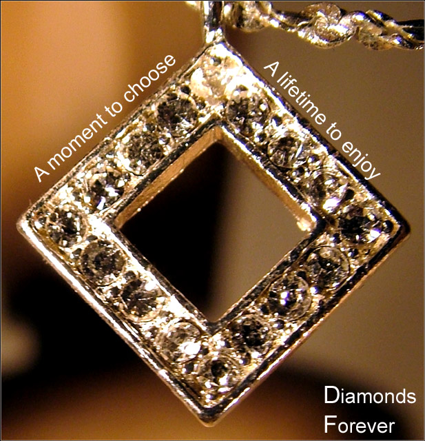
| Color is a bit off for diamonds, and the focus is a bit fuzzy. |
|
 Photographer found comment helpful. Photographer found comment helpful. |
|
|
05/01/2005 11:32:22 AM |
| I like the placement of the wording. However, the pendant itself appears out of focus and a little blown out. |
|
| Photographer found comment helpful. |
|
|
05/01/2005 10:54:12 AM |
| This shot seems to be suffering from some digital artifacting...those jagged edges. Also, the lighting is harsh, making it difficult to sort out the fine detail of the shot. |
|
| Photographer found comment helpful. |
|
|
04/30/2005 03:35:32 PM |
| To photograph one diamond is difficult. To take on this many may spell failure if definition and clarity is sacrificed. The layout is nice. Bumping up. |
|
| Photographer found comment helpful. |
|
|
04/30/2005 03:01:04 PM |
| great composition and idea, unfortunately the stones aren't crisp and clear as needed for a print ad |
|
| Photographer found comment helpful. |
|
|
04/30/2005 12:08:08 PM |
| Nice composition. Text is appropriate. Too many hot spots though |
|
| Photographer found comment helpful. |
|
|
04/29/2005 11:28:25 PM |
| I wish the picture was clearer. You almost got the shine, but the pendant is slightly out of focus. Nice concept, tho. |
|
| Photographer found comment helpful. |
|
|
04/29/2005 05:13:16 PM |
| nice shot i like the DOF, though the lighting is a little harsh. |
|
| Photographer found comment helpful. |
|
|
04/29/2005 08:58:39 AM |
| Maybe it is just me, but it just seems a little blurry to me. I also think that a solid background may have put more of the focus on the pendant rather than trying to figure out what the background is. |
|
| Photographer found comment helpful. |
|
|
04/29/2005 06:54:26 AM |
|
| Photographer found comment helpful. |
|
|
04/29/2005 06:50:34 AM |
| an image like this really needs it's main subject to be well focused |
|
| Photographer found comment helpful. |
|
|
04/28/2005 02:12:38 PM |
| The focus seems soft to me. Nice layout though. |
|
| Photographer found comment helpful. |
|
|
04/28/2005 12:29:16 AM |
| I don't know if it is the lighting or the focus, but the diamonds are really hard to identify. The background is very distracting, maybe a contrasting color would have helped. |
|
| Photographer found comment helpful. |
|
|
04/27/2005 09:47:38 PM |
| Nice layout, color, and lighting. Focus is a bit soft. |
|
| Photographer found comment helpful. |
|
|
04/27/2005 09:36:22 PM |
| Looks like the focus is off on the diamonds or they are over-processed |
|
| Photographer found comment helpful. |
|
|
04/27/2005 09:22:44 PM |
| Interesting presentation, but difficult to see the diamonds because of the lighting. |
|
| Photographer found comment helpful. |
|
|
04/27/2005 11:59:59 AM |
| Neat idea wrapping the text arond the object. The jewelry piece itself is a bit bright and the detail of the stones is lost. Good luck in the challenge. |
|
| Photographer found comment helpful. |
|
|
04/26/2005 10:52:11 PM |
Composition works for me, as well as the text layout.
Personally the font used could have a little more feminine flair to it, which would soften teh feel there.
I'm sure you have received comments about the lack of detail here and can only suggest less of a crop, not shooting too close to the subject, a smaller aperature (if available).
Decent attempt at a difficult subject. (5) |
|
| Photographer found comment helpful. |
|
|
04/26/2005 02:28:54 PM |
| Very origianl and I llike the way you used the shape to place the text. Great dof but the peice itself needs to be crisper as it is what you're trying to sell. |
|
| Photographer found comment helpful. |
|
|
04/26/2005 09:18:47 AM |
| Diamonds don't seem to be in focus. Text on the left is not lined up with the side of the jewelry. |
|
| Photographer found comment helpful. |
|
|
04/26/2005 02:26:02 AM |
| the diamonds are out of focus the idea is good but needs to be sharper |
|
| Photographer found comment helpful. |
|
|
04/25/2005 09:11:33 PM |
| THis is a really cool idea, but the necklace is out of focus. |
|
| Photographer found comment helpful. |
|
|
04/25/2005 04:43:13 PM |
| beautiful!!! I like the focus, the color, the text, i like it all! |
|
| Photographer found comment helpful. |
|
|
04/25/2005 10:02:40 AM |
| Good. It seems out of focus and there is a lack of sparkle for all those diamonds. |
|
| Photographer found comment helpful. |
|
|
04/25/2005 07:26:23 AM |
Massive focus/detail issue here: think that you are too close to the jewels. Reflections are looking dirty.
Lettering detracts: capitals are too big. |
|
| Photographer found comment helpful. |
|
|
04/25/2005 03:21:01 AM |
| Fantastic!!!! A thought provoking advertisement! |
|
| Photographer found comment helpful. |
|
|
04/25/2005 01:53:29 AM |
|
| Photographer found comment helpful. |
|
|
04/25/2005 01:27:53 AM |
| very nice wish it was more clear |
|
| Photographer found comment helpful. |
|
|
04/25/2005 01:02:13 AM |
|
| Photographer found comment helpful. |
Home -
Challenges -
Community -
League -
Photos -
Cameras -
Lenses -
Learn -
Prints! -
Help -
Terms of Use -
Privacy -
Top ^
DPChallenge, and website content and design, Copyright © 2001-2024 Challenging Technologies, LLC.
All digital photo copyrights belong to the photographers and may not be used without permission.
Current Server Time: 04/27/2024 09:32:34 AM EDT.