| Author | Thread |
Comments Made During the Challenge  |
|
|
05/03/2005 09:19:59 AM |
| Don't think this fits "minimalism |
|
|
|
05/03/2005 12:11:50 AM |
|
|
|
05/02/2005 11:04:44 PM |
|
|
|
05/02/2005 05:28:36 AM |
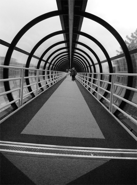
| I find the bottom half of the shot a little distracting. For me if this image were cropped to only show the circular pattern it would be much stronger, and very pleasing image |
|
|
|
05/01/2005 08:50:00 PM |
|
|
|
05/01/2005 02:52:55 PM |
| would have more lights to contrast the darks... |
|
|
|
05/01/2005 02:35:17 PM |
|
|
|
05/01/2005 03:40:04 AM |
| I would have avoided/ cropped the "end of the tunnel" at the bottom of the picture... having just one person in the tunnel would have helped.. although you cant really control that.. |
|
|
|
05/01/2005 12:19:34 AM |
| great photo. awesome spot. |
|
|
|
04/30/2005 12:55:48 PM |
| The main subject should be better identified in this one, im assuming it's the people, but i shouldn't have to guess. 4 |
|
|
|
04/29/2005 10:47:54 PM |
| Nice perspective good capture and use of black and white the distance from the people in the picture really shows the volume of the Sky Bridge. Real nice use of contrasting angles. |
|
|
|
04/29/2005 10:25:57 PM |
| I love the simplistic and surrealistic feel of this image. :o) |
|
|
|
04/29/2005 05:05:43 PM |
| Maybe you'll get some nags about the tilt on this picture, but I think it makes the entire picture much more interesting to look at. |
|
|
|
04/29/2005 04:07:12 PM |
| I could definitely do without the crooked feel of the photo. Next time make sure its level! Good image, good use of lines, converging lines, the the people at the end of the walk is great. I think I would of cropped right where that horizontal line is, anything below that isnt really helping the photo. 7 |
|
|
|
04/29/2005 10:48:12 AM |
|
|
|
04/29/2005 10:18:03 AM |
| I thinkyou should have gone one step forward |
|
|
|
04/29/2005 01:23:27 AM |
| i like the lines and b&w. did you consider cropping it above the line (on the floor) and making it square? perhaps a black border as well? (you see, i like borders :) ) 9 |
|
|
|
04/29/2005 01:09:24 AM |
| Very Cool Image.. not sure it belongs in Minimalism, lots of lines. Seems very busy! Still gave it an 8 |
|
|
|
04/29/2005 12:40:07 AM |
|
|
|
04/28/2005 02:42:56 PM |
| i enjoyed this shot much. the skew is effective as well as the monotony of colors. 9 |
|
|
|
04/28/2005 12:39:06 PM |
|
|
|
04/28/2005 12:17:54 PM |
| instreating but neat as well good thumnail |
|
|
|
04/28/2005 10:27:35 AM |
| Nice idea. Needs straightening a little. |
|
|
|
04/27/2005 11:25:12 PM |
| man I wish this wasn't tilted..it's really cool overall 6 |
|
|
|
04/27/2005 08:19:40 PM |
| Awesome POV. Great use of B&W. I think the tilt works very well, if the horizon was 'flat' instead of tilted it wouldnt be as attractive to me as it is right now. |
|
|
|
04/27/2005 05:26:48 PM |
| is this intentionally sloping? to me it spoils the result |
|
|
|
04/27/2005 04:49:43 PM |
| Awesome photo. The tilt makes it that much better and the B&W really emphasizes the shapes and perspective. |
|
|
|
04/27/2005 03:14:25 PM |
| I think it would work better if the horizon was level. Great concept. |
|
|
|
04/27/2005 01:17:41 PM |
| I think there are too many visual elements to consider this minimalism. |
|
|
|
04/27/2005 12:36:58 PM |
| Interesting picture, but I don't think it meets the challenge (imo). |
|
|
|
04/27/2005 11:34:24 AM |
| It's a little crooked and could have done with out the line across the bottom. A tighter crop and rotation would look better. |
|
|
|
04/27/2005 11:02:27 AM |
| a bit off center..makes me feel like im falling over. neat shot tho |
|
|
|
04/27/2005 10:50:14 AM |
| I wish that the photo was looking straight into the tube. Other than that, good. |
|
|
|
04/27/2005 10:15:34 AM |
| Love the leading lines in this. |
|
|
|
04/27/2005 10:15:28 AM |
| Very good. I would also like this in a square crop. 8/10 |
|
|
|
04/27/2005 09:52:26 AM |
| This is a better example of leading lines than minimalism. |
|
|
|
04/27/2005 06:52:07 AM |
|
|
|
04/27/2005 05:50:36 AM |
I want to go here! cool place
great pic - but the focal point is not clear - the figures are slightly out of focus/unsharp. Have to mark down slightly, as this is essential part of the challenge, for me. |
|
|
|
04/27/2005 03:42:48 AM |
| A like this, well done, just needs a little bit more brightness, try adjusting the curves and levels a tad to give it a little bit more umph |
|
|
|
04/27/2005 01:13:52 AM |
| i love it, but it doesn't fit the challenge |
|
|
|
04/27/2005 12:23:42 AM |
| Aaarggh. I want to score this higher - it's great - but can't get over the angle. Good job though. |
|
Home -
Challenges -
Community -
League -
Photos -
Cameras -
Lenses -
Learn -
Prints! -
Help -
Terms of Use -
Privacy -
Top ^
DPChallenge, and website content and design, Copyright © 2001-2024 Challenging Technologies, LLC.
All digital photo copyrights belong to the photographers and may not be used without permission.
Current Server Time: 04/28/2024 01:09:51 AM EDT.