| Author | Thread |
|
|
06/07/2003 06:54:53 PM |
critique club:
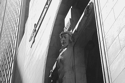
the inclusion of the part of the building on the right causing the eye to go vertical is a distraction, because of the vertical, and because it is brighter than the subject. However, the lighting does create a nice effect on the arms of the figure of Christ. Perhaps cropping out the left side or having eliminating it during the shoot would have enhanced the effect.
The tonalities are smooth and even otherwise lending to a peaceful feeling that is in sharp contrast to the suffering in the figure.
|
|
Comments Made During the Challenge  |
|
|
05/29/2003 10:08:59 AM |
| I know where that is. :-> That Christ is darn hard to photograph, major kudos. Every time I try it looks wrong, or awkward. Good lighting-angle choice, too. However, the 'pose' is a little awkward (though better than I've ever managed), and the crop feels strange for some reason I can't quite articulate. Good try. 6. |
|
|
|
05/27/2003 05:59:41 PM |
Is this in Chicago? I seem to remember something like this when I was last there...
Anyway, a little dark/shadowy for my taste. |
|
|
|
05/26/2003 11:13:28 PM |
| you've lost some detail in the shadows and the thing on the face of the building is distracting. |
|
|
|
05/26/2003 01:36:45 PM |
| more contrast I think would have made this a stronger image. |
|
|
|
05/26/2003 02:00:11 AM |
| Not enough contrast. Needs to be much darker I think. |
|
|
|
05/26/2003 12:09:28 AM |
| fairly strong black and white... I think this image could be a bit larger to highlight the detail a little more... i'm also wondering what a vertical compositon on this would look like that showed more of the statue... = 6 |
|
Home -
Challenges -
Community -
League -
Photos -
Cameras -
Lenses -
Learn -
Prints! -
Help -
Terms of Use -
Privacy -
Top ^
DPChallenge, and website content and design, Copyright © 2001-2024 Challenging Technologies, LLC.
All digital photo copyrights belong to the photographers and may not be used without permission.
Current Server Time: 04/25/2024 08:58:27 AM EDT.