| Author | Thread |
|
|
05/03/2006 08:59:16 AM |
|
 Photographer found comment helpful. Photographer found comment helpful. |
|
|
08/02/2005 12:26:02 PM |
|
| Photographer found comment helpful. |
|
|
06/23/2003 08:29:51 AM |
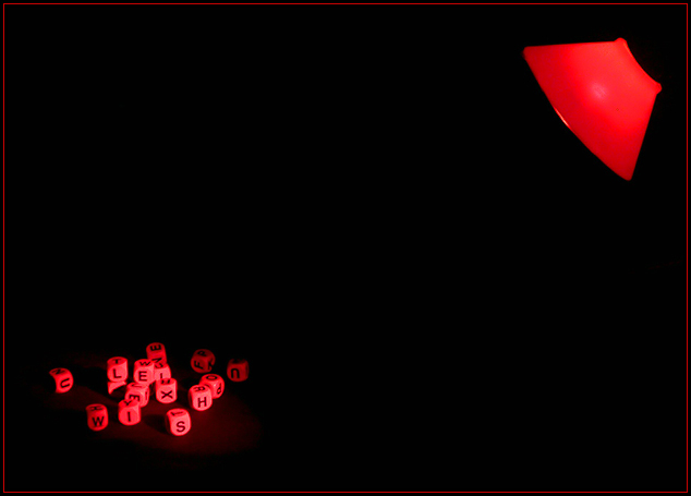
I found this to be an extremely interesting photo and was one of the ones who gave this a 9. I think that it didn't score a 6 or higher because it's a shot that belongs in an art show in a gallery or museum - one that the viewer needs to study and appreciate. Extremely clever. Perhaps too clever for the casual voter who looks for a second and a half before voting and bases everything on a "wow" factor.
Regardless, be proud of this shot. It's a winner in my book! |
|
| Photographer found comment helpful. |
|
|
06/23/2003 02:39:02 AM |
| Thanks Jason! I'm not sure why this didn't hit a 6. I thought it was a pretty neat image. I called it "dyslexia" because I know words can seem like a big jumble of letters for someone with dylexia. :) Thanks for all the good comments, and thanks for adding it to your favourites, Jason. ;) |
|
|
|
06/23/2003 01:03:54 AM |
| Woaah! Not even a 6? I beat this? What!? This was my second favorite for the whole challenge. I'm adding it to my favorites. Hope that makes you feel better! |
|
| Photographer found comment helpful. |
Comments Made During the Challenge  |
|
|
06/22/2003 08:41:26 PM |
| One of the most off center shots in the challenge. I like the cubes outside the area of light - and that the light beams across the center from corner to corner. Awesome shot. 10 |
|
| Photographer found comment helpful. |
|
|
06/21/2003 11:54:40 AM |
| Hi I'm dyslexia and that makes a word to me ..... 10/10 |
|
| Photographer found comment helpful. |
|
|
06/21/2003 09:11:22 AM |
| Novel idea - compellingly executed. Red is a good color choice - makes you feel the frustration at the indeciferable (ouch! my spelling!) jumble of letters. The blackness works with this too. |
|
| Photographer found comment helpful. |
|
|
06/20/2003 04:18:20 PM |
|
| Photographer found comment helpful. |
|
|
06/18/2003 11:17:40 PM |
| Interesting shot. The red lamp and letter dice juxtapose each other quite nicely. I'm not sure of the significance of the title, but I find the photo intriquing. |
|
| Photographer found comment helpful. |
|
|
06/16/2003 01:01:30 PM |
| May have worked well for the black/black challenge, too! Nice set up here. |
|
| Photographer found comment helpful. |
|
|
06/16/2003 12:04:36 PM |
| very good title..... and superb idea....... |
|
| Photographer found comment helpful. |
|
|
06/16/2003 07:53:16 AM |
| I think the thing that puts me off this picture is the complete lack of structure from the lamp... IMHO I think it would look quite good with some soft light to shot the stem and base of the lamp so that it wasn't so disembodied. The shadow from the dice looks good. Mitonski |
|
| Photographer found comment helpful. |
|
|
06/16/2003 04:33:31 AM |
| cool idea. great red lighting, not sure how you got the spotlight so tight. This really hits the mark for marketablilty. I could see putting this on my wall. Great job. I think this is ribbon material. 10 |
|
| Photographer found comment helpful. |
|
|
06/16/2003 12:15:03 AM |
| well done but in my opinion it would look better had the light been cropped out, good though. 7 |
|
| Photographer found comment helpful. |
Home -
Challenges -
Community -
League -
Photos -
Cameras -
Lenses -
Learn -
Prints! -
Help -
Terms of Use -
Privacy -
Top ^
DPChallenge, and website content and design, Copyright © 2001-2024 Challenging Technologies, LLC.
All digital photo copyrights belong to the photographers and may not be used without permission.
Current Server Time: 04/19/2024 07:33:12 AM EDT.