::: Critique Club :::
First Impression - the most important one:
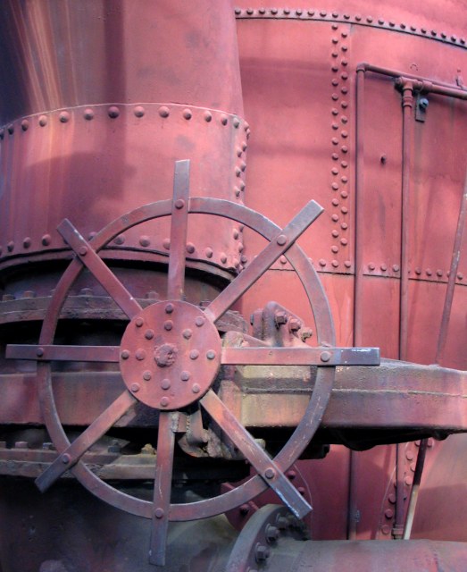
I just loved the look of this the minute I saw it, but I was disappointed that it looked dull because the subject is so interesting. You can't see the full item, only a tanatalising portion of it, so you are drawn into it to try and work out what it is. Any image that actively engages the eye and mind like this starts ahead of the pack.
Composition:
Technically right on for the rule of thirds with the wheel centre right on the thirds intersection. Nice and tightly cropped so that as i said above, you have to really explore it.
Subject:
Perfect for this challenge but also very very good just as a general image about technology. I had no idea it was old until I read your comments, I just thought it looked interesting and timeless. Sure the wheel looks old design but the rest of it looks in such great condition.
Technical (Colour and light):
Your first two commenters picked up on it straight away. This image has just soooo much power and potential which aren't realised because it just looks a little 'flat'. It's nice and sharp too so I'd stick with the Powershot :)
The other thing to look for is the little details. We're a picky lot here and as we wade through hundreds of images to vote on, anything that looks like the photographer has been a bit lazy on, will get a point or two slahed off it. Most of the basic editing packages allow you to rotate and straighten images. I don't think I;ve taken one straight in the camera yet. Your verticals are not vertical. It's not a life and death thing but it does niggle. In this case it will be 1 deg or something like that - thats all.
Growing its vote?:
It's the colour. Only the colour. If you have the benefit of some reasonable photo editing software that does three basic things, contrast, hue and saturation, then you can quick jazz it up and give it a heightened degree of wow factor.
I am usually reluctent to tell people what I whould have done with their images because most photographers think long and hard about the shot before its taken. Post-processing is a little different simply because it takes a long time to learn and the best tips are usually those that have been passed on by someone else. So I thought perhaps you might not take offence if I demonstrated what we're talking about with the colour here by doing a quick edit on it.
I have taken your image into Paint Shop Pro and made the following adjustments to demonstrate. Contrast +37, Hue +19, Saturation +26, that's all, it took 35secs.
 (Click image for full size) (Click image for full size)
As you can see, the result fairly 'pops'. Yes it is overdone and the blue tinge needs to be adjusted out, but this is just a very quick demo of what is lurking in every negative we take.
Summary:
This is a cracker image that could have really rocked in the voting with a little post shot editing. I looked at your portfolio and like what you are doing, good luck.
Brett
|