| Author | Thread |
|
|
10/20/2014 12:59:38 PM |
| Speaking words of wisdom. |
|
|
|
02/26/2006 08:32:57 PM |
| I can't believe I haven't seen this before Hanneke, it's wonderful!!! Had I voted I would have quickly hit "10" - superbly done! |
|
 Photographer found comment helpful. Photographer found comment helpful. |
|
|
01/09/2006 05:07:51 PM |
I understand puzzled ;)
I had the comment from someone else about the pants on the side of my nose before entering it. tried to get that part away, but I thought it was missing something over there to make the photo "fit", if you know what I mean.
@ Palmetto: while voting, I read the comments about the "too white", but I didn't know it was really too much. I thought it was just right. Think my monitor is set a little too bright...
thanx everybody for commenting, very much appreciated!!
Message edited by author 2006-01-09 17:08:06. |
|
|
|
01/09/2006 04:57:28 PM |
Hi there, biteme - just wanted to say that this deserved at least a 6.4 :-) I enjoyed the shot and enjoyed reading your comments about it. I learned a lot from reading the comments made, too. I think you have a perfect face for this kind of profile shot. It might be interesting to see your nose area, around where your pants are sticking out a little, slightly more defined. Hmmm, that last part of the comment sounds funny. Just PM me if you want me to explain :-)
|
|
| Photographer found comment helpful. |
|
|
01/09/2006 10:33:27 AM |
| I really like this shot. I expected it to do better than "middle of the road". The high-key purity is wonderful. I agree with the others, it may be a little "too white", but with a slight adjustment, this would be perfect! |
|
| Photographer found comment helpful. |
Comments Made During the Challenge  |
|
|
01/08/2006 10:24:03 PM |
| Nice use of high key effect. 7 |
|
| Photographer found comment helpful. |
|
|
01/08/2006 05:01:38 PM |
Love the blown out affect you have achieved.
9'
good luck
Kev |
|
| Photographer found comment helpful. |
|
|
01/08/2006 03:41:43 PM |
|
| Photographer found comment helpful. |
|
|
01/08/2006 01:28:12 PM |
| I like the use of selective desaturation a lot. Very nice high key image. 8 |
|
| Photographer found comment helpful. |
|
|
01/08/2006 01:03:45 PM |
| Very nice high key! Bumping up. |
|
| Photographer found comment helpful. |
|
|
01/06/2006 02:32:48 PM |
| Would be really great with more contrast... 6 |
|
| Photographer found comment helpful. |
|
|
01/06/2006 01:21:30 PM |
| I love how the hands stand out but the face blends in with the background a bit too much because of a lack of contrast. Maybe a bit more room on the left side of the hands would have been nice. |
|
| Photographer found comment helpful. |
|
|
01/05/2006 07:25:39 PM |
| I like your selective color and your creativity in putting this shot together. |
|
| Photographer found comment helpful. |
|
|
01/05/2006 07:51:46 AM |
| Very good treatmetn of the almost mono whiteness, very impressive and expressive |
|
| Photographer found comment helpful. |
|
|
01/04/2006 10:40:00 PM |
| The actual picture itself, I'm not terrbily crazy about. I really like your use of desat and high key though. Good work |
|
| Photographer found comment helpful. |
|
|
01/04/2006 07:14:27 PM |
| Maybe a little too high key. We lose some detail which, I think, would be nice. Not bad though. 6 |
|
| Photographer found comment helpful. |
|
|
01/03/2006 11:58:52 PM |
| Composition is ok. The choice of subject matter is ok. The image quality is ok. Has potential of being really creative. - 5 |
|
| Photographer found comment helpful. |
|
|
01/03/2006 10:17:04 PM |
|
| Photographer found comment helpful. |
|
|
01/03/2006 09:33:20 PM |
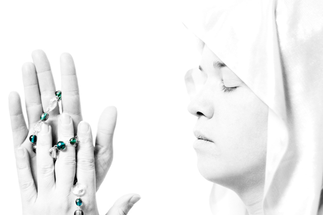
| I'm glad you did this shot. I was hoping someone would. I would have, and thought of it, but didn't have a model. This is a very nice depiction though. I don't think I would have thought to do a lot of white in the photo. I'm bumping this up. The model is great. Looks very angelic, and the hands look very pure. I also like the rosary beeds shoing through. Would have liked to see a cross though. |
|
| Photographer found comment helpful. |
|
|
01/03/2006 07:28:44 PM |
Too washed out to be significant
|
|
| Photographer found comment helpful. |
|
|
01/03/2006 05:53:10 PM |
|
| Photographer found comment helpful. |
|
|
01/03/2006 07:23:04 AM |
| This is quite surreal, even eerie...... |
|
| Photographer found comment helpful. |
|
|
01/03/2006 03:08:55 AM |
| Superb!! Favourites. 10!! |
|
| Photographer found comment helpful. |
|
|
01/03/2006 01:07:52 AM |
| too white for me, hurts my eyes |
|
| Photographer found comment helpful. |
|
|
01/02/2006 10:09:38 PM |
| Interesting desat, too white for my liking, but that is me:) |
|
| Photographer found comment helpful. |
|
|
01/02/2006 09:40:06 PM |
| i like the picture except that it is so bright that I cant look at it for more than a minute |
|
| Photographer found comment helpful. |
|
|
01/02/2006 08:22:07 PM |
| like the high key nice image good luck |
|
| Photographer found comment helpful. |
|
|
01/02/2006 01:07:57 PM |
| I wanted to try something like this (being a catholic) somehow your photo (without the title) doesn't lead me to mother mary, perhaps a little more covered face, less wrinkled hands... more like in a "prayer" attitude than a "posing" attitude, like there should be a deeper feeling, deeper emotion coming from the mother of Christ... you have something against you, we are used to seeing lots of different representations and form each one his own expectations from such a subject. I hope this helps, I am commenting with full respect to the subject, to Mother Mary and to you, I think this is a good photo but is just lacking something. |
|
| Photographer found comment helpful. |
|
|
01/02/2006 09:25:20 AM |
| I like the whiteness as far as the purity feel... but it's just a bit too bright for me. |
|
| Photographer found comment helpful. |
|
|
01/02/2006 01:31:45 AM |
| A bit too stark. I like it otherwise. Creative. |
|
| Photographer found comment helpful. |
Home -
Challenges -
Community -
League -
Photos -
Cameras -
Lenses -
Learn -
Prints! -
Help -
Terms of Use -
Privacy -
Top ^
DPChallenge, and website content and design, Copyright © 2001-2024 Challenging Technologies, LLC.
All digital photo copyrights belong to the photographers and may not be used without permission.
Current Server Time: 04/18/2024 06:31:29 PM EDT.