| Author | Thread |
Comments Made During the Challenge  |
|
|
01/08/2006 11:59:09 PM |
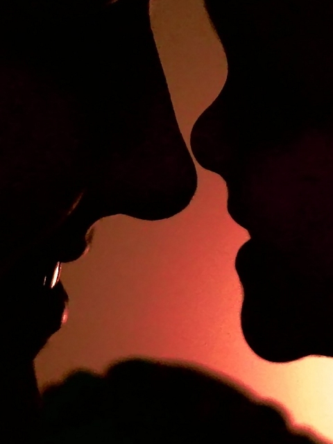
| I like this better the second time around great pic |
|
 Photographer found comment helpful. Photographer found comment helpful. |
|
|
01/08/2006 11:17:47 PM |
| This would be sweet, minus the distracting blob on the bottom... |
|
| Photographer found comment helpful. |
|
|
01/08/2006 03:41:18 PM |
| I kind of like the silhouette look, but the image lacks something for me - there's really nothing to keep my interest, or to keep me coming back to it. |
|
| Photographer found comment helpful. |
|
|
01/08/2006 01:42:42 AM |
| I'm not sure but I am guessing this is a daughter/mother profile close up? Neither are very feminine looking because of the tight crop, IMO. |
|
| Photographer found comment helpful. |
|
|
01/07/2006 11:57:33 PM |
|
| Photographer found comment helpful. |
|
|
01/06/2006 03:07:06 AM |
|
| Photographer found comment helpful. |
|
|
01/06/2006 01:18:06 AM |
Awwwww
I like the red. wonder if blue or a softer color would have worked better?
(not voting on this one) |
|
| Photographer found comment helpful. |
|
|
01/06/2006 12:41:11 AM |
| A very nice use of the silhoutte. Bumping up. |
|
| Photographer found comment helpful. |
|
|
01/05/2006 07:26:16 PM |
| This one is nice. I love a silhouette, but maybe if you had pulled back a little bit more to have more of their faces or them in the shot. |
|
| Photographer found comment helpful. |
|
|
01/04/2006 11:02:04 PM |
| Great silhouette. The bottom shadow is distracting a little only because it is not readily identifiable. But the expressions are great. Good job. |
|
| Photographer found comment helpful. |
|
|
01/04/2006 07:22:45 PM |
| The lower shadow is too blurred. I like sillouettes to be in sharp relief. A similar problem exists with mom's lips. 6 |
|
| Photographer found comment helpful. |
|
|
01/04/2006 03:19:01 PM |
| took me awhile to understand what this was, i got it though, great great shot!! |
|
| Photographer found comment helpful. |
|
|
01/03/2006 10:30:45 PM |
| The composition needs a little work. The choice of subject matter is ok. The image quality is a little below average. Could have been a little more creative. - 3 |
|
| Photographer found comment helpful. |
|
|
01/03/2006 10:22:33 PM |
| I would have like this better without the black area at the bottom. |
|
| Photographer found comment helpful. |
|
|
01/03/2006 10:02:23 PM |
|
| Photographer found comment helpful. |
|
|
01/03/2006 10:08:23 AM |
| Not sure what the shadow at the bottom is.. hands? |
|
| Photographer found comment helpful. |
|
|
01/03/2006 01:11:06 AM |
| the bottom of this is very distracting.. otherwise i really like this picture.. i like these type of photos.. 7 |
|
| Photographer found comment helpful. |
|
|
01/02/2006 10:51:21 PM |
| I cant see any real connection with mothers although I didnt dock for that. If this wasnt so close up might have made a difference, her nose is the central focus of the pic, not usually a good focal for me. The colors are a bit strange, maybe too saturated, more of a glowy feel might be better. Also last point if you could get rid of the glow on the back back part, the coloring makes it too much. |
|
| Photographer found comment helpful. |
|
|
01/02/2006 08:26:16 PM |
| Your opposing title confuses me a bit, but I like the silhouettes. |
|
| Photographer found comment helpful. |
|
|
01/02/2006 08:13:47 PM |
| different take on the challenge good luck with it |
|
| Photographer found comment helpful. |
|
|
01/02/2006 09:29:08 AM |
I would have chosen a more symmetric composition.
But the idea is good. |
|
| Photographer found comment helpful. |
Home -
Challenges -
Community -
League -
Photos -
Cameras -
Lenses -
Learn -
Prints! -
Help -
Terms of Use -
Privacy -
Top ^
DPChallenge, and website content and design, Copyright © 2001-2024 Challenging Technologies, LLC.
All digital photo copyrights belong to the photographers and may not be used without permission.
Current Server Time: 04/18/2024 10:39:45 AM EDT.