| Author | Thread |
|
|
03/01/2006 05:36:00 PM |
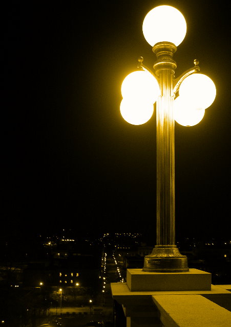
I gave this a 5. I thought it was an OK image. Reasons I didn't vote it higher:
I thought it was just that little bit TOO yellow, just for my taste.
The lights are overexposed.
The composition feels a little out of balance. You have the lamp post pretty much on a thirds line, but then you have the (street? runway?) going straight down the middle. It just feels a little awkward to look at; there's nowhere to let the eyes come to rest somehow.
|
|
 Photographer found comment helpful. Photographer found comment helpful. |
|
|
03/01/2006 10:42:36 AM |
| I love your perspective and title! I think the hot areas on the lamppost and lights may have hurt your score. Dusk would be a good time if you reshoot. Your tones are great and I think it was underrated, too. |
|
| Photographer found comment helpful. |
|
|
03/01/2006 02:26:53 AM |
The approach looks so much different when you're not drunk ... still recognizable though :)
Maybe a graduated ND filter would help bring out more of the city (which, after living there, I don't know why I'm suggesting this is a good idea).
[edit: fixed grammar, hopefully]
Message edited by author 2006-03-01 23:46:29. |
|
| Photographer found comment helpful. |
|
|
03/01/2006 01:05:55 AM |
I hope you see my comment as constructive and helpful in your pursuit to improve your photos ;)
My first impression of this image is that it is unbalanced. In as much as asymmetry works in images sometimes, the weight of the lamp post versus the negative space is unequal hence most viewers would think that this image is weighted more on the right. The almost green glow that is cast on the concrete doesn't seem render a warm and evoking image. I think this image suffered from lack of interest frankly. Had there been more "twinkle" or lights in the background, I think there would be more interest. The sparse background also contributed to the viewers lack of interest. The crop could be improved. IMHO, the top of the photo is too tight compared to the bottom. I think a tighter crop at the bottom of the image would allow for more black space that could offset the unbalanced nature of this image. Last but not the least, the exposure could have been set a bit too long as seen from the hotspots in the lamps. The top lamp seems to be exposed correctly but not the bottom ones.
Keep practicing on these kind of shots. They are not easy and demands practice. But I would think that with enough practice, you could definitely imrpove on this image.
Cheers,
Rikki
Message edited by author 2006-03-01 01:06:14. |
|
| Photographer found comment helpful. |
|
|
03/01/2006 01:03:33 AM |
| Good old Troy, NY. I spent 4 years in Albany. It's a nice picture and I do think it was underrated. The tone is excellent and makes you feel like these are old sulfur lights. I like the dropoff, but perhaps the tiny lights below aren't enough to fill out the rest of the shot. It's not like you can change it, but it may be limiting here. I'd like to see a shot taken at dusk so the lights are on but you could see more detail below. You could make it dark in PP. Technicals are good. I don't mind the slight overexposure of the lamps, it gives them a nice glow. The crop is nice as well. I would have scored this a 6 on the limitations of the rest of the canvas. |
|
| Photographer found comment helpful. |
|
|
03/01/2006 12:58:00 AM |
Over all it is a very nice composition... very calculated. Probably the biggest thing that hurt you in the challenge is that that lights (globes) are too hot (over exposed)... on a calibrated monitor the four bottom globes tend to flow together with not distiction overpowering the shot.
Andy |
|
| Photographer found comment helpful. |
Comments Made During the Challenge  |
|
|
02/28/2006 01:11:20 PM |
| I wish I could take night shots that good. Nice work. Did you use a tripod or do you just have a steady hand? |
|
| Photographer found comment helpful. |
|
|
02/25/2006 06:37:38 AM |
| The composition seems unbalanced somehow. 4 |
|
|
|
02/24/2006 02:54:51 PM |
| Nice shot! It would be better with backround more visible, good colour! |
|
| Photographer found comment helpful. |
|
|
02/22/2006 11:13:03 AM |
| Nice exposure and beautiful tones. |
|
| Photographer found comment helpful. |
Home -
Challenges -
Community -
League -
Photos -
Cameras -
Lenses -
Learn -
Prints! -
Help -
Terms of Use -
Privacy -
Top ^
DPChallenge, and website content and design, Copyright © 2001-2024 Challenging Technologies, LLC.
All digital photo copyrights belong to the photographers and may not be used without permission.
Current Server Time: 04/28/2024 07:43:56 AM EDT.