DPChallenge: A Digital Photography Contest You are not logged in. (log in or register
 
Challenge Entries
Portfolio Images
This image is not part of a public portfolio.
Memorial Arch - Valley Forge
panynj


Photograph Information Photographer's Comments
Challenge: Square Crop (Advanced Editing IV)
Camera: Casio Exilim EX-Z750
Location: Valley Forge National Historical Park
Date: Mar 3, 2006
Aperture: f/8
ISO: 50
Shutter: 1/250
Galleries: Snapshot, Emotive
Date Uploaded: Mar 3, 2006

Got a great day with bright sun, partly cloudy skies, and a stiff breeze. Post-processing: slight adjustments to contrast and saturation, crop, resize.

Statistics
Place: 241 out of 369
Avg (all users): 5.2200
Avg (commenters): 5.1111
Avg (participants): 5.1163
Avg (non-participants): 5.4085
Views since voting: 780
Views during voting: 262
Votes: 200
Comments: 10
Favorites: 1 (view)


Please log in or register to add your comments!

AuthorThread
03/16/2006 04:07:27 PM
Greetings from the Critique Club...

Hi panynj :)

Compositionally, this is a nice image. Subjectively, it doesn't offer a lot of interest to me. I think the blue saturation is overboard to the point of looking very unnatural. At least you didn't get but one flag hater to comment on the image :) People outside the United States don't seem to have much patriotism for their own countries, and they really hate Americans who do. Politics will override great photography in most cases...

John Setzler
 Comments Made During the Challenge
03/12/2006 07:23:22 PM
640x638 : (
03/12/2006 10:09:14 AM
Sorry not square.
03/08/2006 04:17:24 PM
Nice photo!
  Photographer found comment helpful.
03/07/2006 03:22:15 PM
Sorry, do not like flag waving...
03/07/2006 02:28:57 PM
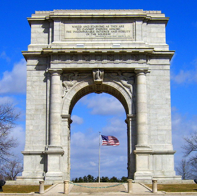
decent enough detail, and focus, and so on, but to me simply an architectural portrait - telling me very little, affecting me likewise very little. Whilst the exposure is 'correct' in the sense of nothing is over- and nothing is under-exposed, the overall brightness of this is taken too far: you'd get more impact, more sense of the true depth of colour of the stone, more drama to the shot if you were to lower the overall brightness level - just try adjusting with levels and moving the slider to the right a bit, just to give it some punch. A perfectly fine, ut an unexciting entry.
  Photographer found comment helpful.
03/07/2006 02:13:26 PM
this is pretty average, but none-the-less an okay image
  Photographer found comment helpful.
03/07/2006 12:40:56 AM
In our current political climate, this will undoubtedly go under appreciated. I like it a lot! Thanks!
  Photographer found comment helpful.
03/06/2006 02:39:28 PM
Beautifully done. Lovely symmetry. 8.
  Photographer found comment helpful.
03/06/2006 08:37:32 AM
Beuatiful blue sky. I like the angle.
  Photographer found comment helpful.


Home - Challenges - Community - League - Photos - Cameras - Lenses - Learn - Prints! - Help - Terms of Use - Privacy - Top ^
DPChallenge, and website content and design, Copyright © 2001-2024 Challenging Technologies, LLC.
All digital photo copyrights belong to the photographers and may not be used without permission.
Current Server Time: 04/19/2024 01:17:26 PM EDT.