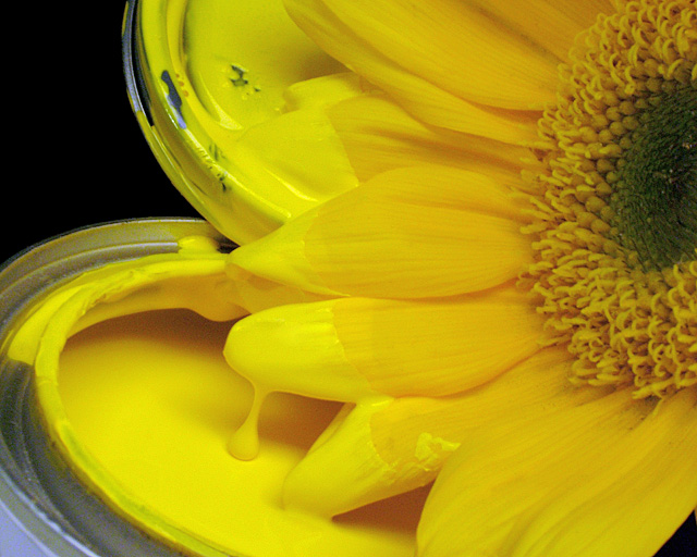
I went to the hardware store around the block to get something for an external flash for my camera...I lost the knob that screws into the bottom of the camera. While there and thinking Macro Abstract at the time, I bought a small can of yellow paint, thinking it was oil based I could shoot that. No dice. But it was yellow. So I shot the can and lid and it was...well yellow...not too much to it. Then I thought about getting a flower. There was only one local florist open and instead of getting one of the ratty looking yellow gerberas they had, I got some sunflowers instead. SO....I stuck the ends of some of the petals in to the paint and hoped to get a drip off one of the petals and I did so here it is. Just trying something a little different, I hope. We'll see.
Post. Crop. Re-Crop. Layer adjustments for levels, brightness/contrast and hue/saturation. Power Retouche Dynamic Range compressor, to bring out the center of the flower and dull some of the highlights in the paint. Sharpen. Clone and healed schmutz on the flower and highlights and bright spots in the paint and on the paint on the flower. Left a few of the less offensive ones so that it would not look to flat. Also cloned a very small bit of lettering on the can in the bottom left corner. Resize. Sharpen.
**************************************
07/31/2006
Greetings Robert,
Well here I am again writing to say Congratulations!
"Touch Up" has been accepted for Picture of the Day and
will appear August 3, 2006 on the Home Page of kodak.com,
in Picture of the Day, and every few minutes on the Kodak
Times Square Gallery in New York City.
In addition, your picture has been selected as a featured
Picture of the Day image, and will appear during the month
of August on this popular page on the Kodak Website:
~Inkjet Paper~
//www.kodak.com/eknec/PageQuerier.jhtml?pq-path=8935
As always, thank you for sharing your beautiful pictures with
us, and our kodak.com visitors!
Best Regards,
Marianna O'Brien
Statistics
Place: 74 out of 404 Avg (all users): 5.9200 Avg (commenters): 6.6667 Avg (participants): 5.9077 Avg (non-participants): 5.9556 Views since voting: 886 Views during voting: 221 Votes: 175 Comments: 6 Favorites: 2 (view)
I like the idea, but the photo itself is a little busy imho. Might be fixable by eliminating the paint can lid (I don't think the lid is really necessary), desaturating all but the yellow channel and focusing more on the petals and less on the central part of the flower. Those are my suggestions anyway.
Colors of the yellows are very bold and vibrant in this shot. Lighting and detail sharpness are done exceptionally well. The composition is good over-all but I think it mayhap suffer abit too much with 'over-saturation'. What I mean by that is that the viewer is hit up with a bit too much yellow - the yellow hue of the paint is almost the same shade as the yellow of the daisy and as such there is little contrast/difference between the two elements for the viewer to appreciate. Perhaps if the daisy was a different color the color of the yellow paint would really stand out or vice versa - i.e. painting a white daisy or some natural two-tone daisy that I have seen that are yellow & white. I do hope I am explaining what I mean effectively. Or explained in another way: If you had a painting with just shades of yellow on yellow side-by side with another painting with a shade of yellow paired with white. The two-tone painting will stand out more than the same shade painting only because visually it pops a bit more. That is what I think is needed here - an addition of another partner color that would make this visually pop more. Aside from that the photo is above average but not just yet in the exceptional category.
HAHAHA! I LOVE IT! Very creative, well done, good lighting, unique idea! The only thing that bugs me is the corner of blue in the lower left, it's fighting for attention with the flower and paint. Other than that, which I'm going to forgive you for because this is by far my favorite so far you get a 10