| Author | Thread |
|
|
05/05/2006 11:44:22 PM |
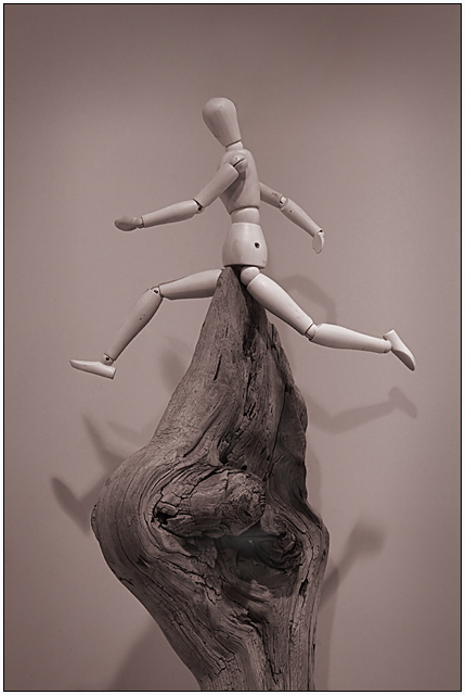
| Vaguely reminiscent of the hospital scene in the book, "Catch 22", where Nurse Duckett gets suspended upon her 'divine fulcrum'! |
|
 Photographer found comment helpful. Photographer found comment helpful. |
|
|
05/03/2006 07:30:20 AM |
| It's witty, I like it. :) |
|
| Photographer found comment helpful. |
|
|
04/19/2006 09:45:56 AM |
| Love the subject but don't like the color cast or the flat contrast. Just MHO. :) |
|
| Photographer found comment helpful. |
|
|
04/17/2006 07:20:27 PM |
OK, you've probably forgotten more about photography than I know, but here goes...
1) I would have gone with a single light source. The multiple shadows tend to confuse the eye.
2) With that, perhaps upping the contrast. I know I'm leading to a slightly different shot overall, but I'm trying to add a bit more dynamics.
3) That warm gray looks more like a mauve on my monitor. Not a fan.
4) If you are happy with it, then who the hell cares? ;) |
|
| Photographer found comment helpful. |
|
|
04/17/2006 09:54:21 AM |
I really hate the way Woody shots are treated on this site. I am convinced people are jealous because they don't have a Woody or do but lack the imagination to create a good shot with one. In any case, I know where at least one of your 10's came from.
Thanks for the 'cringe of pain!' Nice job on an underappreciated shot.
|
|
| Photographer found comment helpful. |
Comments Made During the Challenge  |
|
|
04/16/2006 11:26:47 PM |
| Ouch! Enough to make men cry! :) |
|
| Photographer found comment helpful. |
|
|
04/15/2006 02:52:05 PM |
| Your subject is not very interesting. The Woodies are hard to handle in photography, if you use them you should make sure that it results in something unusual and unexpected. On the technical side, your subject is lit too flatly and casts distracting shadows on the background. (You can prevent this by moving the background further back.) The picture might also profit from a stronger contrast, it would add to the nice textures in the wood. 3. |
|
| Photographer found comment helpful. |
|
|
04/13/2006 09:35:23 PM |
| Owwww!!! And I'm not even a guy! |
|
| Photographer found comment helpful. |
|
|
04/12/2006 11:30:23 AM |
|
| Photographer found comment helpful. |
|
|
04/11/2006 11:29:01 PM |
|
| Photographer found comment helpful. |
Home -
Challenges -
Community -
League -
Photos -
Cameras -
Lenses -
Learn -
Prints! -
Help -
Terms of Use -
Privacy -
Top ^
DPChallenge, and website content and design, Copyright © 2001-2024 Challenging Technologies, LLC.
All digital photo copyrights belong to the photographers and may not be used without permission.
Current Server Time: 04/23/2024 04:42:41 AM EDT.