| Author | Thread |
|
|
07/21/2006 05:31:56 PM |
what a nice&funny concept\
beautiful use of 'dooie ruimte' ook
well done |
|
 Photographer found comment helpful. Photographer found comment helpful. |
|
|
04/29/2006 03:22:30 PM |
::: Greetings from Critique Club :::
Hi, as requested, here is an indepth critique of your submission.
First Impression - the most important one:
Loved it in the challenge, love it here. Thought it was creative and well executed with an interesting PoV.
Composition:
Works very well. Clean and appealing.
Subject:
Can miss it and the white bg couldn't go wrong.
Technical (Color, focus, and light):
All good. Materful techicals.
To grow its vote?:
Hell, you tell me :-)
Summary:
Good entry for this challenge. Keep up the good work.
Hope to see more from you soon,
Leroy |
|
| Photographer found comment helpful. |
Comments Made During the Challenge  |
|
|
04/23/2006 06:45:14 PM |
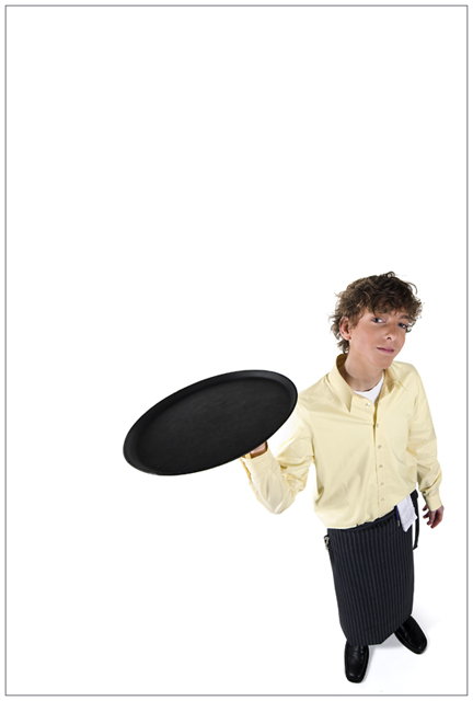
| This is really nice, love the perspective. Can't help but think it would be a tad better if there were something on that tray. |
|
| Photographer found comment helpful. |
|
|
04/23/2006 04:12:58 PM |
| A little to omuch white space on top. A bit more sharpness in his face would be nice too - but I enjoyed this shot. Great angle |
|
| Photographer found comment helpful. |
|
|
04/23/2006 10:36:41 AM |
Too much negative space for my taste. Nice overall composition though!
TC |
|
| Photographer found comment helpful. |
|
|
04/21/2006 08:24:21 PM |
|
| Photographer found comment helpful. |
|
|
04/21/2006 06:25:53 PM |
| Weird perspective, it makes him look rather flat. Interesting effect. |
|
| Photographer found comment helpful. |
|
|
04/21/2006 08:13:31 AM |
| I like this one, I just wish his face didn't look distorted. A 9! |
|
| Photographer found comment helpful. |
|
|
04/20/2006 10:50:26 PM |
| I love that britcom, and this picture is ok, but his hair is a mess. |
|
| Photographer found comment helpful. |
|
|
04/20/2006 08:18:13 PM |
| Nice photo. Would work great as a stock image but as a portrait I just don't know. |
|
| Photographer found comment helpful. |
|
|
04/20/2006 07:59:32 PM |
| really coool perspective for portrait....9 |
|
| Photographer found comment helpful. |
|
|
04/20/2006 09:51:51 AM |
great use of negatine space and all that stuff.
different than the usual portrait.
excellent.
my favorite so far. |
|
| Photographer found comment helpful. |
|
|
04/20/2006 12:10:56 AM |
cute, almost funny take. The model has a cute, and almost natural expression on his face, nice!
good use of negative space, actually - tho I think it's a love it or hate it kind of thing to some people. White is a good choice too.
Message edited by author 2006-05-17 23:48:04. |
|
| Photographer found comment helpful. |
|
|
04/19/2006 05:29:03 AM |
| this looks like a stock photograph, nice prespective. |
|
| Photographer found comment helpful. |
|
|
04/18/2006 11:16:42 PM |
|
| Photographer found comment helpful. |
|
|
04/18/2006 09:17:21 AM |
| Something on his plate would make the photo better and maybe if you have placed him a little bit further from the corner. It's good though. |
|
| Photographer found comment helpful. |
|
|
04/17/2006 09:11:52 PM |
|
| Photographer found comment helpful. |
|
|
04/17/2006 02:27:09 PM |
| Very nice picture, nice use of negative space. |
|
| Photographer found comment helpful. |
|
|
04/17/2006 11:54:22 AM |
| Very cool, although I would have liked to see it just a tad bit closer to the subject. |
|
| Photographer found comment helpful. |
|
|
04/17/2006 08:19:40 AM |
| I love the angle, tilt and perspective on this shot. Very cool and fun. The lighting and white backdrop are very well done as well. The only thing that detracts for me is the black tray/light yellow shirt/black apron. My eye sees the tray first, and then down to the apron and misses his face. Regardless, this is one of my favorites. 8 from me. |
|
| Photographer found comment helpful. |
|
|
04/17/2006 08:16:53 AM |
| Nice angle and use of negative space. -8- |
|
| Photographer found comment helpful. |
|
|
04/17/2006 07:48:33 AM |
| great work! love the perspective. Well done, hope you do well with this... |
|
| Photographer found comment helpful. |
|
|
04/17/2006 07:34:42 AM |
not recently. ;)
great portrait |
|
| Photographer found comment helpful. |
|
|
04/17/2006 05:27:07 AM |
| Good pose, good composition and good different idea. The neutral space is everything to this pic - well done |
|
| Photographer found comment helpful. |
|
|
04/17/2006 03:14:34 AM |
| Great shot! Good angle - good colors and a great idea - 9 from me |
|
| Photographer found comment helpful. |
Home -
Challenges -
Community -
League -
Photos -
Cameras -
Lenses -
Learn -
Prints! -
Help -
Terms of Use -
Privacy -
Top ^
DPChallenge, and website content and design, Copyright © 2001-2024 Challenging Technologies, LLC.
All digital photo copyrights belong to the photographers and may not be used without permission.
Current Server Time: 04/18/2024 10:27:46 PM EDT.