| Author | Thread |
|
|
05/02/2006 07:47:57 AM |
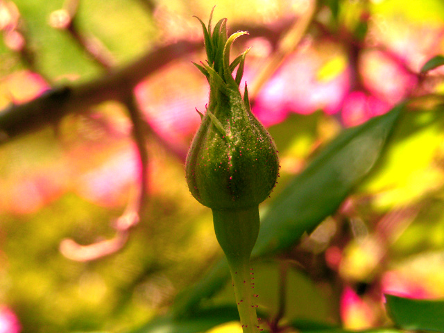
| Right off the bat I am thinking "Too much saturation". Knock down the saturation as a whole and then maybe knock down the saturation again in the background to allow the bud to stand out on its own rather than be flooded by the intense colors in the background. Rotate the pic so the bud is coming more from a corner into thepic instead of standing right there would be nice too. But stillwhen I go back and look at it again the saturation is just overwhelming. |
|
 Photographer found comment helpful. Photographer found comment helpful. |
|
|
04/30/2006 05:08:47 PM |
Before I start, lets be honest - this isn't really my kind of picture.
For a start, the composition is a bit dead with the bud right in centre. This is an occasion I'd recommend the rule of thirds, or a slight diagonal. Also, the colours are very garish, and the brightness of the background means that the bud - the main subject - doesn't stand out as much as it should, and the b/g is very distracting. The pink thorny bits are a bit too bright, and at this compression just look lke ompression artifacts/hot pixels or something similar.
This is my take of it - more muted colours, diff crop

-crop, some slight cloning after rotation
-select background, create new layer via copy
-hue&saturation on b/g layer - saturation waaay down
-slight gaussian blur and lightening via levels on b/g
-levels on f/g
-much lower hue on reds, on all but top tufts on f/g, plus less lightness to keep the spikes visible
|
|
| Photographer found comment helpful. |
|
|
04/29/2006 11:00:09 PM |
ok. i like that you captured the red dots on he sprout.
um
it looks over sharpened and the bg is horrible. the bright colors of the bg do nothing but make me wanna turn my head away from the subject.
ifn you could pull that guy out and put him in a more "picturesque bg it would be better. and i think i would like to have him a little more off to the right.
|
|
| Photographer found comment helpful. |
|
|
04/29/2006 08:53:35 PM |
there are a few things that could really improove this image..
1. the subject is dead center, that will almost always score low on DPC, crop about 1" of the left side, the right side looks better.
2 the colors in the background steal all the attention from the subject, this is advanced editing, selective desat would have been great here.
3. the background is too bright, a bit of burning could help
but this image is well lit, the focus is good and it's a nice subject, even though it would be nicer if the bud were a bit open. |
|
| Photographer found comment helpful. |
|
|
04/29/2006 08:09:43 PM |
Colours in this image are wonderful. It may be due to post-processing, but really enjoy the red or magenta tones. I think the strength of this image may have been helped by a portrait orientation, rather than landscape. It could be argued that with the current orientation, we get more of that lovely jumble of colour to contemplate, but for me, the verticality of the reaching bud demands a taller and less wide image.
Though the background is indeed interesting, it's also a tad harsh, for me. I really want to look at it. :) But I should be looking at the bud, I think. Had you lit the bud a little more, perhaps with fill flash, the effect may have been strengthened. |
|
| Photographer found comment helpful. |
|
|
04/29/2006 04:45:32 PM |
| You have taken on a tall order here, IMHO. You have a relatively small, dark green subject matter with a large bright background. While the colors in the background are pretty, they are competing with the new bud. I think I would have tried a different angle and/or used the dodge and burn tools (if permitted in this challenge) to strengthen the bud and diminish the background. Things that I like are the sharp focus on the bud (right down to the little nodules on the stem) and the lighting on the bud. I think a vertical cropping might help since your bud is a vertical object (the horizonal picture does not support the 'direction' of the primary subject, whereas a verticle picture might). |
|
| Photographer found comment helpful. |
|
|
04/29/2006 11:44:21 AM |
| Wow! There's some serious color in this one :) The only negative part of that is that the color is all in the background, and the subject is pretty dark. Keeping all that saturation in the back would have been great, but maybe a teensy bit of fill flash on the bud itself would have given this one a lot more kick. I didn't vote on this but would have probably dished out a 5 or 6. It's also a little bit "static" because it's centered. I really love the color, though!! |
|
| Photographer found comment helpful. |
|
|
04/29/2006 10:50:47 AM |
| Fits the challenge well and the subject is in sharp focus, but the subject is also overwhelmed by the brightness of the background. I love the overall color of the picture. |
|
| Photographer found comment helpful. |
|
|
04/29/2006 02:10:52 AM |
| I thnk that Dr Achoo hit the nail on the head. While I ma not a stickler for the "rules" of photography, the rule of thirds would serve this shot well. The lighting is somewhat harsh, and using some fill flash and a quicker shutter speed might help to isolate your subject from that busy background. It does seem over-saturated, but I am not sure that the red dots aren't there anyway. Overall, not bad, but still room for improvement. |
|
| Photographer found comment helpful. |
|
|
04/26/2006 04:20:42 PM |
OK, I gave this one a 3 on the vote through. That seems pretty harsh considering you got a 5.15. My thoughts:
1) The composition is quite centered. Try to move the subject to one side (usually the right side with space on the left).
2) The thing that really got me was the supersaturation. The pink line that is just to the right of the bud looks completely blown out and that doesn't make for a good look. You can also see the saturation in the red dots on the bud itself.
3) The lighting is a bit harsh. perhaps try in the morning or evening.
Good things are the nice DOF and the sharp focus of the subject. I think you did well there. |
|
| Photographer found comment helpful. |
Comments Made During the Challenge  |
|
|
04/25/2006 10:06:47 PM |
| WOW new colors! I was just getting tired of macro flowers, but this is exciting. |
|
| Photographer found comment helpful. |
|
|
04/25/2006 01:50:33 PM |
| excellent colours, very strong and lively. |
|
| Photographer found comment helpful. |
|
|
04/25/2006 09:14:47 AM |
|
| Photographer found comment helpful. |
|
|
04/25/2006 04:53:14 AM |
| Your subject is rather overwhelmed by the bright background, |
|
| Photographer found comment helpful. |
|
|
04/22/2006 01:30:39 PM |
|
| Photographer found comment helpful. |
|
|
04/21/2006 08:49:00 AM |
| Great dof, but seems a bit oversaturated with the bold pinks both in the background and on the stem/bud. |
|
| Photographer found comment helpful. |
|
|
04/21/2006 12:43:32 AM |
|
| Photographer found comment helpful. |
|
|
04/20/2006 04:45:22 PM |
|
| Photographer found comment helpful. |
|
|
04/19/2006 08:08:58 PM |
| The bright background overwhelms the bud. |
|
| Photographer found comment helpful. |
|
|
04/19/2006 07:36:19 PM |
| subject is slightly underexposed...a little dodging may help the matter. |
|
| Photographer found comment helpful. |
|
|
04/19/2006 04:34:17 PM |
| Good idea. The bud may have looked better to one side. It is also in shade compared to a bright similar coloured background which stops it from standing out. Your depth of field used is very good. |
|
| Photographer found comment helpful. |
|
|
04/19/2006 06:11:26 AM |
| The vibrant colours here are fabulous, but distract my eye from the bud. |
|
| Photographer found comment helpful. |
Home -
Challenges -
Community -
League -
Photos -
Cameras -
Lenses -
Learn -
Prints! -
Help -
Terms of Use -
Privacy -
Top ^
DPChallenge, and website content and design, Copyright © 2001-2024 Challenging Technologies, LLC.
All digital photo copyrights belong to the photographers and may not be used without permission.
Current Server Time: 04/19/2024 10:56:09 PM EDT.