| Author | Thread |
|
|
06/15/2006 07:06:24 AM |
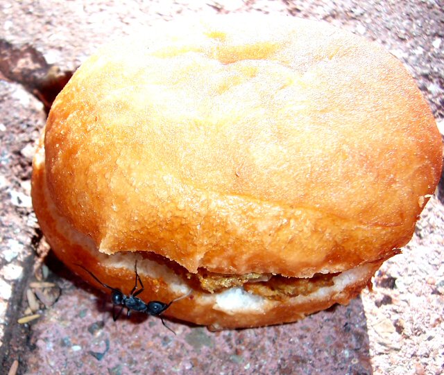
Hi from CTPII Gunnsi :-)
First impression
Funny but a bit blown at the top. Setup is good but I would have tried to have the Ant a little bit higher in the photograph to use the rule of thirds. He is the main subject isn't he? Also it is a bit destracting the bright stone on the right.
What could be better
Soften the lights, you could use baking paper to cut off the direct sunshine. Maybe zoom a bit closer allowing the meet to come through and crop away the distracting things. |
|
 Photographer found comment helpful. Photographer found comment helpful. |
|
|
06/13/2006 01:46:17 PM |
Greetings from your own critique club. Sorry, I was off the hook for a while.
First Impression
Nice idea, not so good execution.
Composition:
Needs improvement. Instead of shooting from top, I will sit down and just shoot the Ant. It's not required to have whole bread in the frame. Just the close up of Ant with bread in the back ground would have worked better.
Subject:
Subject is creative and fits the challenge.
Technical (Colour and light):
Lighting is bit harse on top of the bread. Colors are fine. Don't like the shadow of Ant and Bread.
Improvement:
Composition, Comosition, Composition...
Summary:
Good creative idea, needs better perspective and composition.
Cheers!! Keep shooting. |
|
| Photographer found comment helpful. |
|
|
06/05/2006 10:48:09 PM |
Hi from ctp2:
This is a really cute idea. The biggest problem I see is the lighting. The top of the bun is blown out, and the texture of the bun looks a bit funny. Also, the eye isn't immediatly drawn to the ant. To make this really effective, the ant would need to be more the focal point. The title is great, though, and brings the impact of the photo up a bit. |
|
| Photographer found comment helpful. |
|
|
06/04/2006 11:00:57 AM |
b]Hello from Álex, CTP MkII [/b]
First Impression: Nice idea but needs improvement.
Composition: is OK
Subject: Good, very clever for the challenge
Technical: it has major technicals flaws IMO: lighting is way too harsh, with parts blowned up; colors are a bit strange, maybe for the strong light
Improvement: lighting basically
Summary: good subject but needs better realization. Don't stop shooting
Álex
|
|
| Photographer found comment helpful. |
|
|
06/02/2006 06:09:36 PM |
Greetings from CTP2
Great idea but the execution is lacking a bit. The highlights are too harsh but more than that the ant is just not prominent enough in the frame. For an idea like this it needs to hit you square in the face and this falls short in that area. Just as a quick fix putting that ant on top would have sold the idea much faster in my opinion and probably would have automatically gotten you a higher score.
As for improving the technicals I think if you just got down even lower the highlights problem wouldn't have been an issue plus the ant would take on more of a central role in the frame itself. Another thought would be to spin the bagel around so the ant is receiving the direct sunlight and that way you would be shooting with your back to the sun, which would also help you avoid those blown highlights.
Message edited by author 2006-06-02 18:11:35. |
|
| Photographer found comment helpful. |
|
|
05/31/2006 10:12:55 PM |
Hi Laura -
This is a unique take on the theme, but I'm not sure I would get the idea of "Success" from just looking at the photo. I actually think, "How sad, someone dropped their bagel!" Technically, there are several problems. First and foremost is that the top third of the photo is tremendously overblown. Besides that, the color seems off, perhaps too red. I think much of the light and color issues is due to the light source being behind the subject, so my main suggestion for this shot is to light it more from the front, but diffusely to avoid glare since the bread (bagel?) is a bit shiny. Also, the bread/pastry is not well-centered, and is on the verge of being cut off on its rightmost edge.
It does look like you got some good DoF along the cut edges of the bread, which works well for the ant. |
|
| Photographer found comment helpful. |
|
|
05/31/2006 01:30:38 PM |
| Technical issues aside. I love this shot and the title. I remember that it brought a smile to my face during voting. Nice capture! |
|
| Photographer found comment helpful. |
Comments Made During the Challenge  |
|
|
05/30/2006 09:57:42 PM |
| this is SO bad..it's good hahaha |
|
| Photographer found comment helpful. |
|
|
05/29/2006 05:29:40 PM |
| Overexposed and somewhat blurred. Doesn't really fit subject "success" that well. |
|
| Photographer found comment helpful. |
|
|
05/29/2006 09:30:55 AM |
| Great presentation of the theme. Technically I think the ant could be better positioned - it is slightly hidden in the shadow of the bun. Also the top of the bun is a little overexposed. Result 7. |
|
| Photographer found comment helpful. |
|
|
05/28/2006 07:33:04 AM |
| Great idea and well set up. Shame about the exposure - the top of the image looks really overexposed. |
|
| Photographer found comment helpful. |
|
|
05/26/2006 03:16:47 PM |
| This might have been better if you'd cropped to about the bottom left quarter to highlight the ant instead of the overly bright burger. We'd have still gotten the impression of a BIG find for him, but would have seen it quicker without the unattractive distractions. It's a good idea, though :) |
|
| Photographer found comment helpful. |
|
|
05/25/2006 02:21:34 PM |
| The concept here is pretty good but the photo itself has a number of issues. The most noticcable would be the exposure as the bun has a huge burned out highlight. The composition seem a bit off as the bun is a little tight on the right side. I think it might have made a better point if the shot was taken at ground level to grab that ant's ponit of view. The color saturation and contrast seems to be set a few point to high. Keep trying :) |
|
| Photographer found comment helpful. |
|
|
05/25/2006 12:07:09 PM |
I see where you are going with this image, but....
Ok comp, blown out whites, blacks need help, ok texture, light very harsh, color flat, movement ok |
|
| Photographer found comment helpful. |
|
|
05/24/2006 05:11:16 PM |
| Very cute idea. I think I would have cropped it tighter to make the ant stand out more, especially as the top half of the roll is overexposed. |
|
| Photographer found comment helpful. |
|
|
05/24/2006 04:31:12 PM |
|
| Photographer found comment helpful. |
|
|
05/24/2006 12:35:46 PM |
|
| Photographer found comment helpful. |
|
|
05/24/2006 10:11:56 AM |
|
| Photographer found comment helpful. |
Home -
Challenges -
Community -
League -
Photos -
Cameras -
Lenses -
Learn -
Prints! -
Help -
Terms of Use -
Privacy -
Top ^
DPChallenge, and website content and design, Copyright © 2001-2024 Challenging Technologies, LLC.
All digital photo copyrights belong to the photographers and may not be used without permission.
Current Server Time: 05/21/2024 12:23:58 AM EDT.