| Author | Thread |
|
|
06/12/2006 02:52:25 AM |
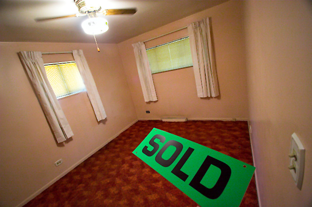
Greetings from the Critique Club. My critiques are generally geared towards trying to help you improve your score within DPC, and not on any true "artistic" merit of the photograph itself, unless it relates to DPC voters and scoring. Please keep that in mind as you read this.
Initial Thoughts
Not much to this.. what's with the big sign?
Composition/Content
While I understand what you were trying to accomplish with the composition (or, at least I think I do), It was a little too little for a shot that is otherwise just plain boring. I don't want to sound harsh, but that's how voters probably looked at this. You have everything you need for the challenge.. but there's just nothing *too* it. The harsh light from the ceiling fan only serves to detract as well, and really adds nothing. So, kudos to trying to liven up the shot with a different angle and perspective, but you just needed more to begin with. The sign is also.. to me.. a little gratuitous. The color clashes, and it really doesn't say anything the viewer doesn't already suspect. The room is empty, the challenge wanted the room empty, we don't really need to know *why* it is empty.. especially when the reason is done by means of photo attention stealing lime green sign.
Background
Not really applicable in this sense.
Camera Work/Technical
You exposure is ok for the most part, but the glaring lights hurt the shot. Were you to process the shot to take advantage of the lights (more gritty, dark, or contrasty), it might have worked more to your advantage. If you can't get a "WOW" shot for DPC, at least go overboard artistically, and try to wow some of us out there that can appreciate something a little different.
Digital Processing
Nothing really grabs you in this shot. The processing shows a realistic room with realistic lighting, and so it remains realistically plain. Some work and playing around with different filters and concepts could have brought something out in this that just isn't there as it is.
Fits the Challenge
Sort of.. it's an empty room, but you've kind of "filled" it with that sign. Like I said, gratuitous, and needed to go.. IMO.
My Opinion of the Photo
A nice job with perspective to try and turn a very mundane shot into a little something different. Without that sign, and with a bit more creative processing, you could have been on to something that might have garnered a higher 5. Always remember that DPC voters need something that grabs them immediately and can hold their attention. For my money, this is simply a shot I'd click 4 or 5 on within the first few seconds and move on. |
|
Comments Made During the Challenge  |
|
|
06/11/2006 11:01:11 PM |
| Nice perspective, creative idea. Well done! |
|
 Photographer found comment helpful. Photographer found comment helpful. |
|
|
06/11/2006 10:45:13 PM |
| Nice! Easy to find an empty room when moving anyway ... colors not my cup of tea, though |
|
| Photographer found comment helpful. |
|
|
06/11/2006 09:57:17 PM |
| I really like this photo. Very well done. Only thing that lets it down is the blown light and the light switch on the right! |
|
| Photographer found comment helpful. |
|
|
06/11/2006 04:44:01 PM |
| that's very creative!!! sweet! |
|
| Photographer found comment helpful. |
|
|
06/09/2006 07:46:05 AM |
| Nice luminous and flourescent colors; much more advertising or film oriented than art photography. I think the blur of the fan is a nice touch. |
|
| Photographer found comment helpful. |
|
|
06/09/2006 07:42:36 AM |
| Very good angle and use of the bold sign incorporating different angles within the image. |
|
| Photographer found comment helpful. |
|
|
06/07/2006 10:31:08 AM |
| I feel dizzy! Not that that is such a bad thing! |
|
| Photographer found comment helpful. |
|
|
06/07/2006 09:40:35 AM |
| This is a nice image as far as quality goes. The light switch up in the right aspect of the foreground is a little distracting. It's a generally good image otherwise. |
|
| Photographer found comment helpful. |
|
|
06/06/2006 08:16:24 PM |
| nice wide angle and nice use of perspective! |
|
| Photographer found comment helpful. |
|
|
06/06/2006 07:46:10 PM |
|
| Photographer found comment helpful. |
|
|
06/06/2006 06:12:33 AM |
| the idea is okay , but the excution is bad |
|
| Photographer found comment helpful. |
|
|
06/05/2006 08:52:13 PM |
|
| Photographer found comment helpful. |
|
|
06/05/2006 06:57:35 PM |
| A new roommate :P Cool idea :) |
|
| Photographer found comment helpful. |
|
|
06/05/2006 05:34:36 PM |
| thats one small room or on big friggin sign |
|
| Photographer found comment helpful. |
|
|
06/05/2006 04:12:02 PM |
| There seems to be too many diferent angles,but it is efective... |
|
| Photographer found comment helpful. |
Home -
Challenges -
Community -
League -
Photos -
Cameras -
Lenses -
Learn -
Prints! -
Help -
Terms of Use -
Privacy -
Top ^
DPChallenge, and website content and design, Copyright © 2001-2024 Challenging Technologies, LLC.
All digital photo copyrights belong to the photographers and may not be used without permission.
Current Server Time: 04/25/2024 11:52:39 AM EDT.