| Author | Thread |
|
|
09/19/2006 03:28:30 PM |
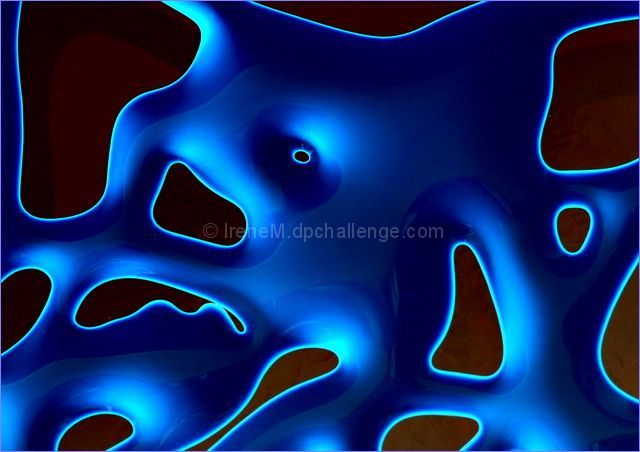
really beautiful abstract - I love the metallic look and feel to it!!
|
|
 Photographer found comment helpful. Photographer found comment helpful. |
|
|
09/10/2006 03:56:54 PM |
Hello from the Critique Club:
I think the comments you received during the challenge sum up the strong points about your entry pretty well. The colors are well saturated and the pattern is very dramatic looking. Having 20/20 hindsight commenting after the challenge, your image could just as easily have been in the top ten as any of the others. When I compare your image to the one that placed 8th, I see nothing in your image indicating yours should be scored lower. I have a feeling that you are the victim of the random order the voters receive the images to vote on, as some people that love abstracts may not have gotten to your image during voting. You have a very creative entry here that anyone at DPC would be proud to have in their portfolio.
Tim
|
|
| Photographer found comment helpful. |
|
|
09/05/2006 03:12:30 PM |
Originally posted by klstover:
You may have scored better, I think, using closer to a 150kb size, as that would probably have helped the black areas to look smoother. |
Hi Kelly, I've sent you a pm. |
|
|
|
09/05/2006 11:44:48 AM |
You may have scored better, I think, using closer to a 150kb size, as that would probably have helped the black areas to look smoother.
edit: Ah, so the brownish black was intentional, sorry! I think that unfortunately it looks like compression artifacts might look. But either way, when I came across this image during voting, my attention was drawn immediately to the liquidyblue beautifulness. I only noticed the background after a second look... so maybe I am completely wrong about how you might have scored better, hehe! Thanks for the PM - is always nice knowing what the photographer intended with an image.
Message edited by author 2006-09-05 15:24:44. |
|
| Photographer found comment helpful. |
|
|
09/04/2006 08:37:12 AM |
| I'm surprised as well that it is not on the front page. This was my top pic of the challenge. Well done and beautiful. |
|
| Photographer found comment helpful. |
|
|
09/04/2006 05:11:52 AM |
| This is so cool, Irene, it meets the challenge so well and is just so unusual and well done. It really surprises me it didn't end up in the top 10. I like it a lot! |
|
| Photographer found comment helpful. |
Comments Made During the Challenge  |
|
|
09/02/2006 07:15:52 PM |
| No subject here...nice job...10 |
|
| Photographer found comment helpful. |
|
|
08/31/2006 10:17:20 PM |
|
| Photographer found comment helpful. |
|
|
08/30/2006 10:37:53 AM |
|
| Photographer found comment helpful. |
|
|
08/29/2006 02:05:04 PM |
| I think that covers the challenge! It's got great colors and crispness to it. And I don't think it's really a subject is it? It's an abstract. How much more non-subject can you get? :) |
|
| Photographer found comment helpful. |
|
|
08/29/2006 09:34:36 AM |
|
| Photographer found comment helpful. |
|
|
08/28/2006 04:40:50 PM |
|
| Photographer found comment helpful. |
|
|
08/28/2006 12:49:56 PM |
| Few have met my concept of the challenge...you did...high mark. |
|
| Photographer found comment helpful. |
|
|
08/28/2006 08:33:22 AM |
| Ooooooh, I love it!! How cool, love the glowing edges. |
|
| Photographer found comment helpful. |
|
|
08/28/2006 06:00:19 AM |
|
| Photographer found comment helpful. |
|
|
08/28/2006 02:41:04 AM |
| Cool.. but how did you do it? |
|
| Photographer found comment helpful. |
|
|
08/28/2006 02:10:47 AM |
| What is this?? Is it a picture or ?? |
|
| Photographer found comment helpful. |
|
|
08/28/2006 12:40:10 AM |
| looks like neon light edges...great colour and comp...well done |
|
| Photographer found comment helpful. |
Home -
Challenges -
Community -
League -
Photos -
Cameras -
Lenses -
Learn -
Prints! -
Help -
Terms of Use -
Privacy -
Top ^
DPChallenge, and website content and design, Copyright © 2001-2024 Challenging Technologies, LLC.
All digital photo copyrights belong to the photographers and may not be used without permission.
Current Server Time: 04/18/2024 02:07:39 PM EDT.