| Author | Thread |
|
|
10/16/2003 12:21:50 AM |
Thanks for the comments everyone.
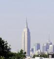
For reference, here's a link to the (reduced) original:  |
|
|
|
10/15/2003 09:37:12 PM |
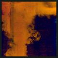
| I like your entry version a lot. It gives it an almost comic book feel to the shot with the colorful buildings on the right. The bright yellow line leads your eyes to the background buildings. The Fed. buildings really stand out from the background. I gave you a "7" |
|
 Photographer found comment helpful. Photographer found comment helpful. |
Comments Made During the Challenge  |
|
|
10/14/2003 02:07:29 PM |
|
| Photographer found comment helpful. |
|
|
10/13/2003 01:19:30 PM |
| the feect doesnt work well for me |
|
| Photographer found comment helpful. |
|
|
10/10/2003 12:09:14 PM |
| The effects seem sort of haphazard. They work really well on the buildings and cars on the right, but not really anywhere else. |
|
| Photographer found comment helpful. |
|
|
10/10/2003 12:04:43 PM |
| so you took a completely boring picture and made the colors weird. no. |
|
| Photographer found comment helpful. |
|
|
10/10/2003 11:48:52 AM |
| Interesting idea, but I must say that after reading the title, my first thought was to wonder if the Federal Buildings were a street :) Gutsy entry, but I'm not sure what to think of it. |
|
| Photographer found comment helpful. |
|
|
10/09/2003 09:22:18 PM |
| I know this is your interpretation of what urban means, but I must say I don't like the color treatment. Just wanted to let you know why I didn't give you a higher score. It looks like a very decent image if not for the colors. Only thing composition wise, I'd crop the sky down to just above the highest lightpost. |
|
| Photographer found comment helpful. |
|
|
10/09/2003 06:23:07 PM |
I like your concept. There is something that isn't quite working for me though.
Possibly cropped a little shorter. The walkways are a bit distracting but nothing you can do about that. Still a very good effort IMO. 7 |
|
| Photographer found comment helpful. |
|
|
10/09/2003 02:53:35 PM |
|
| Photographer found comment helpful. |
|
|
10/09/2003 11:05:40 AM |
| I'm not a big fan of changing the colours this way. The road has some impact though |
|
| Photographer found comment helpful. |
|
|
10/09/2003 09:46:01 AM |
| I do get the sense of urban but don't really like the effects you did to the picture. And possibly if you had focused more on the buildings instead of the street I could have scored much higher. |
|
| Photographer found comment helpful. |
|
|
10/09/2003 05:52:54 AM |
|
| Photographer found comment helpful. |
|
|
10/09/2003 12:25:46 AM |
| There seems to be a little too much street in this image - it's taking my focus off the buildings. |
|
| Photographer found comment helpful. |
|
|
10/08/2003 11:42:53 PM |
| I don't personally care for the post processing used in this shot. |
|
| Photographer found comment helpful. |
|
|
10/08/2003 05:59:40 PM |
| I think i would prefer it without the alterations |
|
| Photographer found comment helpful. |
|
|
10/08/2003 05:50:32 PM |
| If I was gonna play with the color on this one (without seeing the original of course), I would left the yellow stripe and desaturated the rest! Not sure I like this treatment though. |
|
| Photographer found comment helpful. |
|
|
10/08/2003 02:13:18 PM |
| I like the negative color use. The tree is beautiful, the bridges are intrigueing and I feel a sense of forboding with the presents of the buildings in the distance. But it might have worked nicer if somehow the you could have shown the pavement blurred as though moving rapidly. |
|
| Photographer found comment helpful. |
|
|
10/08/2003 09:23:08 AM |
| Is this a photoshop trick? If not I like it. Very hard to give it a score because I like it but I do not know if there is a trick here or not. Nice photo |
|
| Photographer found comment helpful. |
|
|
10/08/2003 07:57:17 AM |
| I can't work out why on earth this photo needed inverting. 2 |
|
| Photographer found comment helpful. |
|
|
10/08/2003 01:46:31 AM |
| nice digital art and interesting perspective |
|
| Photographer found comment helpful. |
Home -
Challenges -
Community -
League -
Photos -
Cameras -
Lenses -
Learn -
Prints! -
Help -
Terms of Use -
Privacy -
Top ^
DPChallenge, and website content and design, Copyright © 2001-2024 Challenging Technologies, LLC.
All digital photo copyrights belong to the photographers and may not be used without permission.
Current Server Time: 04/20/2024 02:49:37 AM EDT.