| Author | Thread |
|
|
12/02/2006 05:29:46 PM |
| Lovely picture. Congrats on your top 20 finish! |
|
 Photographer found comment helpful. Photographer found comment helpful. |
|
|
11/27/2006 11:05:50 PM |
| The perfect postcard. Congratulations! |
|
| Photographer found comment helpful. |
|
|
11/27/2006 05:44:47 PM |
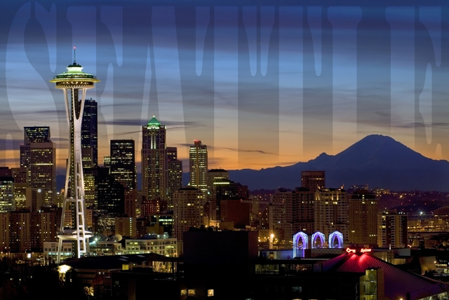
| Wow, I like it! The lettering almost looks like a line of laundry. |
|
| Photographer found comment helpful. |
|
|
11/27/2006 04:32:57 PM |
| I liked the text, and the cityscape is spot on. Congrats on your top 20 finish in this ridiculously scoring challenge. |
|
| Photographer found comment helpful. |
|
|
11/27/2006 07:36:50 AM |
| Wow! Congratulations on such a strong finish in this off-the-chart scoring challenge! This is an amazing photo! |
|
| Photographer found comment helpful. |
|
|
11/27/2006 04:31:19 AM |
| Congrats on a top 20, Frank! IMO the treatment of the text is fine, but the stencil font may not be the best choice. Still a great image and excellent finish! |
|
| Photographer found comment helpful. |
Comments Made During the Challenge  |
|
|
11/26/2006 11:49:32 PM |
| This would be a 10 except the text overlay is too hard to get. 9, though. :) |
|
| Photographer found comment helpful. |
|
|
11/26/2006 10:33:25 PM |
| wow ! great text special effects. Image exposure is spot on . Good luck ! 7 |
|
| Photographer found comment helpful. |
|
|
11/26/2006 04:35:50 PM |
| Thats really pretty, not sure about the text...but I love the shot. |
|
| Photographer found comment helpful. |
|
|
11/26/2006 04:18:49 PM |
| Love the shot and think its very cool the way the name is across the picture. 8 |
|
| Photographer found comment helpful. |
|
|
11/26/2006 03:37:03 AM |
| Nice try with the lettering, but it's too hard to read -- it looks like there's something wrong with the sky. Good capture though. |
|
| Photographer found comment helpful. |
|
|
11/25/2006 04:51:44 PM |
| Very nice use of background to tell us where this is! |
|
| Photographer found comment helpful. |
|
|
11/24/2006 11:14:09 PM |
| Nice landscape catching the Space Needle, Seattle Center, Mt. Rainier, and color in sky. I think that the big "Seattle" overlay kills the shot, a more discrete script title in the upper right corner would be better. |
|
| Photographer found comment helpful. |
|
|
11/24/2006 03:51:39 PM |
| First, good shot; second, I love the way you incorporated the text into this. Very nice! |
|
| Photographer found comment helpful. |
|
|
11/23/2006 08:46:30 PM |
| The lettering is subtle enough that it enhances and the image is excellent. Well done! |
|
| Photographer found comment helpful. |
|
|
11/23/2006 02:04:44 PM |
| Hard to make out the letters...my eye kept picking up the darker background shape which made no sense. Title finally filled me in. Nice concept, though. Nice lighting. 6 |
|
| Photographer found comment helpful. |
|
|
11/23/2006 05:58:20 AM |
| The text works a bit distracting IMHO. But overall a great skyline shot! |
|
| Photographer found comment helpful. |
|
|
11/22/2006 04:25:29 PM |
| nice use of text on this one.. works for me.. 8 |
|
| Photographer found comment helpful. |
|
|
11/22/2006 02:05:55 PM |
| Very interesting and creative graphics. So interesting that my eye spends most of the time there rather than on the city. |
|
| Photographer found comment helpful. |
|
|
11/22/2006 12:52:36 PM |
| I don't like the type at all. Nice skyline during the blue minutes though. |
|
| Photographer found comment helpful. |
|
|
11/22/2006 12:35:55 AM |
| I found the lettering in the background very distracting, sorry to say. Otherwise, great shot. |
|
| Photographer found comment helpful. |
|
|
11/21/2006 09:46:30 PM |
| The text seems to negatively impact the photo |
|
| Photographer found comment helpful. |
|
|
11/21/2006 09:24:43 PM |
| Beautiful shot of Seattle... the lighting is great, and I appreciate that the brightest of the lights aren't blown out. The text for this one is a bit distracting. I think if it were a bit smaller, it would fit completely into the sky instead of running over the buildings/mountains, and it would make it more readable. |
|
| Photographer found comment helpful. |
|
|
11/21/2006 04:21:35 PM |
| Your overlay of the letters is really pretty slick. I like it. |
|
| Photographer found comment helpful. |
|
|
11/21/2006 02:49:20 PM |
| This is one where loud, kooky text works. Good job 8 |
|
| Photographer found comment helpful. |
|
|
11/21/2006 07:31:08 AM |
| Love the photo, hate the writing. 7. |
|
| Photographer found comment helpful. |
|
|
11/20/2006 10:38:41 PM |
| The only issue I have is that the text takes a bit of effort to see. Love the shot. |
|
| Photographer found comment helpful. |
|
|
11/20/2006 05:38:49 PM |
| great picutre. i like the writing, it does appear to be a little too subtle - at least on my screen. |
|
| Photographer found comment helpful. |
|
|
11/20/2006 02:38:29 PM |
| Just like the poster! lol Love it. You did a fantastic job here. I don't miss the weather in the PNW on bit. I do miss the green. Great city, great people. Bad traffic. :) |
|
| Photographer found comment helpful. |
|
|
11/20/2006 04:28:25 AM |
| very nice!at least an 8 from me. |
|
| Photographer found comment helpful. |
|
|
11/20/2006 03:24:42 AM |
| Love the text...excellent image and great as a postcard |
|
| Photographer found comment helpful. |
|
|
11/20/2006 01:00:18 AM |
| Lovely photo. Though it might be nice to see the blue and red a little more desaturated because it draws my attention to that. The sky is also nice, I think it's much nicer than if there would have been large pillowy bright clouds, because that would have been a bit busy. The use of text is pretty cool, very "postcard." |
|
| Photographer found comment helpful. |
|
|
11/20/2006 12:43:15 AM |
| nice pic but the sky has strange grey shapes |
|
| Photographer found comment helpful. |
|
|
11/20/2006 12:42:03 AM |
| Great shot. I like the text layout but not liking the font choice however that's not a big deal for me. |
|
| Photographer found comment helpful. |
Home -
Challenges -
Community -
League -
Photos -
Cameras -
Lenses -
Learn -
Prints! -
Help -
Terms of Use -
Privacy -
Top ^
DPChallenge, and website content and design, Copyright © 2001-2024 Challenging Technologies, LLC.
All digital photo copyrights belong to the photographers and may not be used without permission.
Current Server Time: 04/19/2024 09:01:56 AM EDT.