| Author | Thread |
|
|
02/02/2007 02:25:56 PM |
| Nice cutting quality to this. I like the different tones on each side of the post as well. |
|
 Photographer found comment helpful. Photographer found comment helpful. |
|
|
02/02/2007 02:16:43 PM |
I love the border...you display a real sense of following your creative impulses in so many of your shots...
keep it up! |
|
| Photographer found comment helpful. |
Comments Made During the Challenge  |
|
|
01/09/2007 11:20:23 PM |
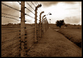
| Great DOF and shot. Love the fog in the background and the icy look to the picture. Border kind of throws it off a bit IMO just because its bigger on the sides. Other than that great work. |
|
| Photographer found comment helpful. |
|
|
01/09/2007 09:57:22 PM |
| Amazing shot, has a cold feeling to it, but not in such a way as to make the viewer not like it. My only gripe is the border, I would rather have seen it stay the same on all sides. the way it is distracts from the image itself. |
|
| Photographer found comment helpful. |
|
|
01/09/2007 09:36:32 PM |
|
| Photographer found comment helpful. |
|
|
01/09/2007 12:18:28 PM |
|
| Photographer found comment helpful. |
|
|
01/09/2007 11:12:06 AM |
| B&W work really good here. Well done. |
|
| Photographer found comment helpful. |
|
|
01/07/2007 11:55:00 PM |
| Very nice visual. The border is a little distracting to me. |
|
| Photographer found comment helpful. |
|
|
01/07/2007 06:00:09 PM |
| You're losing a point from me for your whacked out title. Somehow it's really distracting.. |
|
| Photographer found comment helpful. |
|
|
01/06/2007 05:13:02 AM |
| I am not a fan of your choice of border but the rest is nice. |
|
| Photographer found comment helpful. |
|
|
01/05/2007 04:37:24 PM |
| Love the fog/mist. Not so fond of the alternating caps in the title but that's a personal thing. Good title, though (and I ain't counting off because of the caps thing - just it drives me nuts.) I really do like the picture. |
|
| Photographer found comment helpful. |
|
|
01/05/2007 01:45:13 PM |
I love the look of the wood, so great timing to get the shot. However i feel it is too low in the image to give it the attention it deserves. It has so much potential for giving a great feeling to the shot and it's only in the lower half and you have so much empty sky above it. Position it a bit higher would fill the photo a bit more, without loosing the foggy, cold feel.
Personally i would also have placed the wood just a tiny bit more to the right so i could get a bit more depth feel by seeing the second post a bit better.
I love the atmosphere you captured, but i also feel you've lost some of its impact by not placing it a bit more prominent in the image. (vote=6) |
|
| Photographer found comment helpful. |
|
|
01/04/2007 06:12:21 PM |
my suggestion: stop typing like that
thanks. |
|
| Photographer found comment helpful. |
|
|
01/04/2007 11:38:23 AM |
| Excellent - the muted colours work well. You can just feel the cold. |
|
| Photographer found comment helpful. |
|
|
01/04/2007 07:59:32 AM |
| Avant garde....even down to the font selection :) 8 |
|
| Photographer found comment helpful. |
|
|
01/04/2007 05:29:08 AM |
|
| Photographer found comment helpful. |
|
|
01/04/2007 02:27:58 AM |
|
| Photographer found comment helpful. |
|
|
01/03/2007 09:29:10 PM |
| beautifully drabby tones & nice composition << 8 >> |
|
| Photographer found comment helpful. |
|
|
01/03/2007 08:13:33 PM |
| Like the desaturated colors, fog and the perspective here. |
|
| Photographer found comment helpful. |
|
|
01/03/2007 03:03:20 PM |
| First off I have to ask WHY does one type like that? It's very distracting and I see it often. It irritates me. I would try positioning the post a little more to the right. I like the mist/fog in the background and the muted colours. |
|
| Photographer found comment helpful. |
|
|
01/03/2007 12:09:31 PM |
|
| Photographer found comment helpful. |
|
|
01/03/2007 10:21:44 AM |
|
| Photographer found comment helpful. |
|
|
01/03/2007 09:12:53 AM |
|
| Photographer found comment helpful. |
|
|
01/03/2007 08:59:56 AM |
| i do not like the title, i do like the image |
|
| Photographer found comment helpful. |
|
|
01/03/2007 07:16:25 AM |
|
|
|
01/03/2007 01:20:00 AM |
| 10 from me. Smokes my entry. So far my favorite in the challenge. Great job. |
|
| Photographer found comment helpful. |
Home -
Challenges -
Community -
League -
Photos -
Cameras -
Lenses -
Learn -
Prints! -
Help -
Terms of Use -
Privacy -
Top ^
DPChallenge, and website content and design, Copyright © 2001-2024 Challenging Technologies, LLC.
All digital photo copyrights belong to the photographers and may not be used without permission.
Current Server Time: 05/04/2024 01:27:51 AM EDT.


![fEnCE - [tHe GraSS IsN'T aLWayS GReEneR]](https://images.dpchallenge.com/images_challenge/0-999/609/1200/Copyrighted_Image_Reuse_Prohibited_445762.jpg)


