| Author | Thread |
Comments Made During the Challenge  |
|
|
08/25/2002 05:27:00 PM |
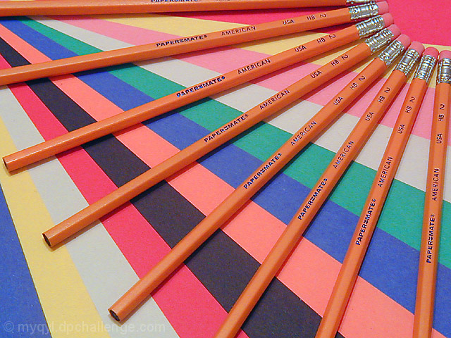
| Nice color. You should sell this to the PaperMate Co. for their advertising. |
|
 Photographer found comment helpful. Photographer found comment helpful. |
|
|
08/24/2002 04:39:00 PM |
| Nice composition. I might have used more vivid colors or better lighting. |
|
| Photographer found comment helpful. |
|
|
08/23/2002 10:28:00 PM |
Really cool (Running out of steam for commenting - so being brief) nice lines, detail, composition, cropping, colors - great for this. Although I know that construction paper is not very bright - I wish the colors were more vibrant - doesn't matter though - great time, effort and work 8
Ruthann |
|
| Photographer found comment helpful. |
|
|
08/23/2002 06:41:00 AM |
This is a nice abstract and colourful pattern, I'd like it more if I happened to like the colours used more, but that's purely about my tastes in colour. Like tthe curve made by the top of the pencils, like a child's drawing of the sun. Pretty.
7, Kavey |
|
| Photographer found comment helpful. |
|
|
08/22/2002 11:57:00 PM |
| Ahhhhhh the addition of colored pape is a very good idea! It adds drama to the image in a simple and basic way. Very nice! Grayce...aka...Gracious |
|
| Photographer found comment helpful. |
|
|
08/22/2002 07:56:00 PM |
Composition: Subject Placement, Cropping, Background6,
Technical: Focus, Exposure, Lighting, Processing7,
Challenge: Does your entry meet it?10,
Appeal: Is it Interesting, Motivating, Etc.? 5,
Total Averaged Rating7. Autool
|
|
| Photographer found comment helpful. |
|
|
08/22/2002 03:55:00 PM |
| Being an engineer I just may be that linear thinking - but should the top and right-most pencils be parallel to the edges? Otherwise, a nice one. 7. |
|
| Photographer found comment helpful. |
|
|
08/22/2002 06:24:00 AM |
| Really like the use of diagonals in your shot, great color too. |
|
| Photographer found comment helpful. |
|
|
08/21/2002 10:32:00 AM |
| Nice use of colors. Ad type photo. |
|
| Photographer found comment helpful. |
|
|
08/20/2002 04:36:00 PM |
| Nice setup and good use of color :) There are a lot of contrasting colors in this photo, which is good in many cases... I wonder what this would look like if the background behind the pencils was an alternating pattern of two colors rather than this many different ones? Good shot :) - jmsetzler |
|
| Photographer found comment helpful. |
|
|
08/19/2002 09:44:00 PM |
| like the intersecting lines/ pencils . My eyes darting all over the place though - no real resting place that I get led to, other than up the corner, then I get pulled away again |
|
| Photographer found comment helpful. |
|
|
08/19/2002 09:09:00 PM |
| Cool!!! I love the use of color on color and the abstract fan effect from two directions. Good lighting with minimal reflection. =9 syamjonimi |
|
| Photographer found comment helpful. |
|
|
08/19/2002 04:28:00 PM |
| This one really catches my eye. 8 :) |
|
|
|
08/19/2002 04:23:00 PM |
| Very colorful. I'm not sure I understand reference to the title though. Unless you're just refering to a fan. Ah, who cares. This isn't a title contest. The colors are great, great spacing in the pencils and different colors. I like how the words are up on all pencils. That shows you took time to make this artistic. The lighting is great. No distracting shadows or bright spots. Nice job and good luck with the challenge. |
|
| Photographer found comment helpful. |
|
|
08/19/2002 03:55:00 PM |
| I like the use of colors! |
|
|
|
08/19/2002 01:46:00 PM |
| Neat effect here. Great lines, though the colors selectio nis strange |
|
| Photographer found comment helpful. |
|
|
08/19/2002 01:45:00 PM |
| Lovely design and colours--great shot andrewm |
|
| Photographer found comment helpful. |
|
|
08/19/2002 10:52:00 AM |
|
|
|
08/19/2002 07:12:00 AM |
| Nice colors, very strong. Good layout of both paper and pencils, nice opposing arcs. |
|
| Photographer found comment helpful. |
|
|
08/19/2002 01:33:00 AM |
| In this case, literally paper's mate. Nicely composed. I like the way the lines draw your eyes in opposing directions. 7 |
|
| Photographer found comment helpful. |
|
|
08/19/2002 01:18:00 AM |
| Creative use of colour! Focus seems a little off though giving the image a rather soft look. You may have intended this, still I like it. sulamk |
|
| Photographer found comment helpful. |
|
|
08/19/2002 12:42:00 AM |
| very pretty, good compositon |
|
| Photographer found comment helpful. |
Home -
Challenges -
Community -
League -
Photos -
Cameras -
Lenses -
Learn -
Prints! -
Help -
Terms of Use -
Privacy -
Top ^
DPChallenge, and website content and design, Copyright © 2001-2024 Challenging Technologies, LLC.
All digital photo copyrights belong to the photographers and may not be used without permission.
Current Server Time: 04/19/2024 03:43:54 AM EDT.