| Author | Thread |
|
|
04/05/2007 02:00:07 PM |
|
 Photographer found comment helpful. Photographer found comment helpful. |
|
|
04/05/2007 01:57:06 PM |
| When I saw this pict. I thought it was very interesting. It just feels right. |
|
| Photographer found comment helpful. |
|
|
02/27/2007 10:04:42 AM |
| Congratulations girl!!! LOVE IT. Well deserved finish. :) |
|
| Photographer found comment helpful. |
|
|
02/21/2007 03:51:44 PM |
| Top five, way to go..Great picture! |
|
| Photographer found comment helpful. |
|
|
02/21/2007 08:53:08 AM |
| Congrats! This was a beautiful shot! |
|
| Photographer found comment helpful. |
|
|
02/21/2007 07:51:14 AM |
Leisha, CONGRATULATIONS, on an honorable mention! This is a wonderful photo! And all this time in the 30-day challenge and I didn't realize you had such a GORGEOUS back yard. You LUCKY!!!!
|
|
| Photographer found comment helpful. |
|
|
02/21/2007 05:32:12 AM |
| Congrats on the OB and fifth place! |
|
| Photographer found comment helpful. |
|
|
02/21/2007 04:52:42 AM |
| Well done - looking at your Profile during the challenge, I thought this one belonged to you: similar palette. Lovely work. Glad that this image belongs to your family - it gives it even more charm. |
|
| Photographer found comment helpful. |
|
|
02/21/2007 12:28:44 AM |
| Excellent image, my pick for the best of the challenge. Congrats on your new PB! You just blew the doors off your previous PB! |
|
| Photographer found comment helpful. |
Comments Made During the Challenge  |
|
|
02/20/2007 09:58:03 PM |
| I like the idea, but I would have liked to see stronger contrast. This just looks too dull and faded for me. |
|
| Photographer found comment helpful. |
|
|
02/20/2007 12:44:14 PM |
| A touch more contrast would have made this KILLER. 9 |
|
| Photographer found comment helpful. |
|
|
02/20/2007 03:32:43 AM |
|
|
|
02/19/2007 10:04:12 AM |
| one of the few choices relating to school days, and a nice composition. I am less a fan of the desat. |
|
| Photographer found comment helpful. |
|
|
02/18/2007 04:10:59 AM |
| the sepia look really suits this...creative and special...well done |
|
| Photographer found comment helpful. |
|
|
02/17/2007 04:42:56 PM |
| I quite love this pciture! The toning down of the saturation is in a great example. And its in an awsome setting, good work! 8 |
|
| Photographer found comment helpful. |
|
|
02/16/2007 07:17:38 PM |
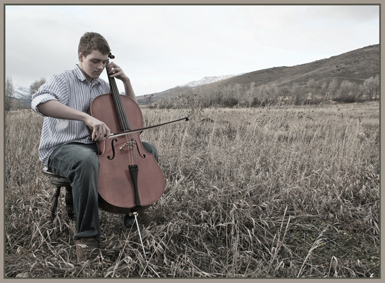
| beautiful composition the hills really balance out the guy playing the cello. I like the faded saturation but I think this could use just a tad more contrast. Lovely! |
|
| Photographer found comment helpful. |
|
|
02/16/2007 09:29:00 AM |
Woo, someone else who likes to practise in random places and Feel inspired by nature!
Wonderful photo :) |
|
| Photographer found comment helpful. |
|
|
02/15/2007 08:07:07 PM |
Very pretty tones, wonderfully subdued.
8 |
|
| Photographer found comment helpful. |
|
|
02/15/2007 04:15:27 PM |
| This is my favorite in the competition. Very nice, the title adds a lot too. |
|
| Photographer found comment helpful. |
|
|
02/15/2007 04:13:36 PM |
| I like the desaturated look, beautiful |
|
| Photographer found comment helpful. |
|
|
02/15/2007 01:20:01 PM |
| the desaturation is very effective here. |
|
| Photographer found comment helpful. |
|
|
02/15/2007 12:49:38 PM |
| this is a good photo, a bit more detail in the sky would help. |
|
| Photographer found comment helpful. |
|
|
02/15/2007 02:49:46 AM |
| Just love this setting and the ever so subdued sepia...wonderful! |
|
| Photographer found comment helpful. |
|
|
02/14/2007 11:08:19 PM |
| I would have preferred greater color saturation for more impact. nice composition and idea |
|
| Photographer found comment helpful. |
|
|
02/14/2007 08:51:23 PM |
| Needs more saturation. Great composition but it's missing something. |
|
| Photographer found comment helpful. |
|
|
02/14/2007 07:38:35 PM |
| I like the image but I would have liked it more at 640px width. Also if the sky was more dramatic it would have helped a lot too. Maybe a polorizer next time. Otherwise good job. |
|
| Photographer found comment helpful. |
|
|
02/14/2007 02:29:00 PM |
| I think the perpective is very nice - with the randomness of the grass and the focus of the students face. I think it could have been improved a little with a bit more contrast to bring out the player and the cello. |
|
| Photographer found comment helpful. |
|
|
02/14/2007 01:06:06 PM |
| It's nice to see that he was able to get into the field of music! |
|
| Photographer found comment helpful. |
|
|
02/14/2007 12:11:54 PM |
| Lovely warm hues - nice set up and location. The dried,brown fields seem to resonate with the cello and its sound. lovely. Bumping to a 10 - my choice for top place. |
|
| Photographer found comment helpful. |
|
|
02/14/2007 10:12:06 AM |
| colors seem a bit washed out ... really like the setting and composition though ... |
|
| Photographer found comment helpful. |
|
|
02/14/2007 09:46:11 AM |
| Very nice...I'm sure the client will love it. |
|
| Photographer found comment helpful. |
Home -
Challenges -
Community -
League -
Photos -
Cameras -
Lenses -
Learn -
Prints! -
Help -
Terms of Use -
Privacy -
Top ^
DPChallenge, and website content and design, Copyright © 2001-2024 Challenging Technologies, LLC.
All digital photo copyrights belong to the photographers and may not be used without permission.
Current Server Time: 04/19/2024 01:45:15 PM EDT.