| Author | Thread |
|
|
03/04/2007 01:34:12 AM |
Greetings from the Critique Club!
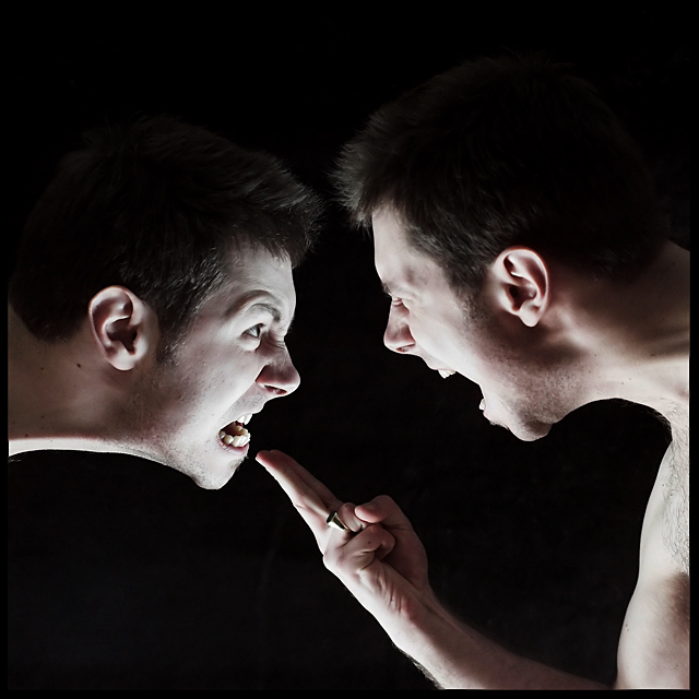
So this is your entry for the 'Hate' challenge. I think you've done a good job of meeting the challenge. The shot has scored well, and congrats on the top 10. I actually have to agree with the majority here, I think you've done a real nice job on the image, especially being within the basic ruleset. I think you did fine on the levels, your background looks black to me, no hint of the velvet. The expressions on the faces are very fitting, and definitely send the theme home. I'd also like to note that the upwards lighting can be a great tool, and I think you've used it quite well to your advantage here, it works well with the concept of the shot and helps the overall theme. You've made a cool image, and it did well in the challenge, I can't really point out any 'improvements'. One thing that you could possibly consider, not really an improvement at all, but I'm thinking a shot like this, maybe taking the slight offset of the 2 faces, and increasing that offset some, creating more of a diagonal comp, perhaps adding a little bit of dynamics, compositionally. But, maybe not, that could just be me :-). Anyways, nice job on the image, it is pretty cool, and again, congrats. Please feel free to contact me if you have any questions, comments or anything.
taterbug |
|
 Photographer found comment helpful. Photographer found comment helpful. |
|
|
02/28/2007 03:12:17 PM |
| Great job Chris! Congrats on a top 10! Now go and get a d200 :) |
|
| Photographer found comment helpful. |
|
|
02/28/2007 12:13:56 PM |
| WTG Chris!!!!! Great shot. |
|
| Photographer found comment helpful. |
|
|
02/28/2007 12:48:20 AM |
|
| Photographer found comment helpful. |
Comments Made During the Challenge  |
|
|
02/26/2007 12:08:33 PM |
| Do you have a twin brother? |
|
| Photographer found comment helpful. |
|
|
02/25/2007 11:35:50 PM |
| wow...that's a great image for basic editing...a fantastic idea, well executed and with great expressions...a photographer and actor in one! 9 |
|
| Photographer found comment helpful. |
|
|
02/25/2007 05:22:10 PM |
| haha, brilliant! double exposure? One of the best in the challenge, I hope this does well. |
|
| Photographer found comment helpful. |
|
|
02/24/2007 01:15:33 AM |
|
| Photographer found comment helpful. |
|
|
02/23/2007 07:58:31 PM |
| One of the few pictures where the photo itself did not rely on the title. Great shot! |
|
| Photographer found comment helpful. |
|
|
02/23/2007 06:44:00 PM |
| Nice multiple exposure, and good expressions and lighting. Nice job. |
|
| Photographer found comment helpful. |
|
|
02/22/2007 09:22:47 PM |
|
| Photographer found comment helpful. |
|
|
02/22/2007 04:25:52 PM |
|
| Photographer found comment helpful. |
|
|
02/22/2007 06:19:27 AM |
| Clever - Like the up-lighting for drama. Nice |
|
| Photographer found comment helpful. |
|
|
02/22/2007 12:11:29 AM |
|
| Photographer found comment helpful. |
|
|
02/21/2007 11:23:24 PM |
| Great! That's about as constructive as I can get with this image. 9 |
|
| Photographer found comment helpful. |
|
|
02/21/2007 08:13:29 PM |
| Very unique. I like the clarity of this image! |
|
| Photographer found comment helpful. |
|
|
02/21/2007 12:24:19 PM |
| A double exposure and a recognizable face is enough to set you apart from the crowd in this challenge. Aside from that, great idea on the challenge and good execution. This should be a top finisher. Good luck. |
|
| Photographer found comment helpful. |
|
|
02/21/2007 12:24:18 PM |
| Either the lighting is a bit off, or it's been smoothed in Photoshop too much... but what an excellent idea! Fits the challenge nicely - good job! |
|
| Photographer found comment helpful. |
|
|
02/21/2007 12:07:08 PM |
|
| Photographer found comment helpful. |
|
|
02/21/2007 11:39:38 AM |
|
| Photographer found comment helpful. |
|
|
02/21/2007 10:29:02 AM |
|
| Photographer found comment helpful. |
|
|
02/21/2007 01:05:57 AM |
|
| Photographer found comment helpful. |
Home -
Challenges -
Community -
League -
Photos -
Cameras -
Lenses -
Learn -
Prints! -
Help -
Terms of Use -
Privacy -
Top ^
DPChallenge, and website content and design, Copyright © 2001-2024 Challenging Technologies, LLC.
All digital photo copyrights belong to the photographers and may not be used without permission.
Current Server Time: 04/19/2024 08:14:30 PM EDT.