| Author | Thread |
|
|
07/24/2009 12:11:22 AM |
Originally posted by JulietNN:
yah, i think you have beat all my pills.
all i can say is add some zeros, take it to Sedona and mount it and you will make a friggin fortune |
You know what? Juliet is absolutely right. |
|
 Photographer found comment helpful. Photographer found comment helpful. |
|
|
07/23/2009 10:52:13 PM |
| oh it does look crooked though |
|
| Photographer found comment helpful. |
|
|
07/23/2009 10:51:48 PM |
yah, i think you have beat all my pills.
all i can say is add some zeros, take it to Sedona and mount it and you will make a friggin fortune |
|
| Photographer found comment helpful. |
|
|
03/04/2007 03:49:47 PM |
Yea..Thanks Alot from the Critique Club
A random click and I get your brown!! hahaha
What can I say Paul, I think you clearly did in this photo what you set out to do. I appreciate the artistic sentiment expressed by trying to burn a cross in basic editing.
Alot of imagination went into shooting this with an eye to the final result and I have no doubt you did what you wanted.
That said, just really not to my tastes. I am not a fan personally of such abstract pieces, but that said, I do not think the colours really make me "feel" the message of the shot.
I applaud your courage and OTB thinking :) |
|
| Photographer found comment helpful. |
|
|
03/01/2007 03:50:35 PM |
Originally posted by posthumous:
brilliant brownness. this is conceptually fascinating, beautiful to look at, out of the box, and shows a sophisticated openness to what can be achieved photographically, all within basic editing rules. this picture's a champ as far as I'm concerned. |
Thanks!
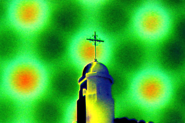
For reference, here is the (resized) original from which I cropped this.

I was trying to achieve the look of flames around the cross within the Basic rules, so I wanted to get a photo of a cross with a surrounding gradient to which I could apply the tone variations. I liked the way the flaw in the domed roof makes it look like molten metal running down from the cross.
I don't speak French either, but I'm pretty sure the title means "The Cross in Flames" or a close variation ... maybe I should have just titled it the more prosaic "Cross-Burning" instead. |
|
|
|
02/28/2007 10:31:32 AM |
| brilliant brownness. this is conceptually fascinating, beautiful to look at, out of the box, and shows a sophisticated openness to what can be achieved photographically, all within basic editing rules. this picture's a champ as far as I'm concerned. |
|
| Photographer found comment helpful. |
|
|
02/28/2007 06:47:24 AM |
| Congratulations. Good to see SC spans the whole range of technical ability. |
|
| Photographer found comment helpful. |
Comments Made During the Challenge  |
|
|
02/24/2007 01:19:56 AM |
| just not feeling it as much as the others. |
|
| Photographer found comment helpful. |
|
|
02/22/2007 11:48:25 PM |
| Way too much processing for my taste. Kind of steps out of the realm of photography. |
|
| Photographer found comment helpful. |
|
|
02/22/2007 09:43:07 PM |
| Am I supposed to hate the editing? Because if that is the case, then you have suceeded. 2 |
|
| Photographer found comment helpful. |
|
|
02/22/2007 06:54:35 PM |
| Great title and colours. Interesting work :) |
|
| Photographer found comment helpful. |
|
|
02/22/2007 03:51:39 AM |
| That's the risk of entering extreme images: some people like it, some don't. I don't (3) |
|
| Photographer found comment helpful. |
|
|
02/21/2007 08:31:29 PM |
| I dont really like the effect... it distracts from the image. |
|
| Photographer found comment helpful. |
|
|
02/21/2007 04:41:39 PM |
| I don't get it. Maybe because I don't speak French. |
|
| Photographer found comment helpful. |
|
|
02/21/2007 12:33:53 PM |
| I'm having trouble with this image... It's not exposed, focused, balanced, or really anything very well. I'm sure with some thinking I could somehow relate it to the challenge, but it's not jumping out at me. And to do well in these competitions, it needs to. |
|
| Photographer found comment helpful. |
|
|
02/21/2007 12:25:25 PM |
| I'm sorry... I don't really care for the post-processing. :( Try keeping the saturation at a more normal rate next time, maybe that will help! |
|
| Photographer found comment helpful. |
|
|
02/21/2007 12:04:16 PM |
| sorry, I don't understand how is it related to hate (or I don't want to...) |
|
| Photographer found comment helpful. |
|
|
02/21/2007 12:27:10 AM |
| very artsy. It will most certainly not score high though. Probably because it looks more like digital art, than a photograph. Good luck. |
|
| Photographer found comment helpful. |
|
|
02/21/2007 12:13:15 AM |
| I dont realy get it, + I realy dont like the BG colours |
|
| Photographer found comment helpful. |
Home -
Challenges -
Community -
League -
Photos -
Cameras -
Lenses -
Learn -
Prints! -
Help -
Terms of Use -
Privacy -
Top ^
DPChallenge, and website content and design, Copyright © 2001-2024 Challenging Technologies, LLC.
All digital photo copyrights belong to the photographers and may not be used without permission.
Current Server Time: 04/16/2024 12:34:01 PM EDT.