| Author | Thread |
|
|
08/26/2002 10:29:00 AM |
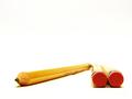
thanks for your comments... i had to crop the bottom thusly for a couple reasons.
a) the pencil was small in relation to the cup, and showing more cup would have unbalanced the pencil part
b) the cup was on something that i didnt want to show.
the white white background is the result of using a white sheet with a 500 W light behind it so that it glows. there is a another light up and camera right providing the highlight on the pencil and cup :) |
|
Comments Made During the Challenge  |
|
|
08/25/2002 06:41:00 PM |
|
|
|
08/25/2002 12:56:00 PM |
| Good for an office supply catalog picture. |
|
|
|
08/25/2002 01:02:00 AM |
| Effective color combined with the pattern. Composition is simple and direct. Nice. |
|
|
|
08/24/2002 04:06:00 PM |
| Nice simplistic composition, I like the use of red, very elegant |
|
|
|
08/23/2002 10:04:00 PM |
Excellent photo. Clean and simple. The contrast is just right. Excellently achieved white background. Great cropping - no, perfect cropping. I can't see one thing to 'complain' about. Professional looking. Great Work 10
Ruthann |
|
|
|
08/23/2002 09:01:00 PM |
|
|
|
08/23/2002 07:01:00 AM |
Nice, clean shot, with limited colour, black, red and white is a classic combo. I think I'd like to see the whole cup, with the white background curving seamlessly from behind to below it.
6, Kavey |
|
|
|
08/23/2002 01:28:00 AM |
| This photo does an excellent job of showing how simplicity creates a powerful image. I love the sharp contrast... great shot :) - jmsetzler |
|
|
|
08/23/2002 12:55:00 AM |
| Crisp composition. But, why did you crop it so tight at the bottom. It makes it look unfinished, I'm afraid. |
|
|
|
08/22/2002 04:29:00 PM |
| I like the simplicity of both the composition and the usage of colors a lot. The only thing that's bothering me, is the harsh cut-off at the bottom, but I guess that couldn't be avoided because of the size-restrictions. |
|
|
|
08/22/2002 02:21:00 PM |
| Simply and clear, very ellegant picture, congratulations. (9) |
|
|
|
08/22/2002 10:21:00 AM |
| Beautiful shot! The color choice makes it. |
|
|
|
08/21/2002 10:57:00 PM |
Composition - quite good
Technical Aspects - quite good
Meets Challenge - yes
Visual Impact / Originality � high
Other suggestions � none, well done.
Jim msp
|
|
|
|
08/21/2002 11:53:00 AM |
| Beautifully simple and effective arrangement and framing. |
|
|
|
08/21/2002 09:18:00 AM |
Composition: Subject Placement, Cropping, Background10,
Technical: Focus, Exposure, Lighting, Processing10,
Challenge: Does your entry meet it?10,
Appeal: Is it Interesting, Motivating, Etc.? 8,
Total Averaged Rating10. Autool
|
|
|
|
08/20/2002 10:05:00 PM |
| excellent contrast...good work... |
|
|
|
08/20/2002 08:52:00 PM |
|
|
|
08/20/2002 06:01:00 PM |
| Great job of capturing this in a way that the other side of the basket isn't distracting. I took a pic of a fan with a similar pattern and it make my eyes go buggy. Did you get that effect by adjusting focus? Anyway, The lighting is beautiful. I love the placement of the subject in the photo. I wonder why you cut off the bottom of the basket though? If there wasn't something really goofy happening with the bottom of the basket, I'd like to see it. Sometimes you don't have a choice to cut something out though, totally understandable. The contrast of the basket to the red pencil is very nice to look at. I'd love to see this hanging in an office or office supply store. It would even look good in my art room. Great job and good luck with the challenge. |
|
|
|
08/20/2002 07:40:00 AM |
| very clear and crisp, well done. |
|
|
|
08/20/2002 12:23:00 AM |
| I love the use of red with the black and white:) VERY nicely done ! = 10 Shiiizzzam |
|
|
|
08/20/2002 12:22:00 AM |
| I really like this picture. The composition and colors are really neat. 8. |
|
|
|
08/20/2002 12:21:00 AM |
| I like the simplicity and white background. Light seems a bit too harsh. Would also try it without cropping the bottom off. |
|
|
|
08/19/2002 10:09:00 PM |
| good contrasts, the red works really well with the grey/silver. Very clean |
|
|
|
08/19/2002 06:23:00 PM |
| loved that movie BTW... nice composition and color maybe would've been nice to see the bottom... |
|
|
|
08/19/2002 03:24:00 PM |
|
|
|
08/19/2002 11:50:00 AM |
nice use of color and composition...etc.... :) tg
|
|
|
|
08/19/2002 06:09:00 AM |
| Great color choice in the pencil, wonderful contrast. Great job. :) |
|
|
|
08/19/2002 03:18:00 AM |
|
|
|
08/19/2002 02:48:00 AM |
Very simple, but very striking photo. I love how the darkness of the basket contrasts heavilly with the white background. My only beef is that the color of the pencil seems a bit off, but otherwise this is a top 10 pick. 9 -lennier
(ok, I changed you to a 9.) |
|
|
|
08/19/2002 12:57:00 AM |
loved the movie.
how did you make the background so white?
i like how the angle of the pencil and the square things contrast together. good work! |
|
Home -
Challenges -
Community -
League -
Photos -
Cameras -
Lenses -
Learn -
Prints! -
Help -
Terms of Use -
Privacy -
Top ^
DPChallenge, and website content and design, Copyright © 2001-2024 Challenging Technologies, LLC.
All digital photo copyrights belong to the photographers and may not be used without permission.
Current Server Time: 04/19/2024 03:40:52 AM EDT.