| Author | Thread |
|
|
01/09/2004 10:03:03 AM |
Greetings from the Critique Club
Initial thoughts/My opinion
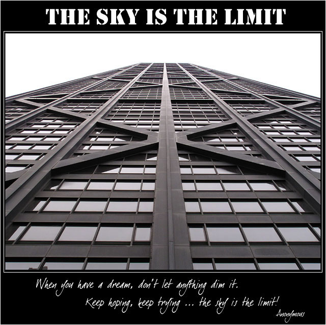
Just excellent: full of symmetry and leading lines, with a well-chosen title and subtitle. Very good
Content/Composition
Not much to say that has not already been said: very well composed, B&W is a great choice, good text. As others, I do think that different fonts could fit better to the strong, esthetical lines of the building though.
Also the lower text is hard to read at this size.
Camera work -technically
You did it just right and it shows.
Digital Processing - Technical
Also very well done. The border is well chosen
Fits the challenge
Of course it does.
Taking 14th place in such a strong contest as this was is almost like winning a ribbon in one of the less strong ones, so thumb up and lets wait for your first ribbon.
Good luck for you further submissions
|
|
 Photographer found comment helpful. Photographer found comment helpful. |
Comments Made During the Challenge  |
|
|
01/04/2004 02:57:38 PM |
I really do not feel comfortable with the square format and the vertical shot?
Very nice idea and work. |
|
| Photographer found comment helpful. |
|
|
01/04/2004 12:20:18 AM |
| nice photo! I love the long, tall angle.... |
|
| Photographer found comment helpful. |
|
|
01/03/2004 04:45:08 PM |
| Overall composition is very "poster" (a good thing) - I like the quote and the way you've chosen to display it. THe title font isn't complimentary to the quote or the poster IMO. I would like to see a more interesting sky (given sky is the motivation here) |
|
| Photographer found comment helpful. |
|
|
01/03/2004 03:23:36 AM |
| Great for business environment. |
|
| Photographer found comment helpful. |
|
|
01/01/2004 11:55:21 AM |
| This works well for me. Very strong presence. |
|
| Photographer found comment helpful. |
|
|
12/31/2003 02:22:50 PM |
| Very nice symmetry in black and white. |
|
| Photographer found comment helpful. |
|
|
12/30/2003 07:00:35 PM |
| Image isn't as strong as it might be though it is an apt choice for the saying. Nicely processed, good borders, text choice, positioning etc. |
|
| Photographer found comment helpful. |
|
|
12/30/2003 02:27:43 PM |
| Great shot, and it fits the title well. |
|
| Photographer found comment helpful. |
|
|
12/29/2003 09:33:04 PM |
| Very nicely done, but I might have picked a different typeface on the title...but I like the angle of the photo and the black and white treatment. Is that the John Hancock?? I grew up in Chicago, and thought I recognized it |
|
| Photographer found comment helpful. |
|
|
12/29/2003 05:06:27 PM |
| good symmetry, effective slogan. |
|
| Photographer found comment helpful. |
|
|
12/29/2003 04:12:41 PM |
|
| Photographer found comment helpful. |
|
|
12/29/2003 01:13:40 PM |
Kudos on a great shot. Hancock-Chicago?
Love this and I hope you do well. 9 from me. |
|
| Photographer found comment helpful. |
|
|
12/29/2003 08:44:09 AM |
| Excellent photo, quote, and typography! "10" |
|
| Photographer found comment helpful. |
|
|
12/29/2003 08:30:00 AM |
| Fits the challenge perfectly! Wonderful abstract. |
|
| Photographer found comment helpful. |
|
|
12/29/2003 05:08:18 AM |
| Wow, great perspective and depth. Good clarity and sharpness. Love the font on the bottom, but the top one is a bit too heavy for my taste. It is usually the other way around. Lighter design components go toward the top and heavier towrads the bottom. Otherwise well done. |
|
| Photographer found comment helpful. |
Home -
Challenges -
Community -
League -
Photos -
Cameras -
Lenses -
Learn -
Prints! -
Help -
Terms of Use -
Privacy -
Top ^
DPChallenge, and website content and design, Copyright © 2001-2024 Challenging Technologies, LLC.
All digital photo copyrights belong to the photographers and may not be used without permission.
Current Server Time: 04/18/2024 08:42:35 PM EDT.